Typography
Words are our primary means of communication. Therefore careful selection of typography and the use of typographic patterns is essential to a successful product.
Developer Docs
Font Families
It is important to take careful consideration when selecting a font family for your product as not all font styles read well on screens. San Serif and Monospace fonts are optimal for desktop and mobile products as they have high legibility at large and small sizes. Additionally, Monospace fonts provide consistent letter spacing that is essential to displaying data and programming languages.
Helvetica & Roboto Mono
Denali utilizes Helvetica and Roboto Mono as they both have high legibility and are widely available as free fonts. We recommend selecting one Sans Serif font and one Monospace font for use throughout your product.
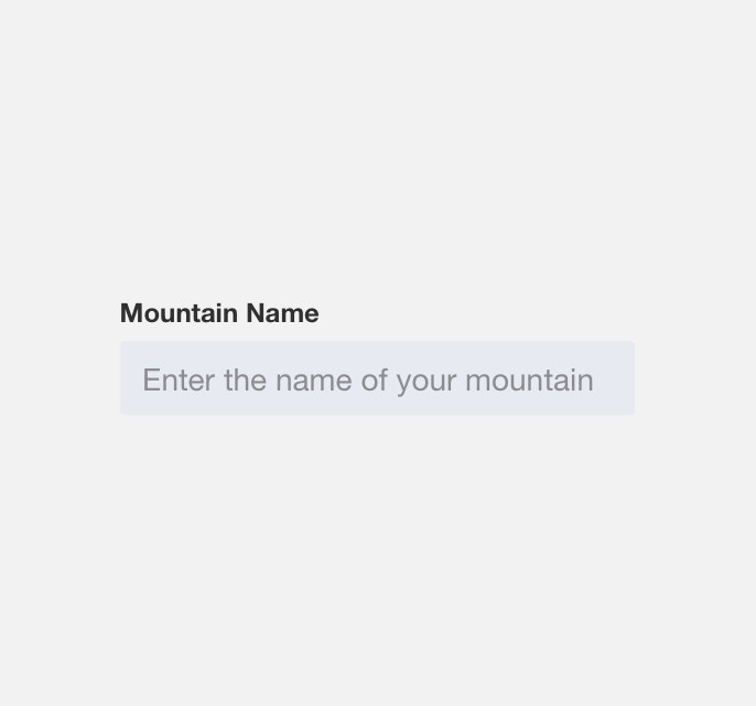
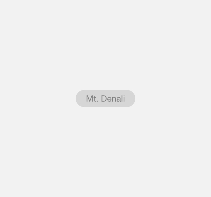
use a sans serif font such as Helvetica throughout your product.
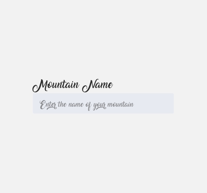
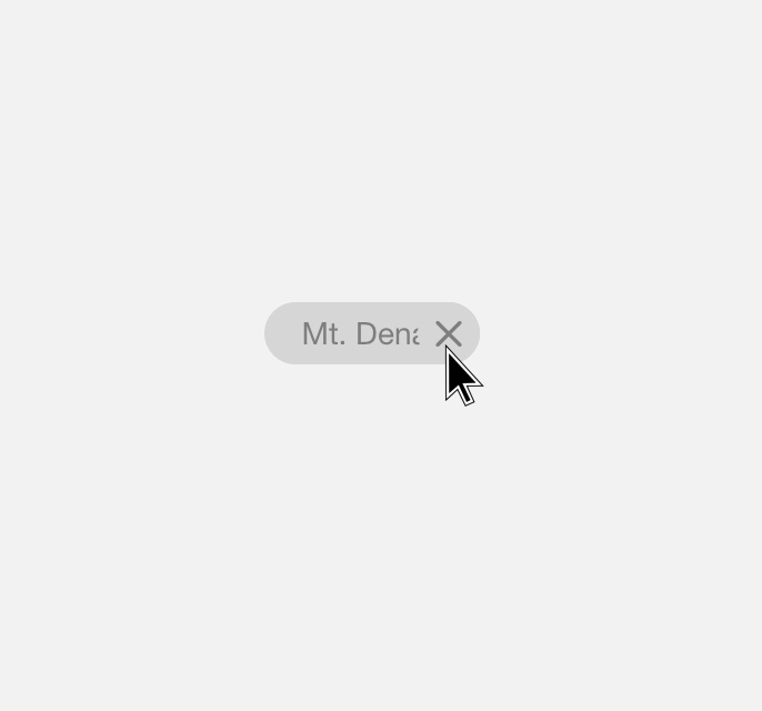
use decorative fonts throughout your product.

use a monospace font when displaying changing time on a countdown or timer.

use a serif font when displaying static time stamps.
Styles
Practicing restraint when selecting type weights and styles is important to establishing visual hierarchy, consistency, and typographic patterns.
Denali Heading Styles
In order to simplify your type selection process and establish recognizable typographic patterns we’ve recommend the following heading styles and use cases:
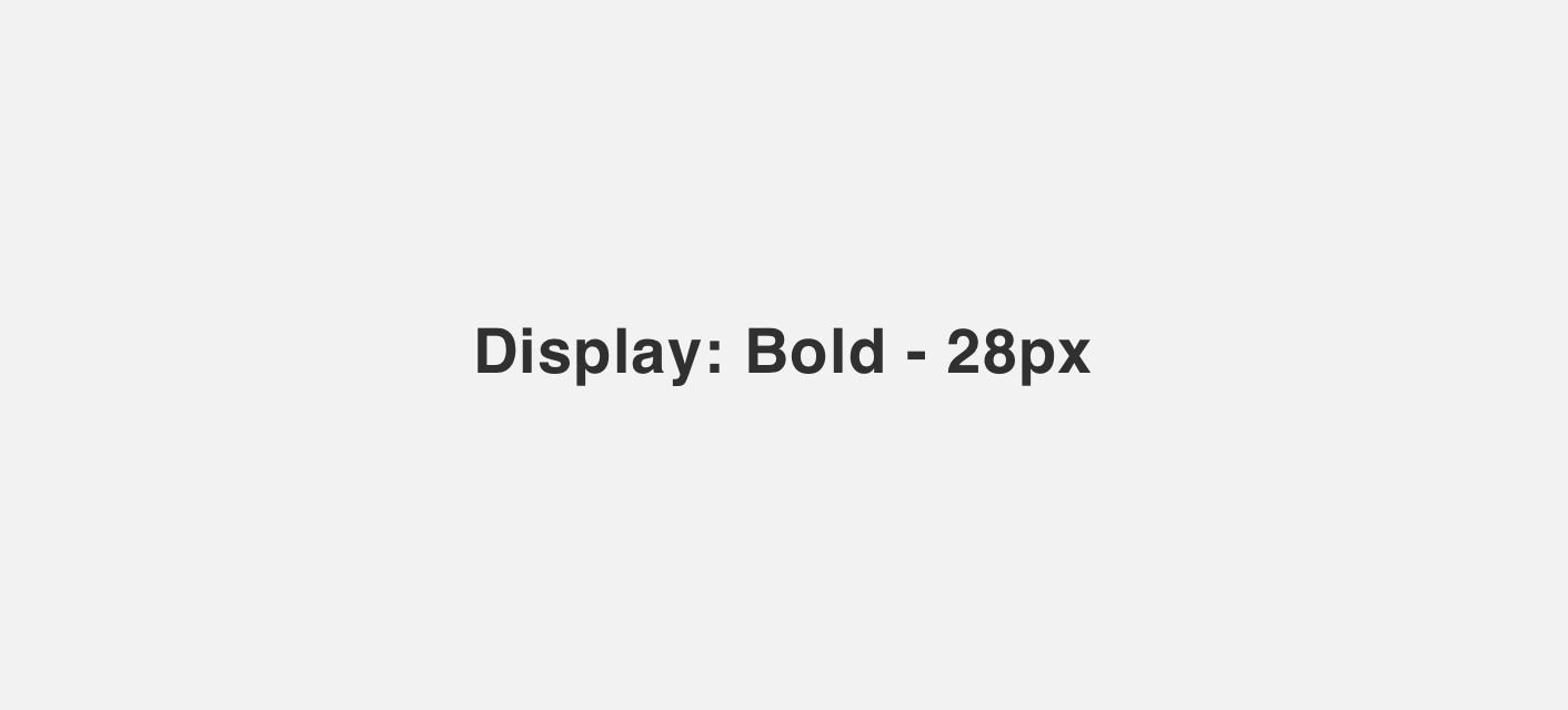
as a heading on welcome pages.
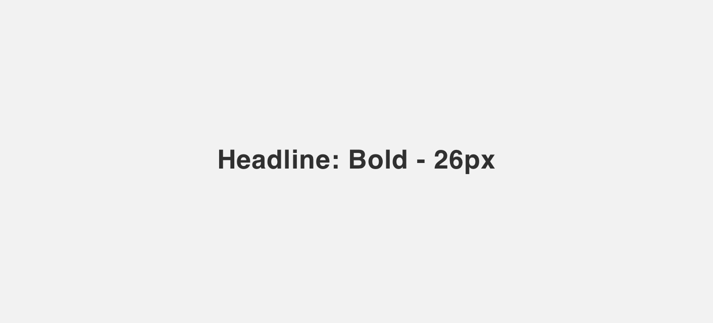
as a heading on a low density page.
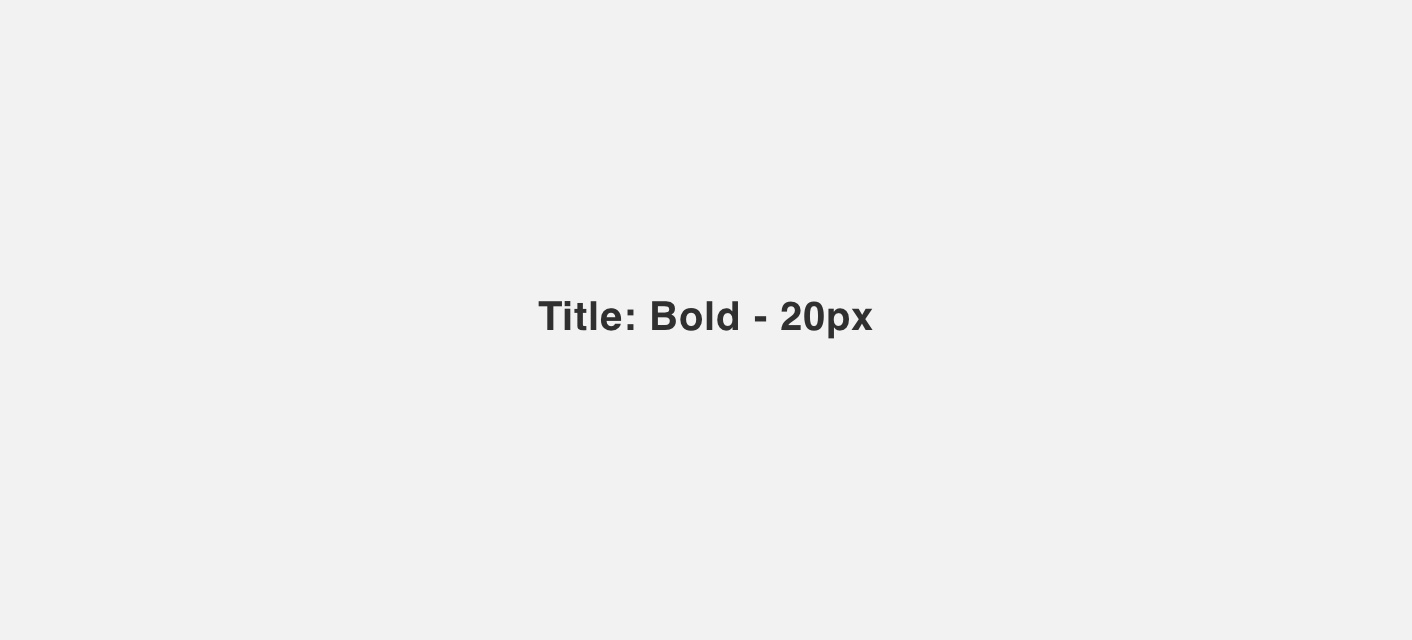
as a heading on a high density page.
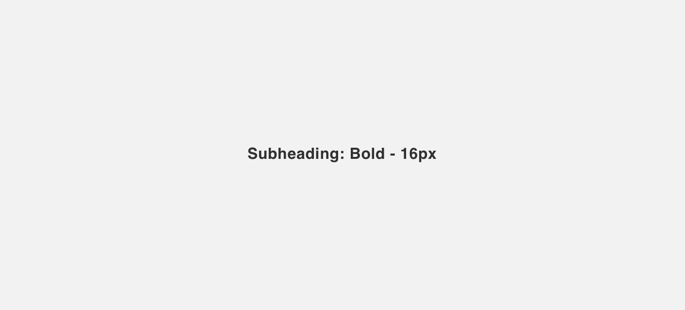
as a heading to break up subsections on a page.
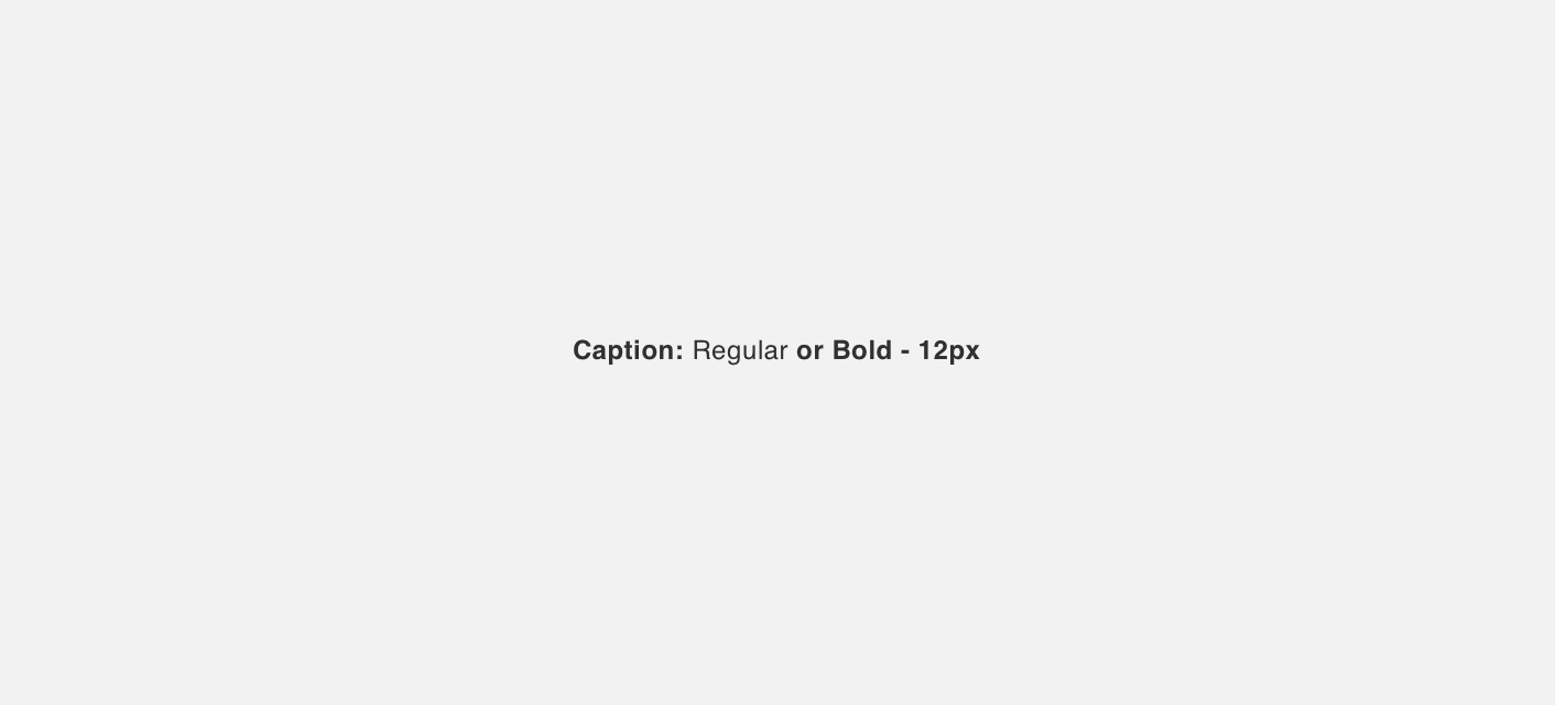
as a descriptor to display secondary information or meta-data.
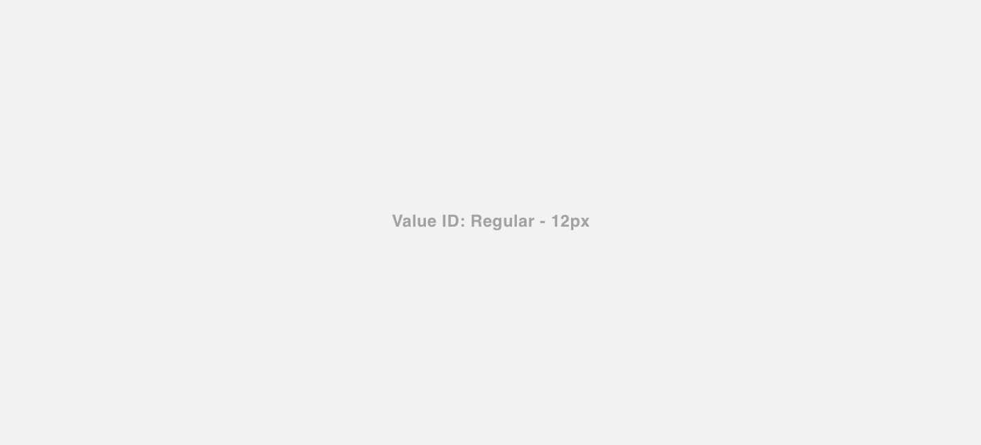
as labels on data visualizations and tables.
Colors
The majority of Denali’s type is black. In certain situations white, grey, blue or status colors can be applied to type to aid visual hierarchy, provide contrast, or convey meaning.
Black
Black #303030 is our primary type color. It should be used for static text elements such as heading and body text.
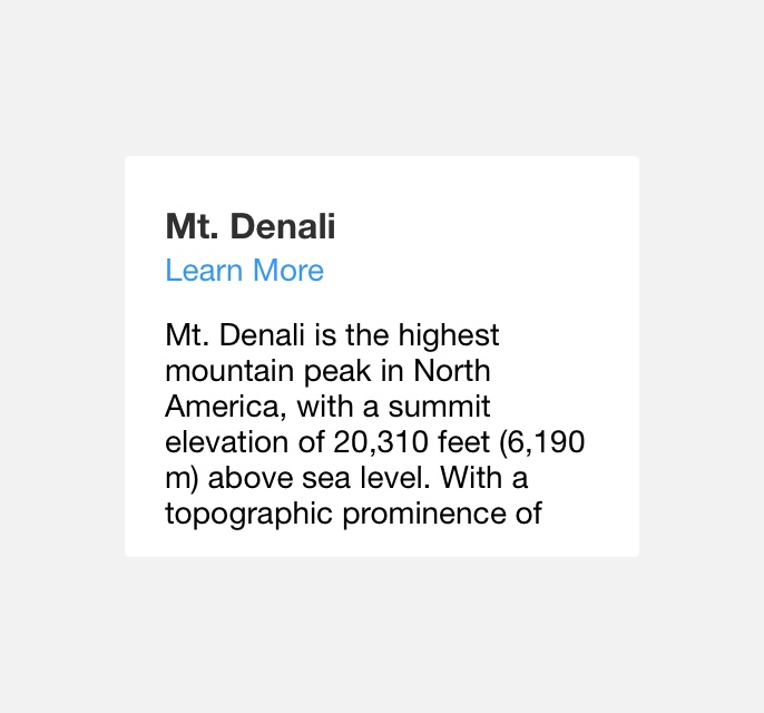
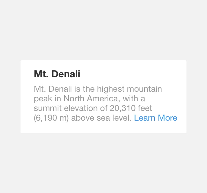
use black on headlines and body copy.
use black on text links.
White
White #FFFFFF should be used in situations where black text does not contrast well against the text element’s background color.
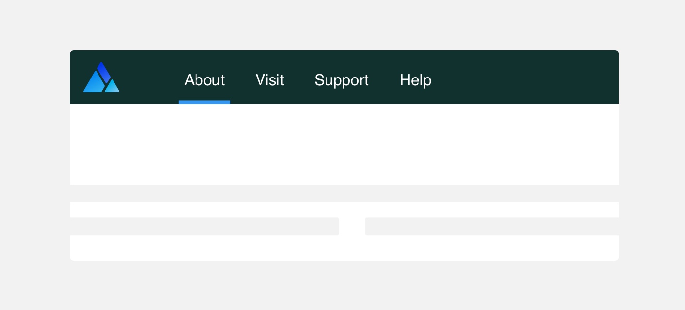
use white text against an element with a dark background.
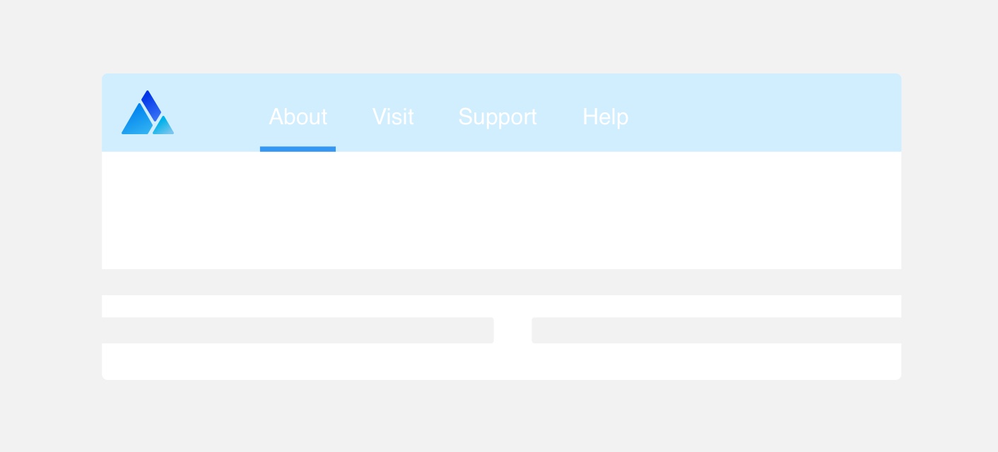
use white text against an element with a light background.
Grey
Grey #XXXXXX should be used to de-emphasize the visual importance of text such as a caption or to convey a disabled state.
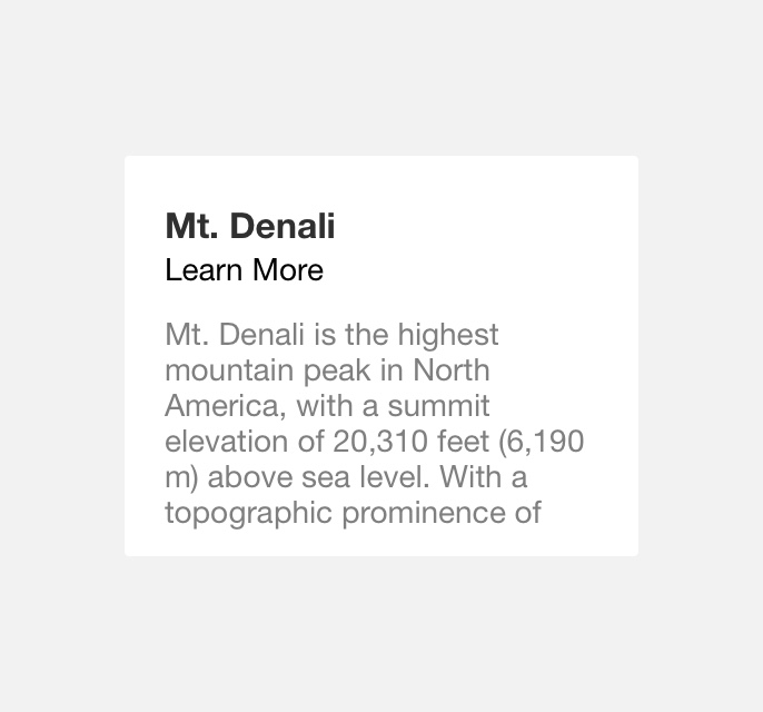
use grey on a text element with low visual importance such as a page title.
use grey on a text element with high visual importance such as a a caption.
Blue
Blue #016EFF should only be used to convey active links and buttons.
use blue to convey an active link within body copy.
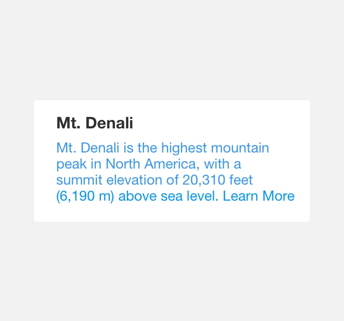
use blue to color sections of static body copy.
Status Colors
Green, Yellow, and Red status colors should be used only when it is necessary to convey a status through text.
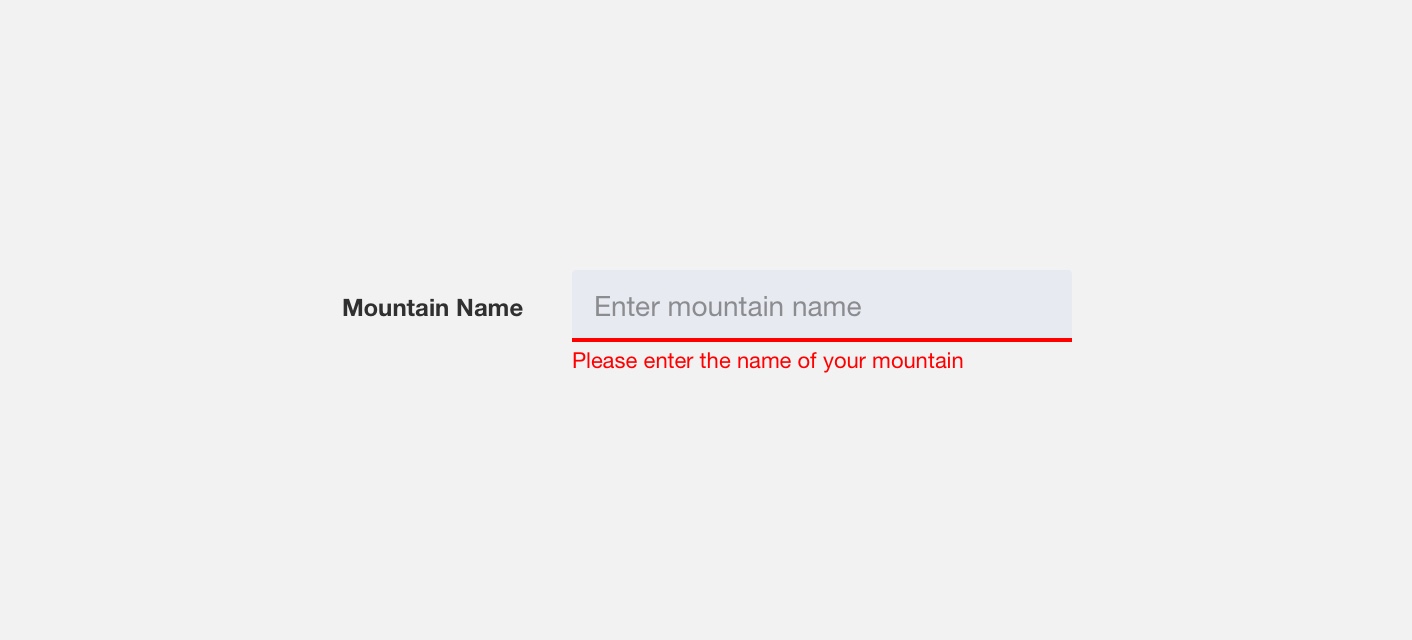
use red text to notify users of required fields.
use red text for input field labels.
Density
Body copy refers to blocks of text in a product or web page. In order to maintain body copy’s legibility it is important to use a legible font size and provide sufficient line height. Optimal font size and line height values for body copy vary by the density of a page, which is why Denali offers two body copy styles:
Standard Body Copy
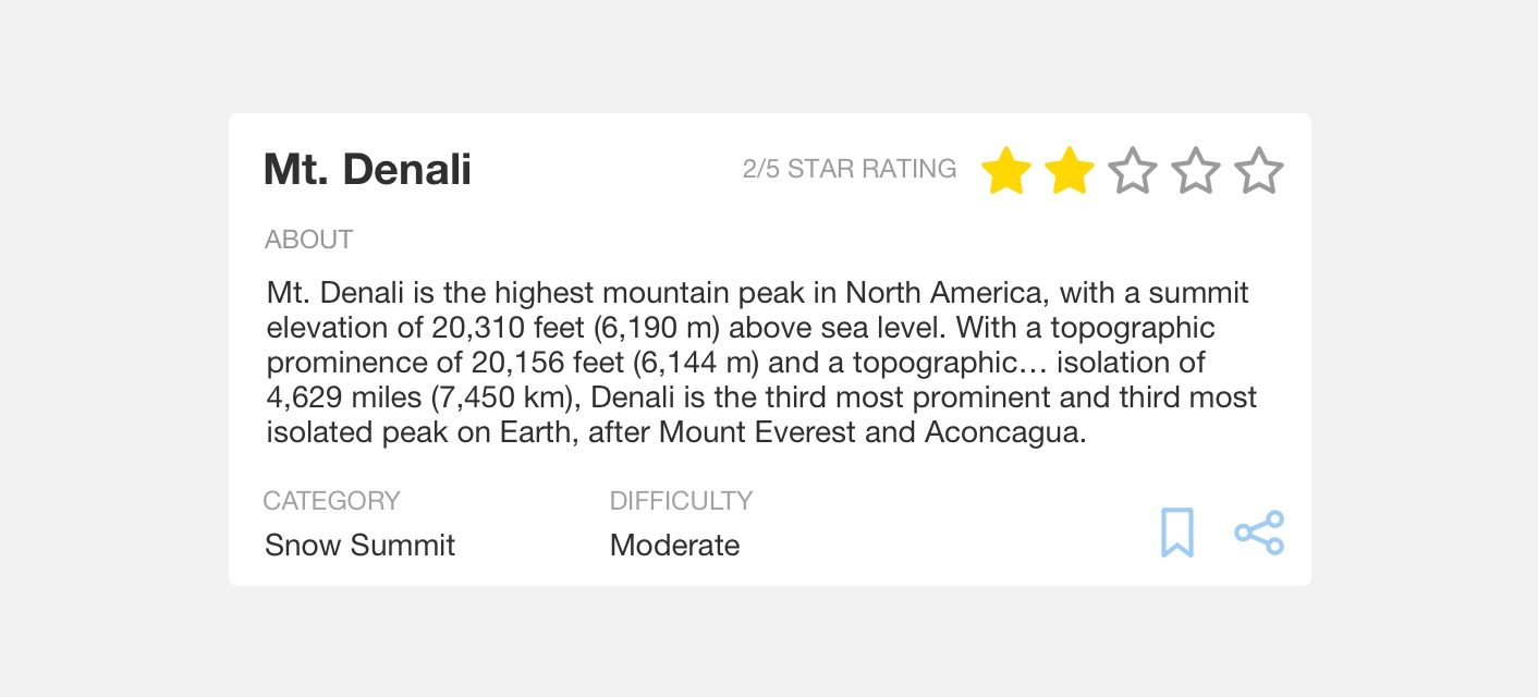
Standard body copy style is intended for pages with high density. Standard body copy utilizes a 14 pixels font size with a line height of 16 pixels.
use standard body copy on pages with high page density.
use standard body copy on pages with low page density.
Large Body Copy
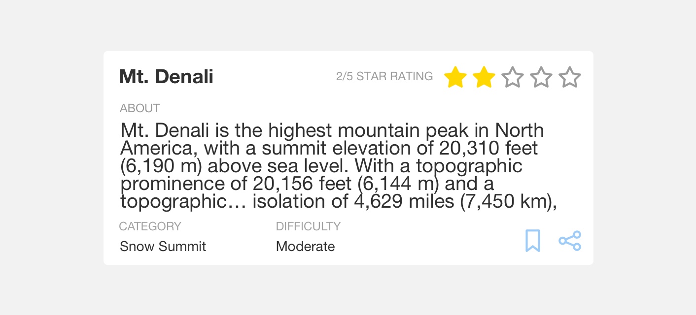
Large body copy style is intended for pages with low density. Large body copy utilizes a 16 pixel font with a line height of 22 pixels.

use large body copy on pages with low density.

use large body copy on pages with high density.
Whitespace
Providing adequate white space around text elements is essential to maximizing legibility, maintaining visual hierarchy, and reducing visual noise.
give text elements adequate white space to ensure legibility.
hinder legibility by placing text elements too close to each other.
Themeing
Denali’s components are completely themeable. This allows you to use our framework and adapt the visual style of Denali’s components to match your prodcut’s unique visual brand. Check out our guide to themeing with Denali to find out more.
For all variables visit the CSS documentation page for typography.