Links
Links are actionable components that allow users to navigate between pages or sections in an application or website.
Developer Docs
Foundation
Links use text labels or a text label and icon pairing to convey an action to a user. The most important thing to consider when working with links is to ensure that their appearance and placement convey their intended action clearly to a user.
Text Labels
Text labels are the core element of a link. Link text labels should be concise while effectively conveying what will occur when the link is clicked. Avoid using vague phrasing like “click here” and instead use copy that concisely conveys where or to what the link leads to.
These link labels clearly and concisely convey their purpose to a user.
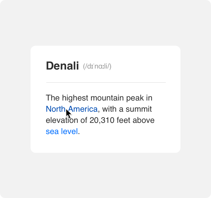
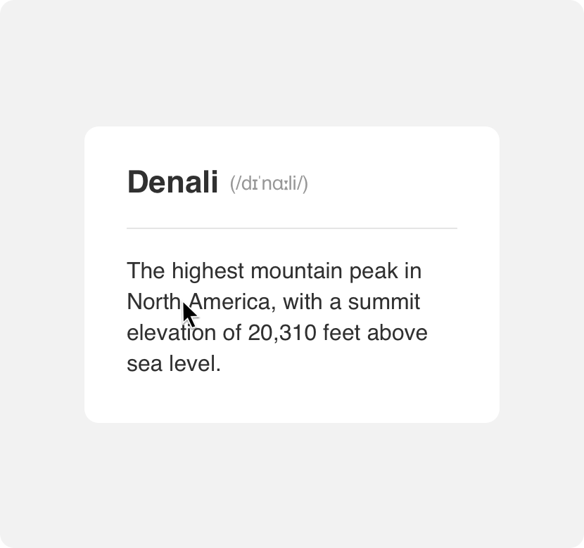
Because text labels can easily be confused with body copy it is important to provide some visual cue to your users that a link’s text label is an actionable page element and not static text.
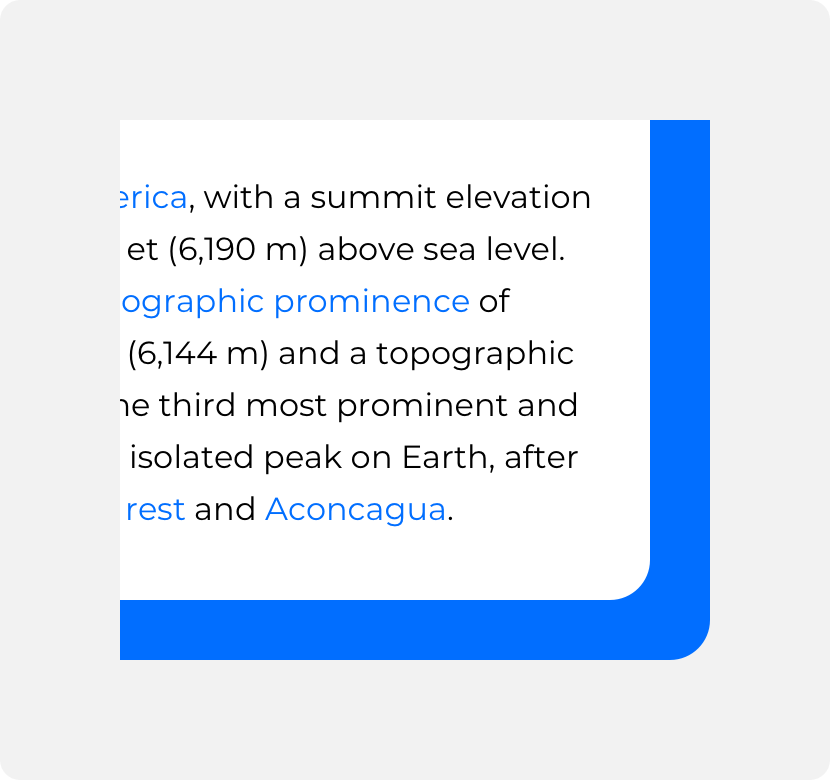
provide visual distinction between surrounding body copy and clickable links.
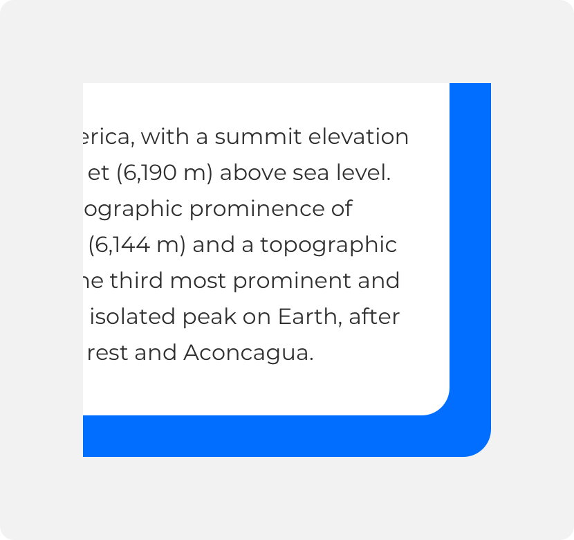
neglect to provide visual distinction between body copy and clickable links.
Icons
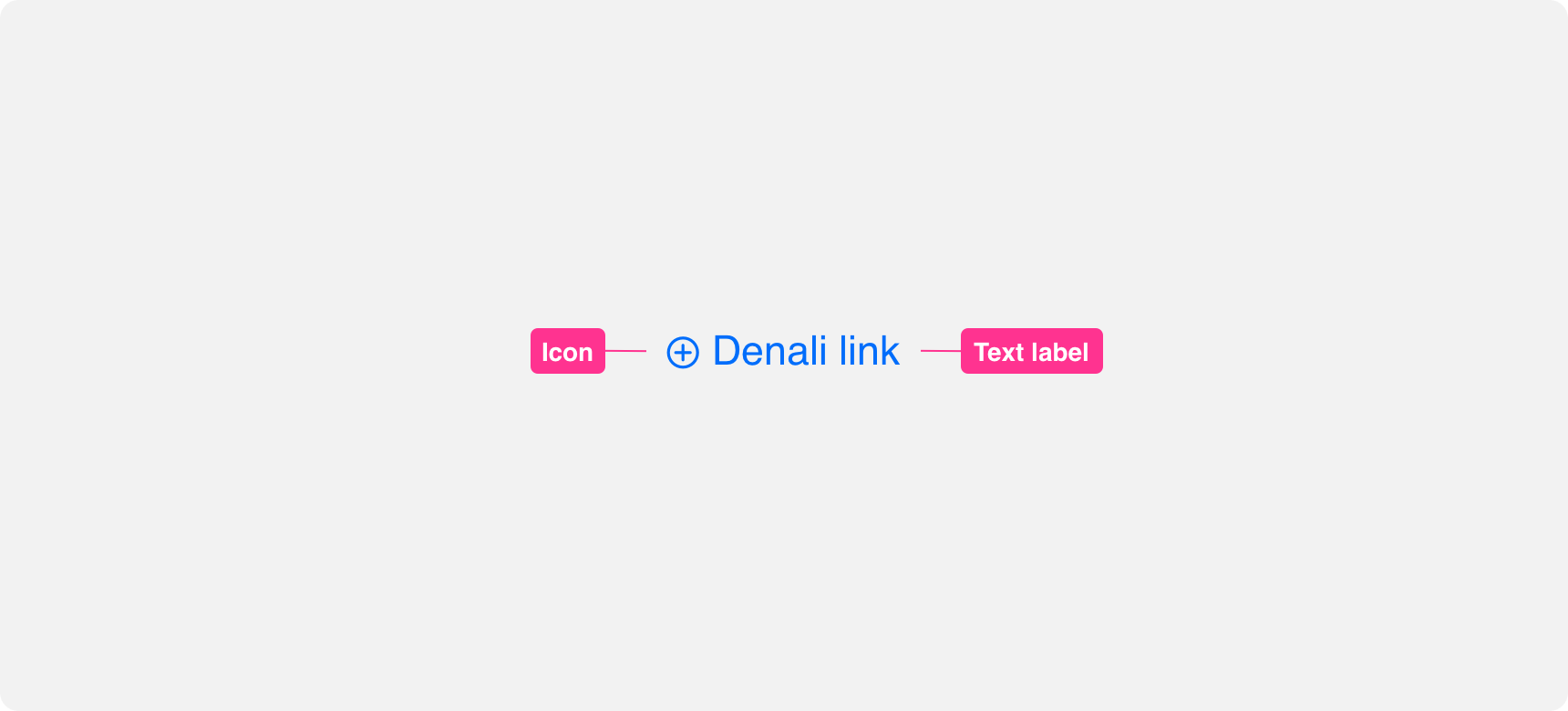
A link can consist of an icon on its own or an icon paired with a text label. Always ensure that the icon you select for your link clearly communicates the link action. Icons paired with text labels should directly support the text label.
use icons and text labels that support each other.
use icons and text labels that do not relate to one another or use multiple icons alongside a text label.
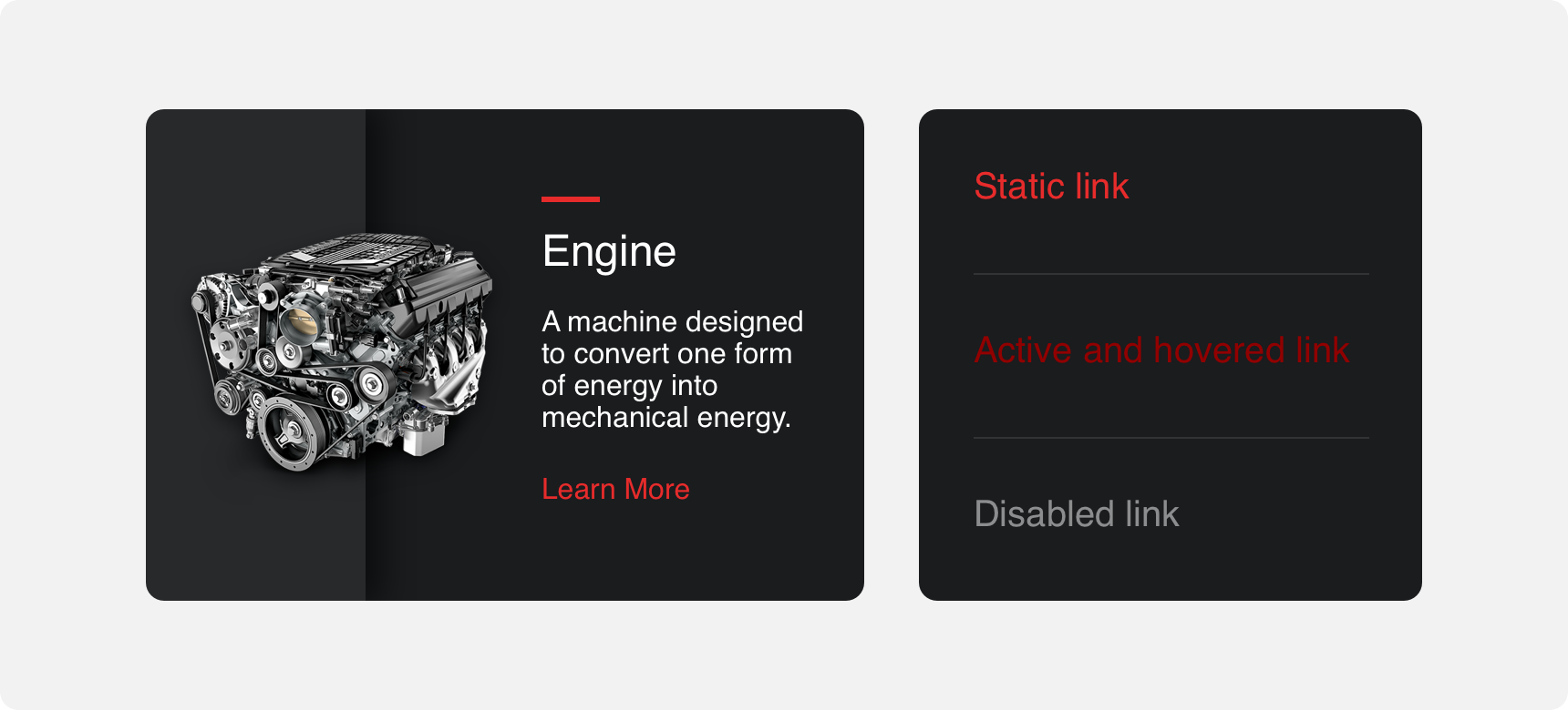
States
Hover, focused, and disabled states help indicate to a user that a link is an actionable element and not static text. Different visual treatments are applied to each of these states to help users perceive the difference between static text and links as well as clickable links and disabled links.
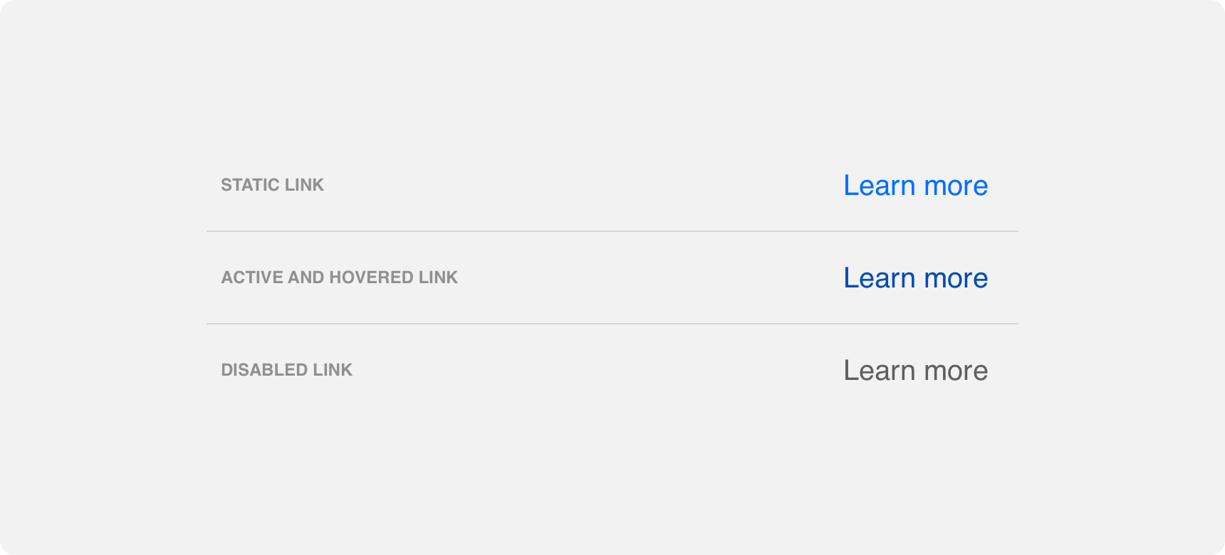
provide visually distinct static and hover states to differentiate clickable links from surrounding elements.
neglect to provide visually distinct static and hover states to differentiate clickable links from surrounding elements.
Placement
Links are an extremely versatile component that can be placed just about anywhere. Oftentimes links are combined with other elements to create larger components such as nav bars or breadcrumbs.
General usage
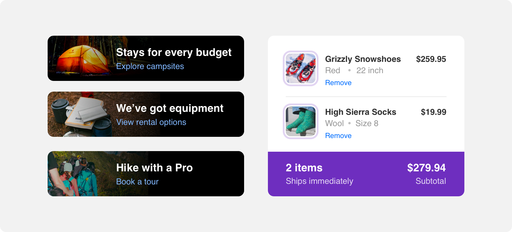
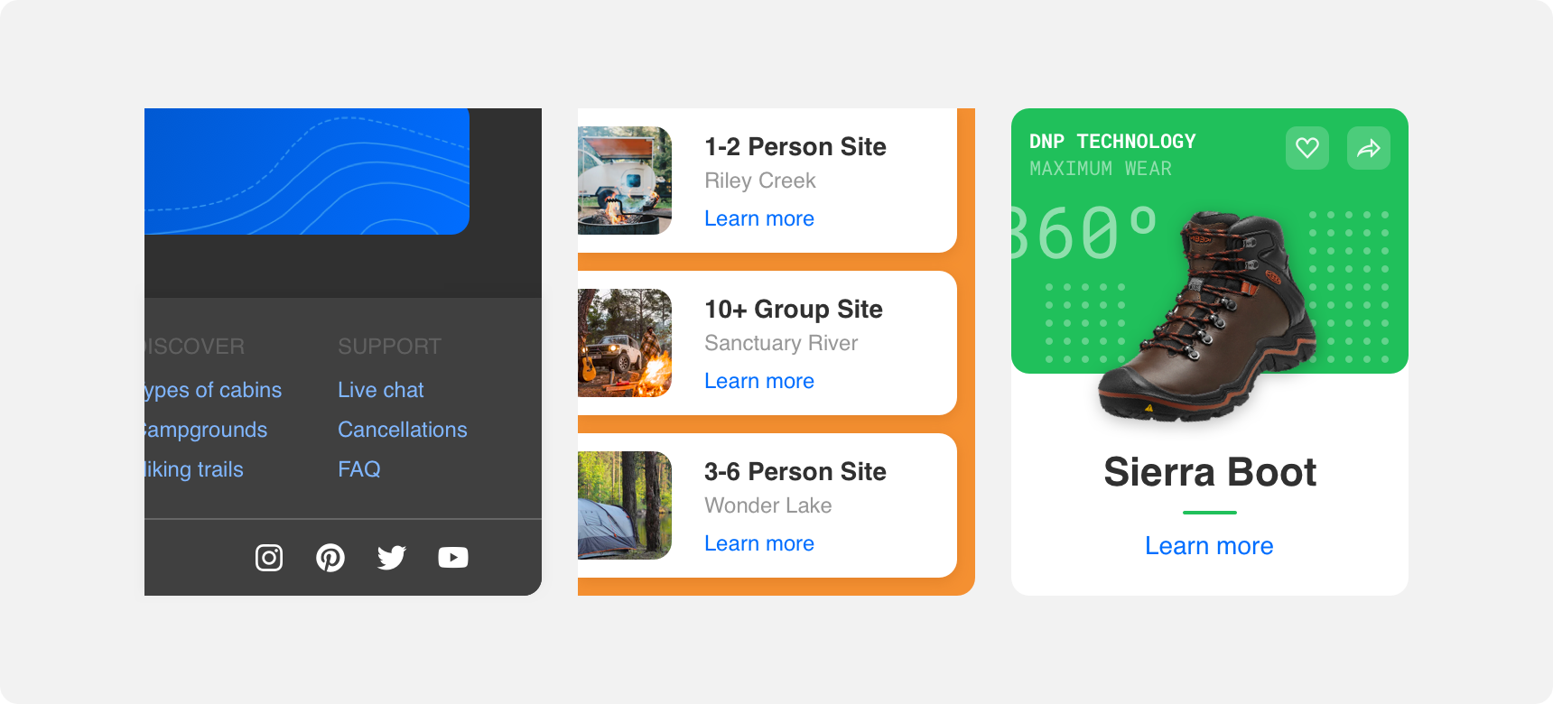
Generally links are supportive elements that work alongside other page elements to convey navigation to the user. Place links in close proximity to the content they are supporting so that the relationship between links and the content they relate to is clear. Common places links appear:
• Alongside body copy
• Alongside images
• Within cards
• With navbars and breadcrumbs
• Footers
As part of other components
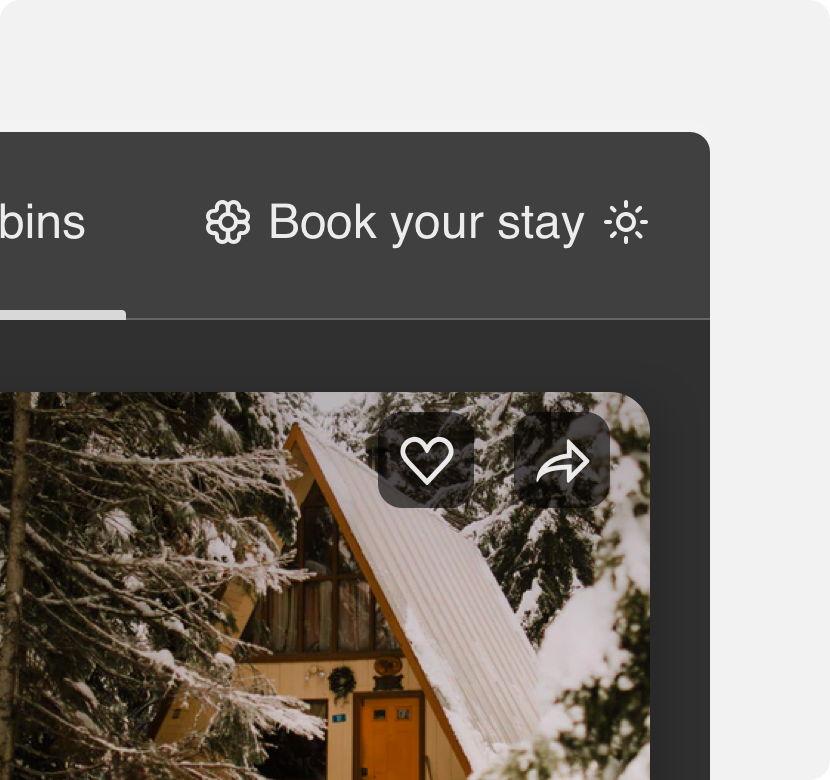
Because a link’s text label is an atomic level element it is possible to incorporate links as part of larger elements. Common examples of this include nav bars and breadcrumbs. The placement of links within these larger elements should be done in a way that ensures the links look like and function as they would on their own.
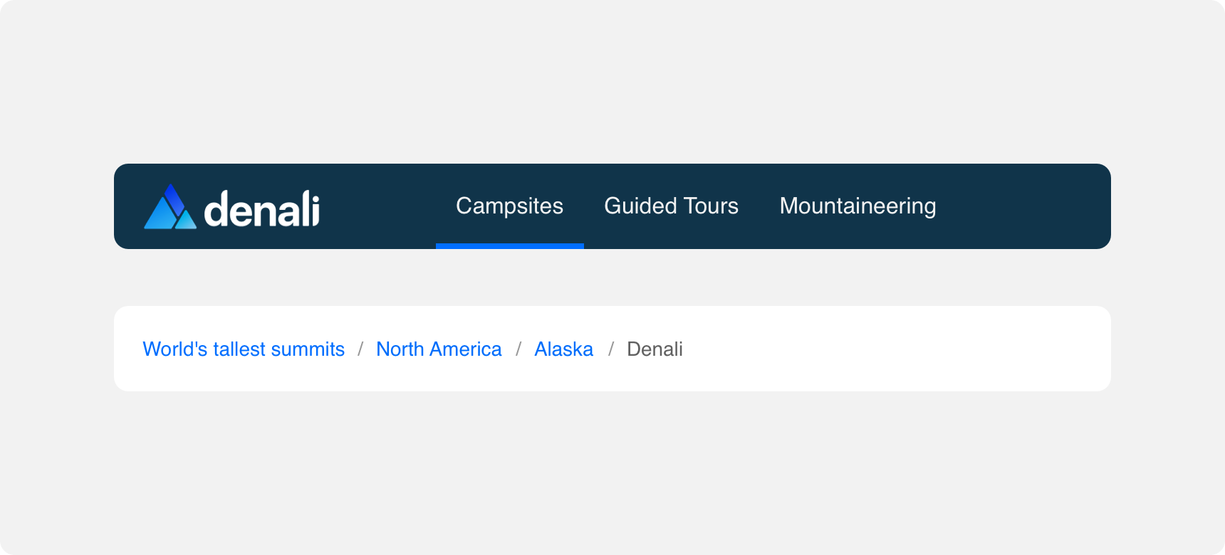
Here links are used as part of a navbar as well as a page breadcrumb.
Margins
Always provide links with sufficient margins on all sides so that they are discoverable. In general it is best to avoid crowding links too closely with content that overshadows them or otherwise makes them difficult for the user to discover.
provide links with enough negative space that they are discoverable.
crowd links other otherwise make them hard to discover by neglecting to provide them with sufficient visual distinction and prominence.
Themeing
Denali’s components are completely themeable. This allows you to use our framework and adapt the visual style of Denali’s components to match your prodcut’s unique visual brand. Check out our guide to themeing with Denali to find out more.
Dennit Racing Theme
Dennit Racing uses a customized Denali theme that aligns visually with their brand. Dennit’s links feature custom type and type color across their default, hover, active, and disbaled states.
For all variables visit the CSS documentation page for links.