Toggle
Toggles are a group of selectable options that are related to each other. The options are contained within a single component and one option is always selected by default. Toggles are available in default and small sizes.
Developer Docs
Foundation
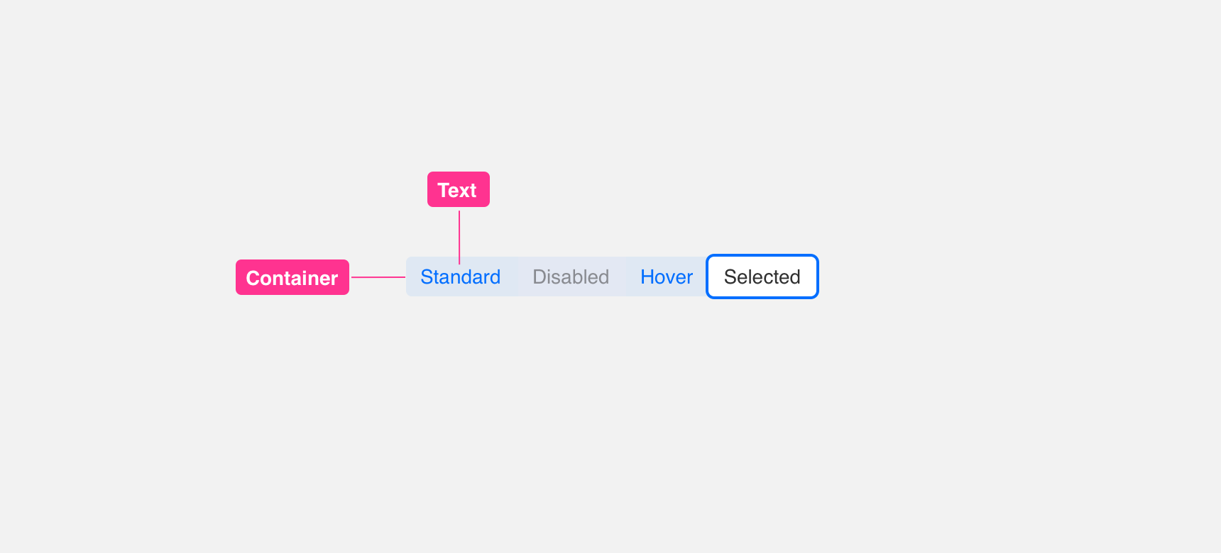
Toggles are made up of a background container with a smaller container inside that holds either text or icons.
States
Toggles always contain one active state with at least one or more inactive or disabled states.
Padding
In order to maintain visual balance, we recommend not providing any padding between toggles. This allows the user to perceive its connectivity.
Placement
General usage
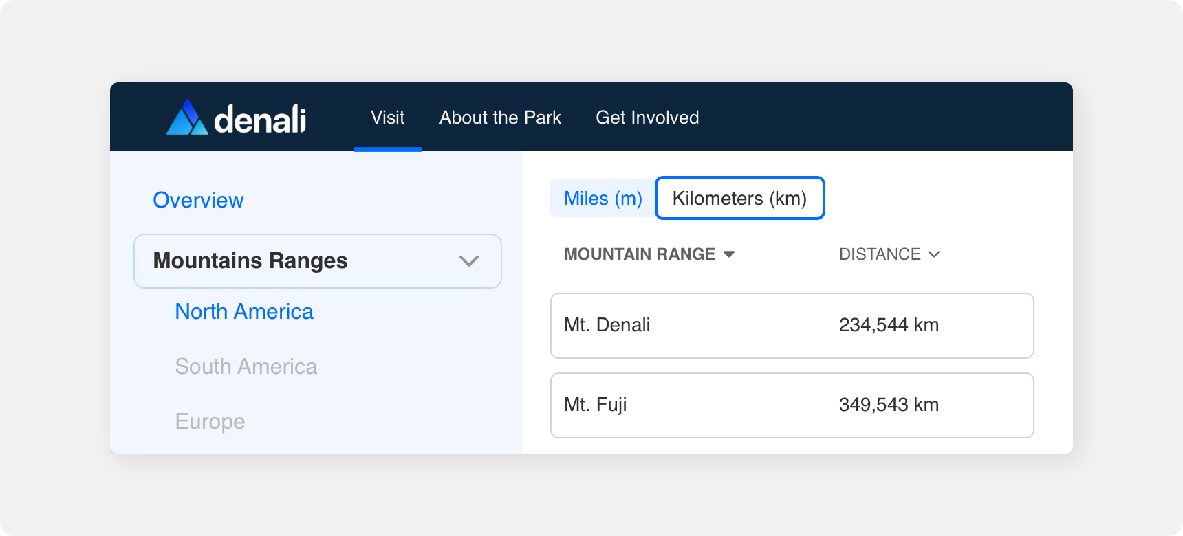
Similar to Tabs, Toggles are used to hide smaller sets of data under this system which can be displayed per the users interaction.
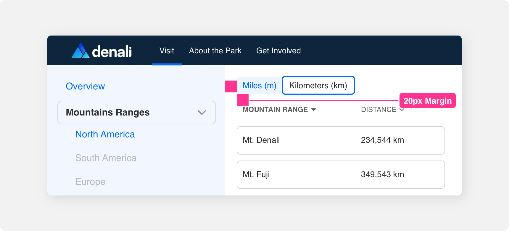
Margin
Adequate margins between Toggle component and other components is important to maintaining discoverability and scannability. We recommend maintaining a minimum 20 pixel margin between Tabs and other components.
Themeing
Denali’s components are completely themeable. This allows you to use our framework and adapt the visual style of Denali’s components to match your prodcut’s unique visual brand. Check out our guide to themeing with Denali to find out more.
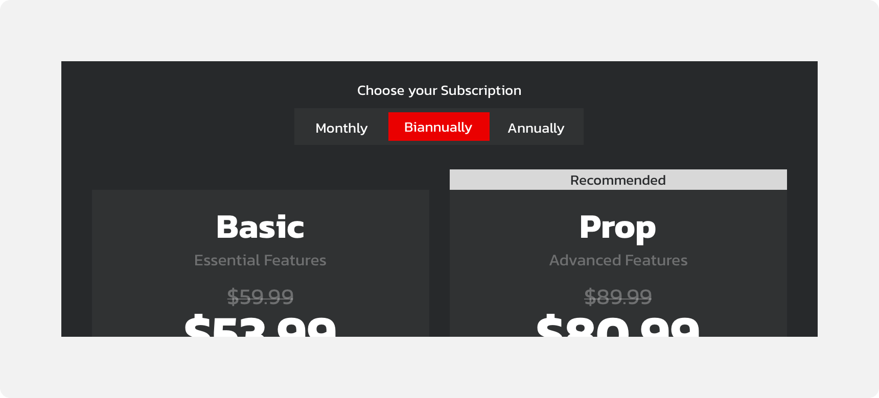
Dennit Racing Theme
Dennit Racing uses a customized Denali theme that aligns visually with their brand. Dennit’s List features custom type and color theming.
For all variables visit the CSS documentation page for toggle.