Progress
Progress bars visually indicate to users that some action or process is progressing. On their own progress bars do not indicate a specific time frame for when the progression will complete, but text labels can be added to indicate time.
Developer Docs
Foundation
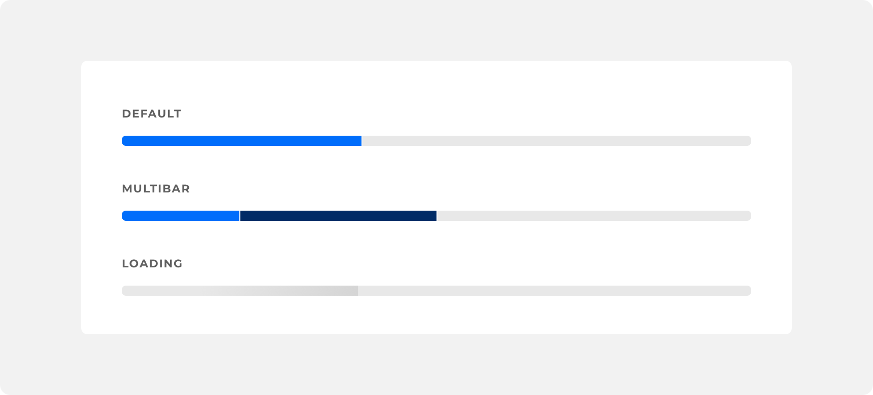
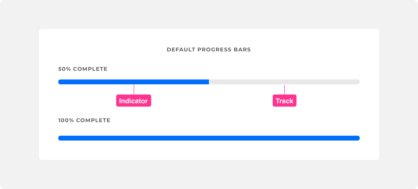
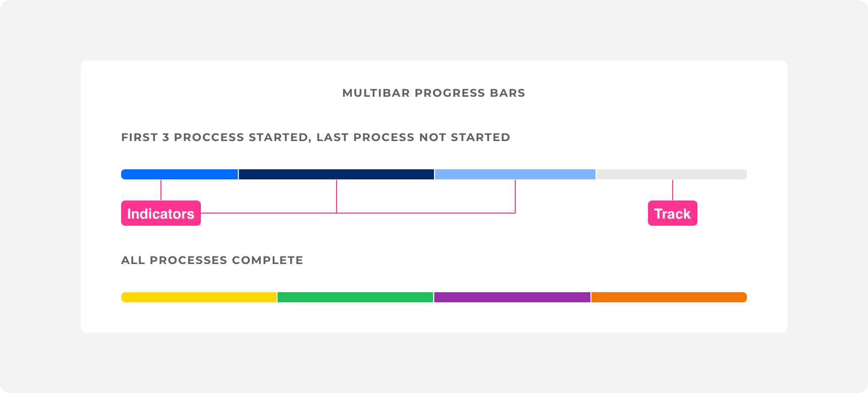
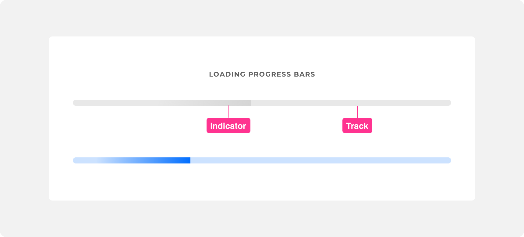
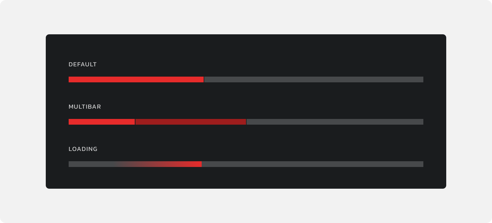
Denali offers three types of progress bars: default, multibar, and loading.
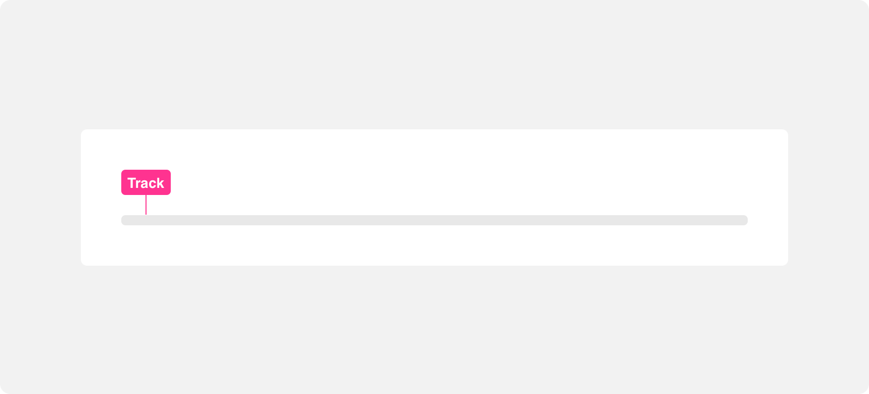
Track
All three progress bars have a track. The track is a narrow, rectangular bar with a fixed width. The track’s fill color should contrast with the fill color of the indicator. The height of the track is equal to the height of the indicator within the track.
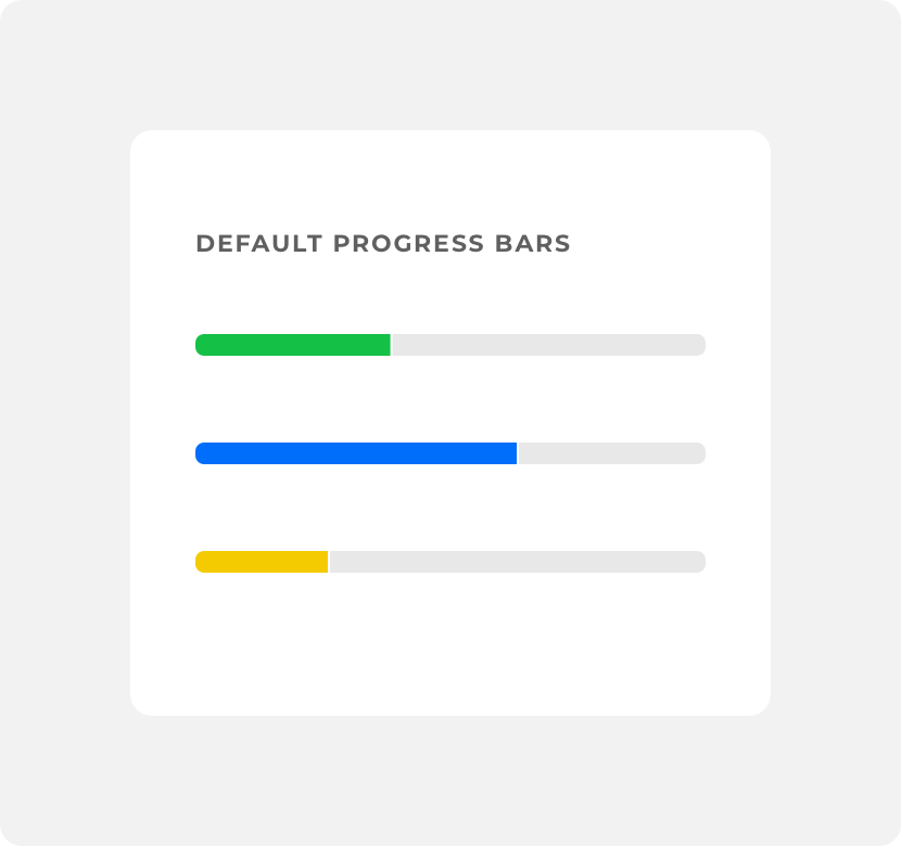
use a track fill color that contrasts with the indicator’s fill color. This makes the distinction between the track and the indicator clear.
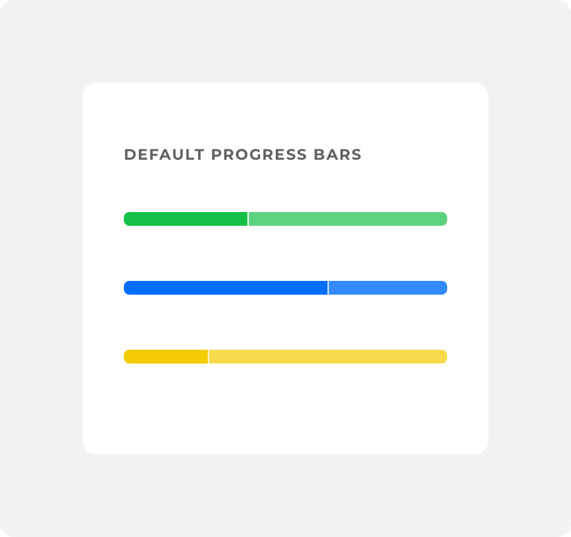
use a track fill color that doesn’t contrast well with the indicator’s fill color because it makes it extremely difficult to make the distinction between the track and it’s indicator.
Indicator
Indicators exist within the progress bar track. They indicate the status of the progression and they change based on user input or the passage of time.The appearance of progress bar indicators differs between default, multibar, and loading progress bars.
Indicators in the default and multibar progress bars consist of solid or dark opacity rectangles that share the same height of the track, but only a portion of its width.
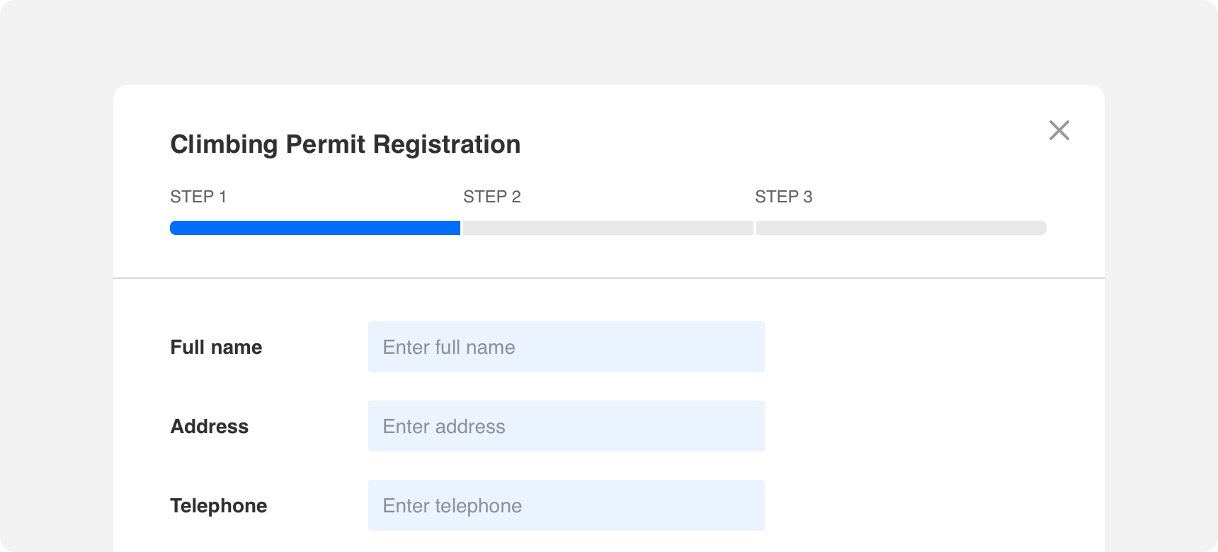
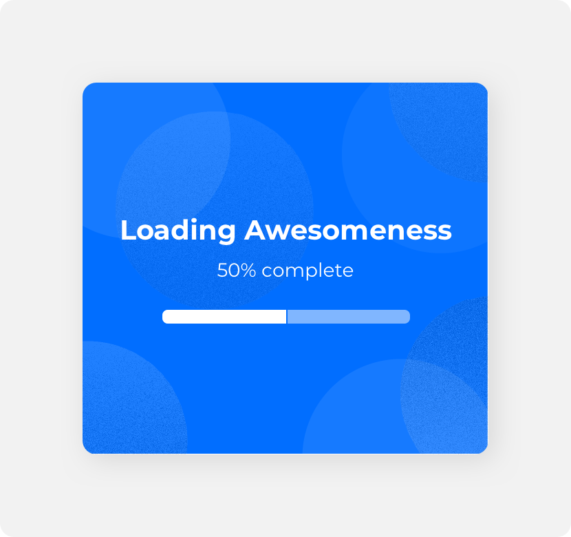
In default progress bars the indicator is a continuous shape. It’s width represents a single action or process. The width of the indicator changes based on specific inputs or actions. When the progression is complete, the width of the indicator is equal to the width of the track.
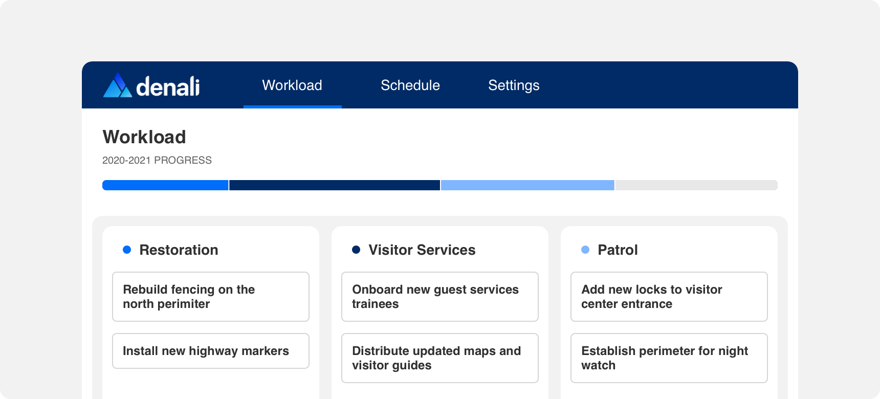
In multibar progress bars there are multiple indicators within the track. These indicators are still rectangular in shape and have a solid or dark opacity. However each one represents the progression of a different action or process. The width of each indicator is equal to the progression of the process it represents and it changes based on specific inputs or actions.When each progression is complete, the width of all the indicators become equal.
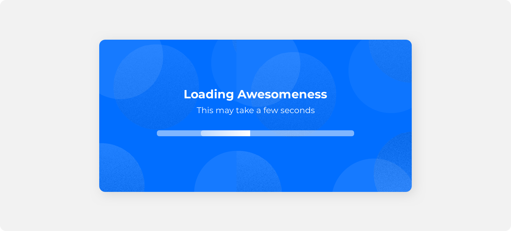
In loading progress bars, the indicator is not a solid rectangular shape. Instead it is a rectangular shape with a lighter gradient fill that blurs the right and left edges of the indicator. This shape is then animated so that it continually passes through the track until the progression is complete.
Types
Denali’s progress bars can be separated into two categories: determinate and indeterminate. Determinate and indeterminate bars serve specific use cases so it is important to take the time to determine which one best suits your needs.
Determinate
Determinate progress bars either represent a specific period of time or correspond 1:1 with the progression of the process or action they represent. Default and multibar progress bars are determinate progress bars because the width of their indicator(s) directly represents the status of the process they represent.
Indeterminate
Indeterminate progress bars do not represent a specific period of time and they do not correspond directly with the progression of the process or action they represent. Instead, an indeterminate progress bar simply indicates to the user that a process is taking place. The loading progress bar is an indeterminate progress bar because it’s indicator does not represent a specific period of time or progression, it only travels back and forth indefinitely.
Placement
Progress bars should be placed in proximity to the process they represent in order to clearly establish the relationship between the bar and the process or action it represents.
General usage
Progress bars are extremely versatile and can be used in a variety of ways. Some examples of what progress bars can be used to indicate include:
• Content loading on a dashboard or within a feed
• Feedback that something is uploading or downloading
• Progression of a task or project
• A user’s place within a form or wizard experience
Alongside Text Labels
Text labels can be used alongside progress bars to provide better context to the user. Examples of text labels that could be used include “loading”, “step x of x”, or “x% complete”. Only use a text label in conjunction with a progress bar if the text label provides an accurate representation of the progression. Avoid placing time specific text labels alongside indeterminate progress bars.
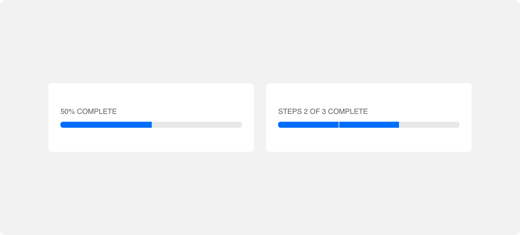
use a time specific text label to indicate that a determinate progress bar is a certain percentage complete.
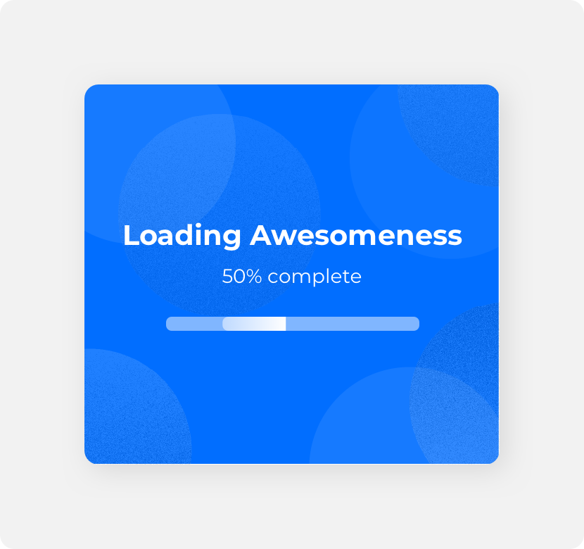
use a time specific text label alongside an indeterminate progress bar as indeterminate progress bars to not indicate specific time.
Themeing
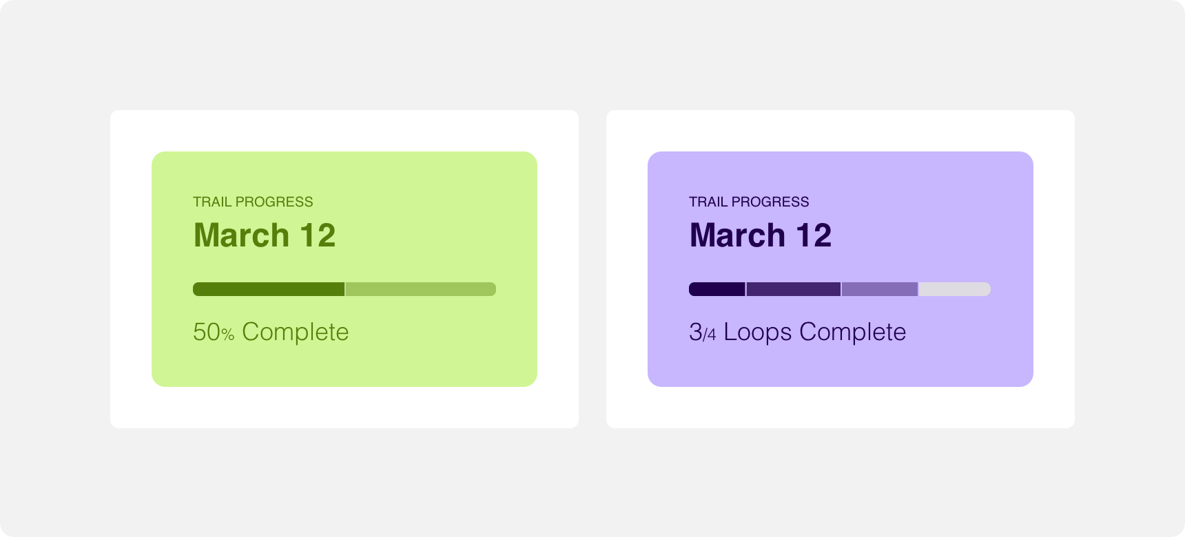
Denali’s components are completely themeable. This allows you to use our framework and adapt the visual style of Denali’s components to match your prodcut’s unique visual brand. Check out our guide to themeing with Denali to find out more.
Dennit Racing Theme
Dennit Racing uses a customized Denali theme that aligns visually with their brand. Dennit’s progress bars feature a custom color and border radius.
For all variables visit the CSS documentation page for progress.