Checkbox
Checkboxes allow users to select and deselect items in bulk. They provide the ability for users to select one or several items, deselect, or initiate an action.
Developer Docs
Foundation
Checkboxes are made up of a container and can include either a check icon or partial icon in their center.
Container
The primary element required to make a checkbox is a container with clearly distinguishable bounds.
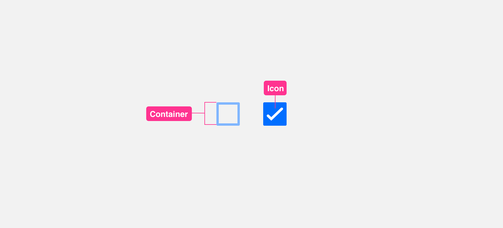
Icon
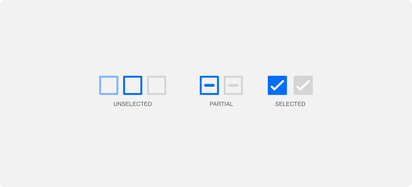
An icon can be added to a checkbox container to show different checkbox states including selected and partial selection.
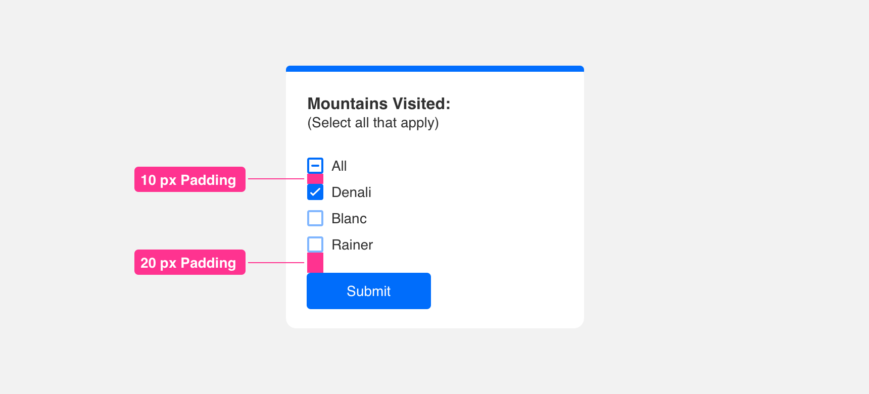
Padding
Icons inside the container should have adequate padding around it to support visual hierarchy and balance. We recommend providing even padding along the top, bottom, right, and left of the icon.
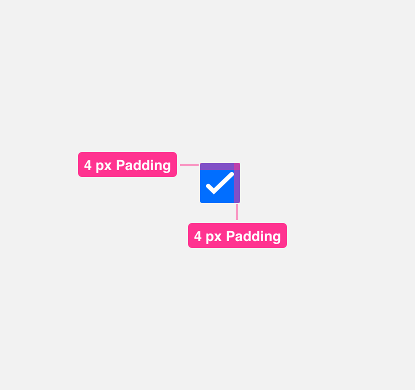
provide minimum 3 px of padding around the icon.
allow icon to extend to edge of container.
Margin
Always maintain a minimum 10 pixel margin between checkboxes or components so that they do not become lost.
Placement
General usage
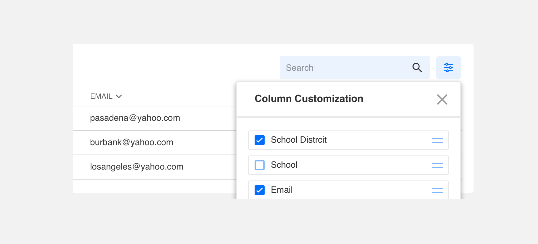
Checkboxes are very flexible components that can be placed anywhere you need to provide a user with choices. Examples of checkbox placement include within forms, tables, or settings pages.
Themeing
Denali’s components are completely themeable. This allows you to use our framework and adapt the visual style of Denali’s components to match your prodcut’s unique visual brand. Check out our guide to themeing with Denali to find out more.
For all variables visit the CSS documentation page for checkbox.
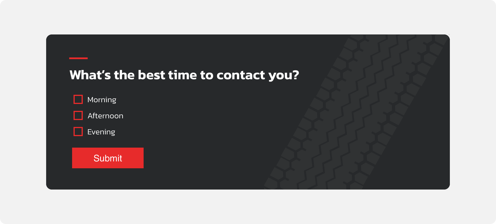
Dennit Racing Theme
Dennit Racing uses a customized Denali theme that aligns visually with their brand. Dennit’s checkboxes feature custom type, background color, border radius, border color and icons.