Lists
Lists allow users to organize words, sentences or paragraphs in a linear form.
Developer Docs
Foundation
Lists are composed of a title and list items. List items can be preceded by a glyph if desired. Lists can also be organized numerically or alphabetically.
Title
List titles describe the content of the list. List titles are text labels. Title text labels should be given a visual treatment that differentiates them from list items. Bolding title text labels is a simple but effective way to differentiate them from list items.
Item
List items are individual pieces of text that relate to the larger list grouping. Oftentimes list items share the same visual styling as body copy. Whatever their visual style, it should be different than the visual style applied to the list title.
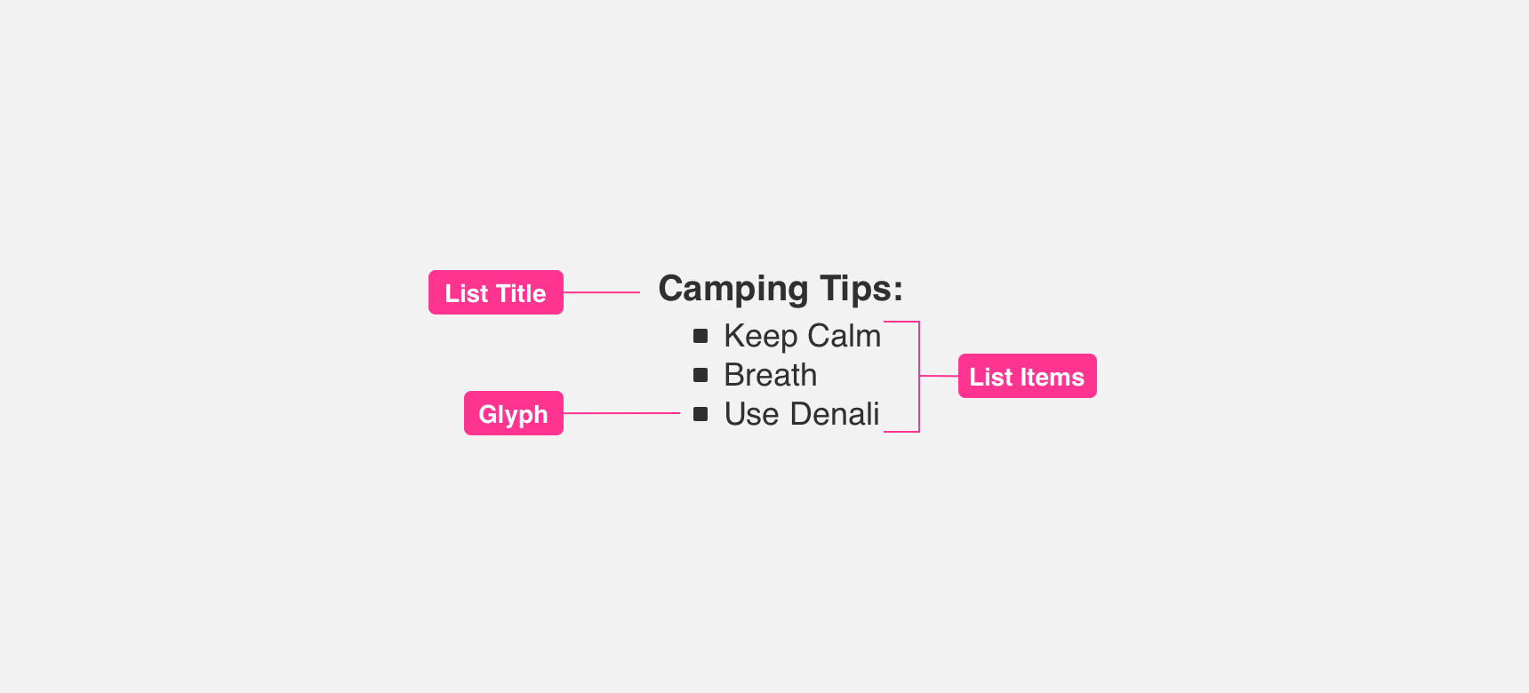
Numbers, Glyphs, Icons
You can give greater context to lists by including numbers, glyphs, or icons before list items. Numbers bring order to lists and are useful when describing actions that need to occur in a specific order. This is common in recipes or set up instructions. Glyphs, such as bullets, are great for conveying things like “to do lists” in which list items need to be noted but specific order is not important. Lastly, placing icons before list items can provide visual support and give greater context to the meaning of the list item.
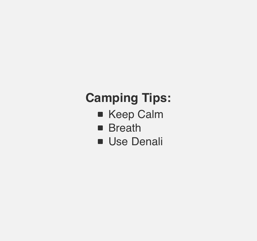
use numbers, glyphs, or icons consistently across list items in a single list.
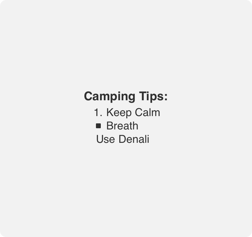
alternate between numbers, glyphs and icons in a single list.
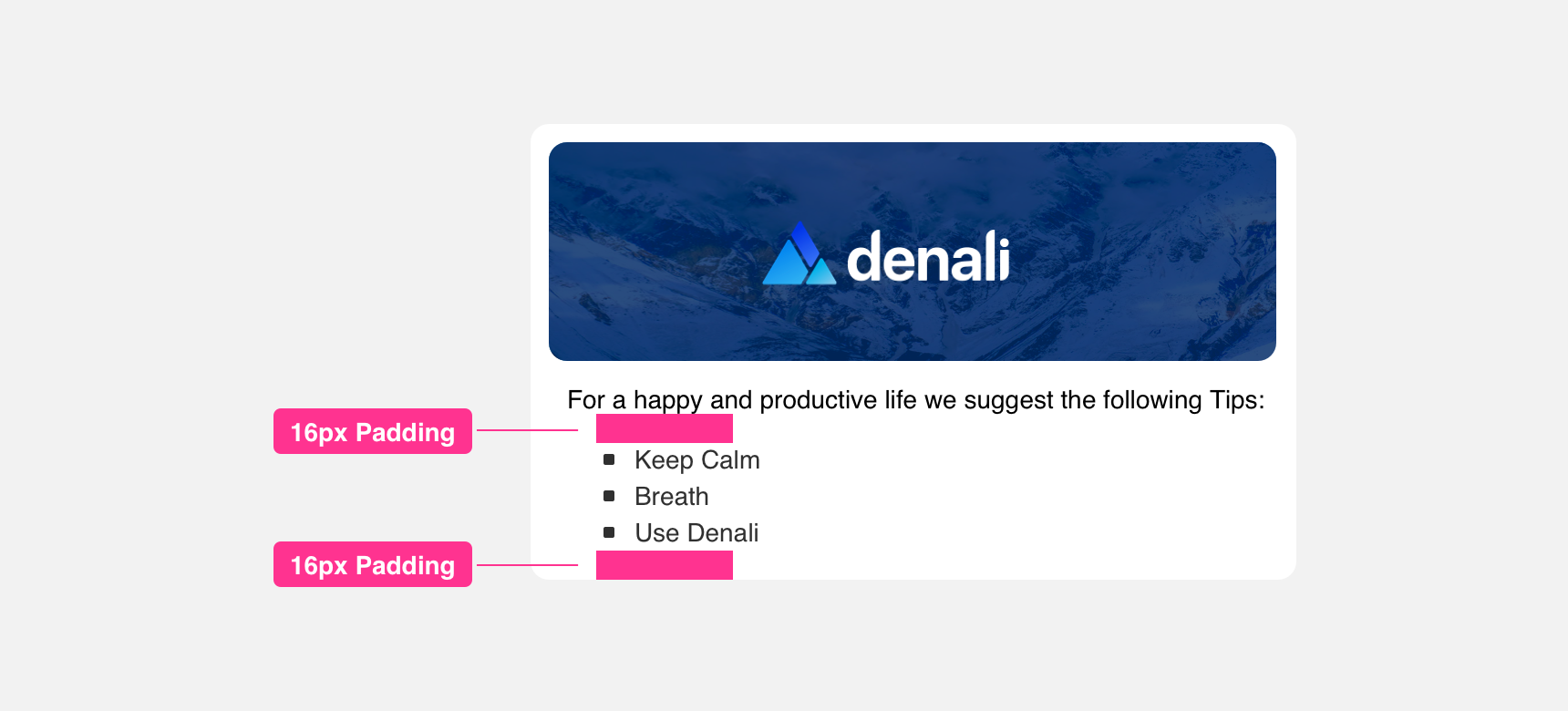
Padding
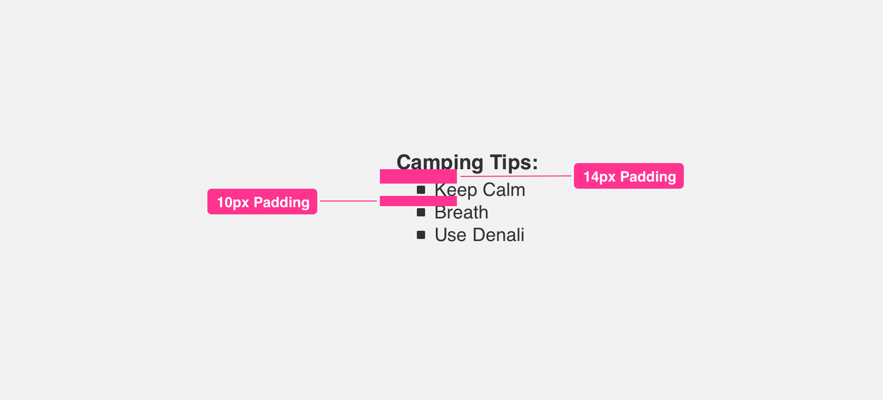
A list title and the first list item should have an adequate amount of padding between them to ensure legibility and clearly differentiate the two between each other. Similarly, list items should have consistent padding between each other to be clearly legible and scannable.
Placement
General usage
Lists can be utilized to describe a specific procedure, organize related items, or otherwise group items together in a way that is easily scannable. For this reason, lists can be placed almost anywhere within the body of a UI.
Margin
Adequate margins between list components and other components is important to maintaining discoverability and list scannability. We recommend maintaining a minimum 10 pixel margin between lists and other components.
Themeing
Denali’s components are completely themeable. This allows you to use our framework and adapt the visual style of Denali’s components to match your prodcut’s unique visual brand. Check out our guide to themeing with Denali to find out more.
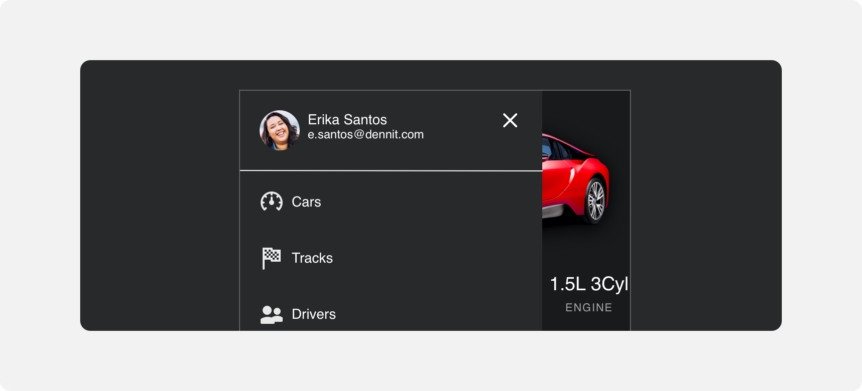
Dennit Racing Theme
Dennit Racing uses a customized Denali theme that aligns visually with their brand. Dennit’s List features custom type and color theming.
For all variables visit the CSS documentation page for lists.