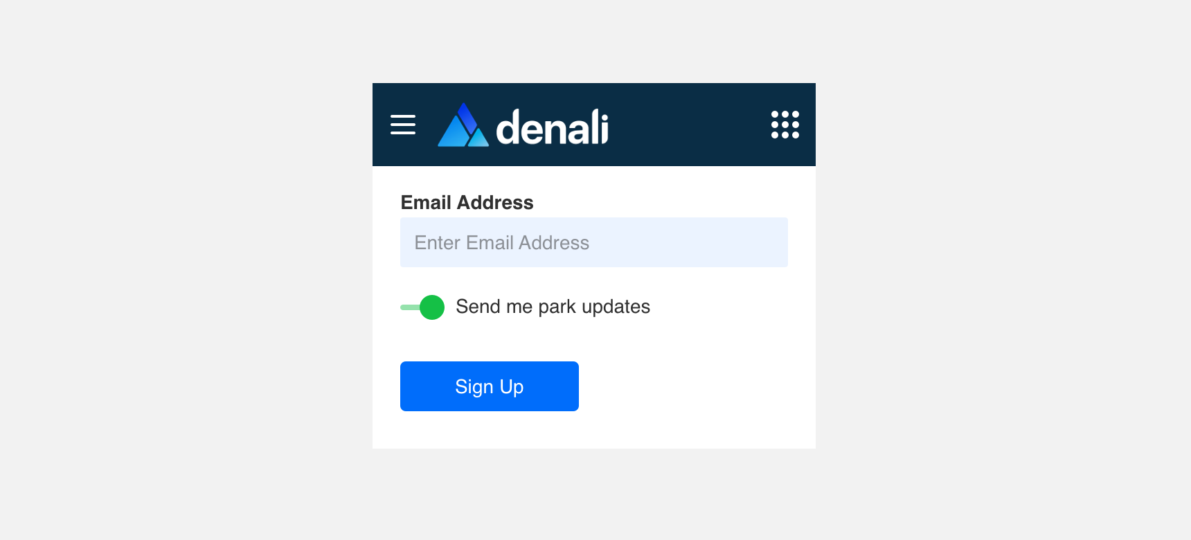
Switch
Switch is a type of control that allows users to turn on or off a single item.
Developer Docs
Foundation
A Switch is made up of a track, which the”thumb” follows either left or right depending on the state.
Track
The track is an element used to guide the Thumb between alternating states.
Thumb
The Thumb is a circular element on the switch that the user interacts with to turn something on or off.

States
Along with an on and off state, Switches can also be disable. This switch also includes a hover state to show if a switch is actionable. This Hover state is used primarily on web based experience and should not be implemented into mobile or tablet experiences.
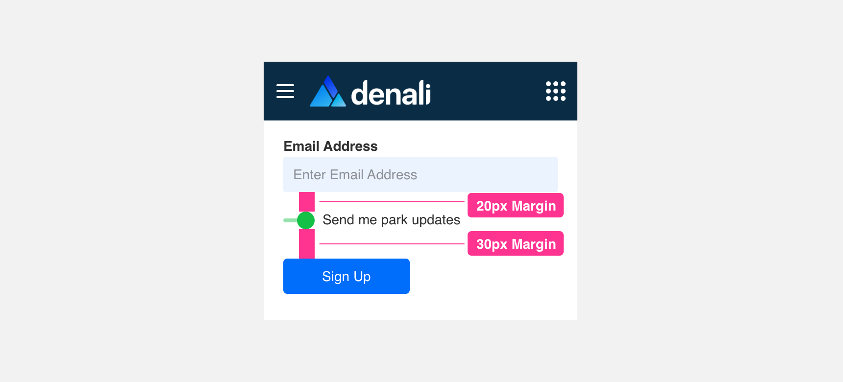
Margin Always maintain a minimum 20 pixel margin between Switch or components so that they do not become lost.
Placement
General usage
Radios are very flexible components that can be placed anywhere you need to provide a user with an on and off option if used correctly.
use Switches to provide multiple on and off options for a set of items.
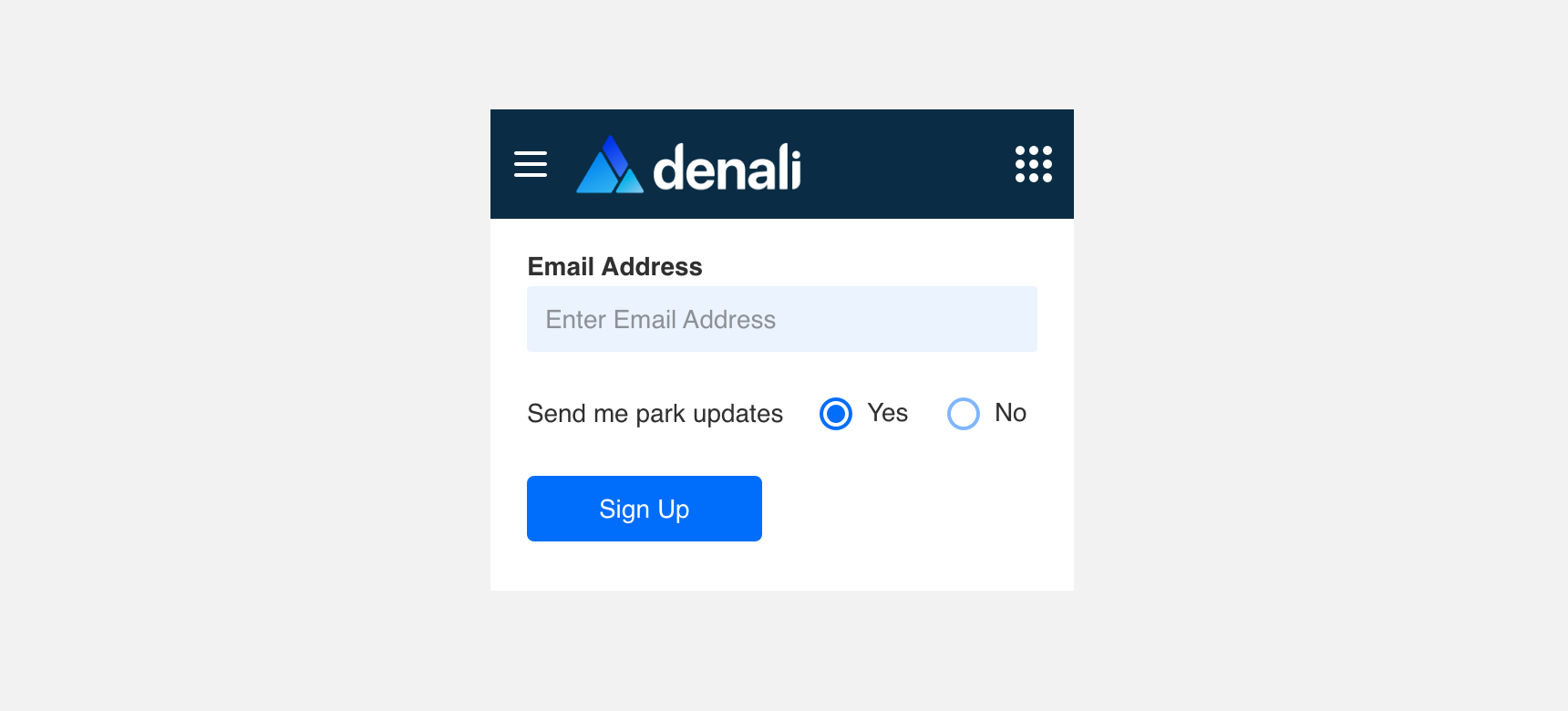
use Radios to provide on and off functionality for a set of items.
Margin
Always maintain a minimum 20 pixel margin between Switch or components so that they do not become lost.
Themeing
Denali’s components are completely themeable. This allows you to use our framework and adapt the visual style of Denali’s components to match your prodcut’s unique visual brand. Check out our guide to themeing with Denali to find out more.
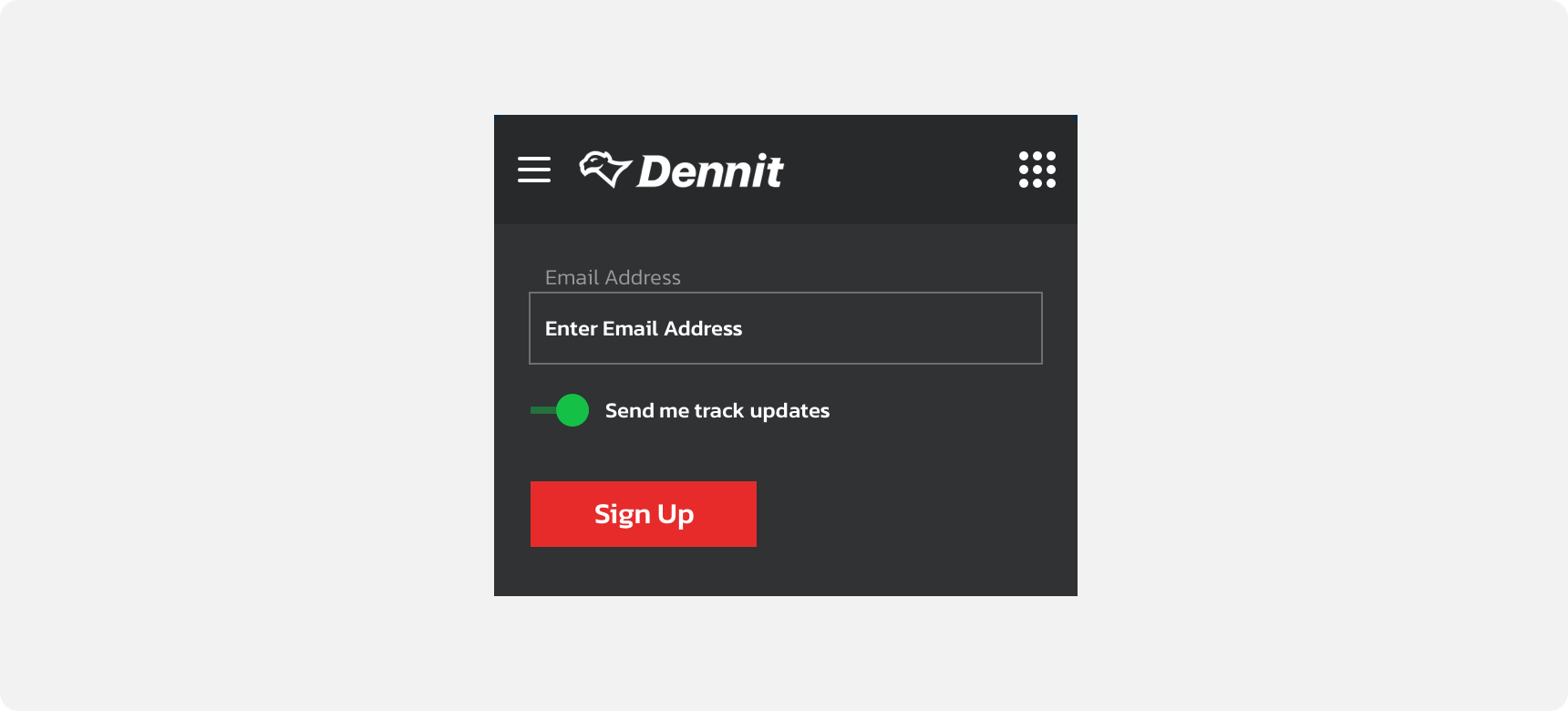
Dennit Racing Theme
For all variables visit the CSS documentation page for switch.