Box
Boxes are used to group related information, images, charts, or actions.
Developer Docs
Foundation
Boxes are defined simply by a container. They are a very flexible component in that they can be filled with a variety of content.
Container
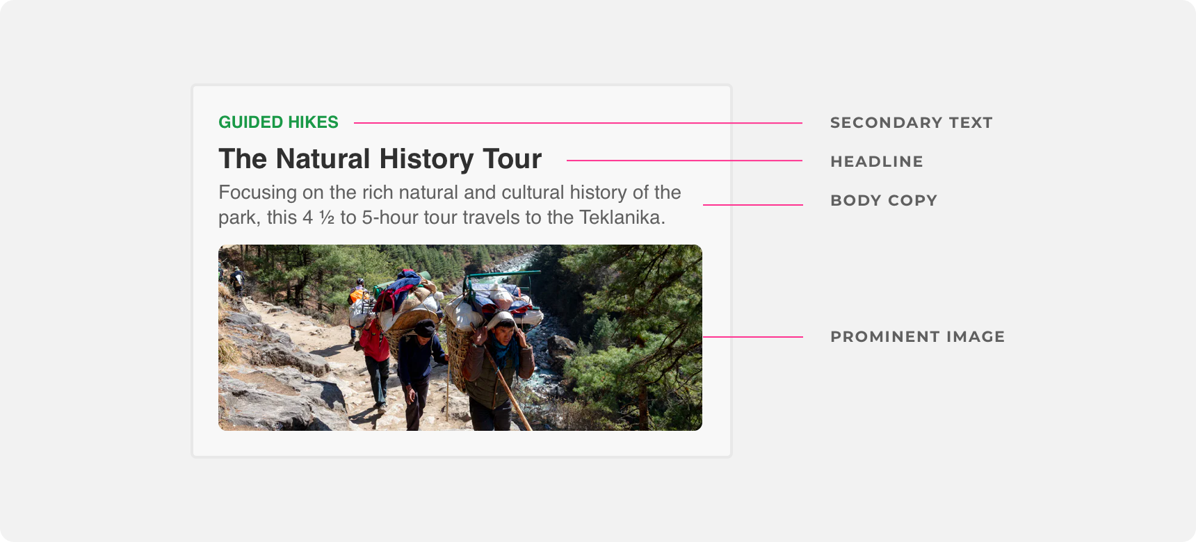
The only element required to make a box is a container with clearly distinguishable and consistent bounds and padding.
use a box to group related content together in a way that is visually consistent and distinguishable.
apply inconsisent visual styling to boxes because it makes it difficult to distinguish groups of related content.
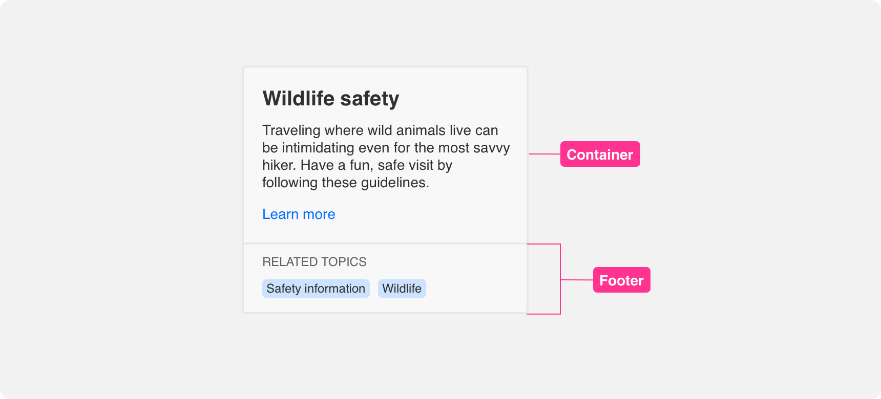
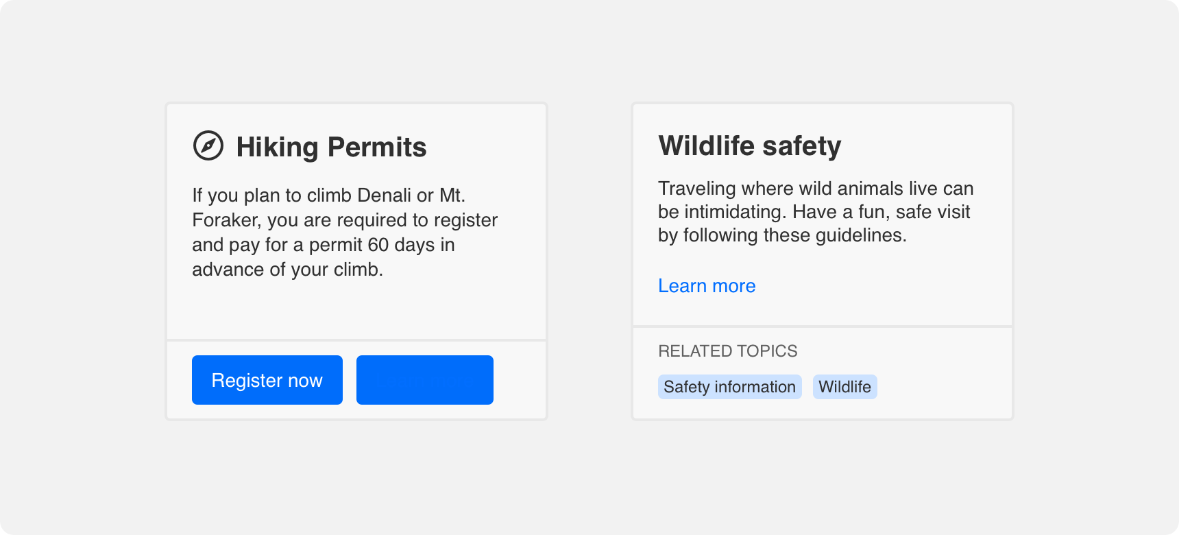
Footer
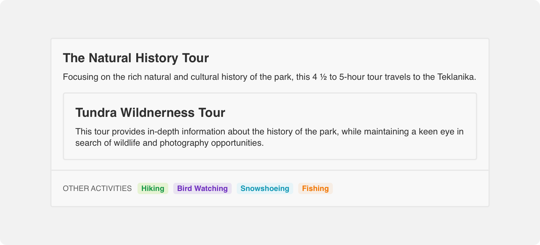
A footer can be added to a box to create visual separation between content inside the box. A footer is indicated by a divider in the lower half of the box. Content placed within the footer should be related to the rest of the content in the box. Examples of footer content includes buttons and links that allow a user to take action on the card’s content or secondary information that supports the main box content.
Padding
Content within a box should have adequate padding around it to support visual hierarchy and balance. We recommend providing even padding along the top, bottom, right, and left of content within a box. This does not apply to images that span the full width of the box and are masked by the box’s edges.
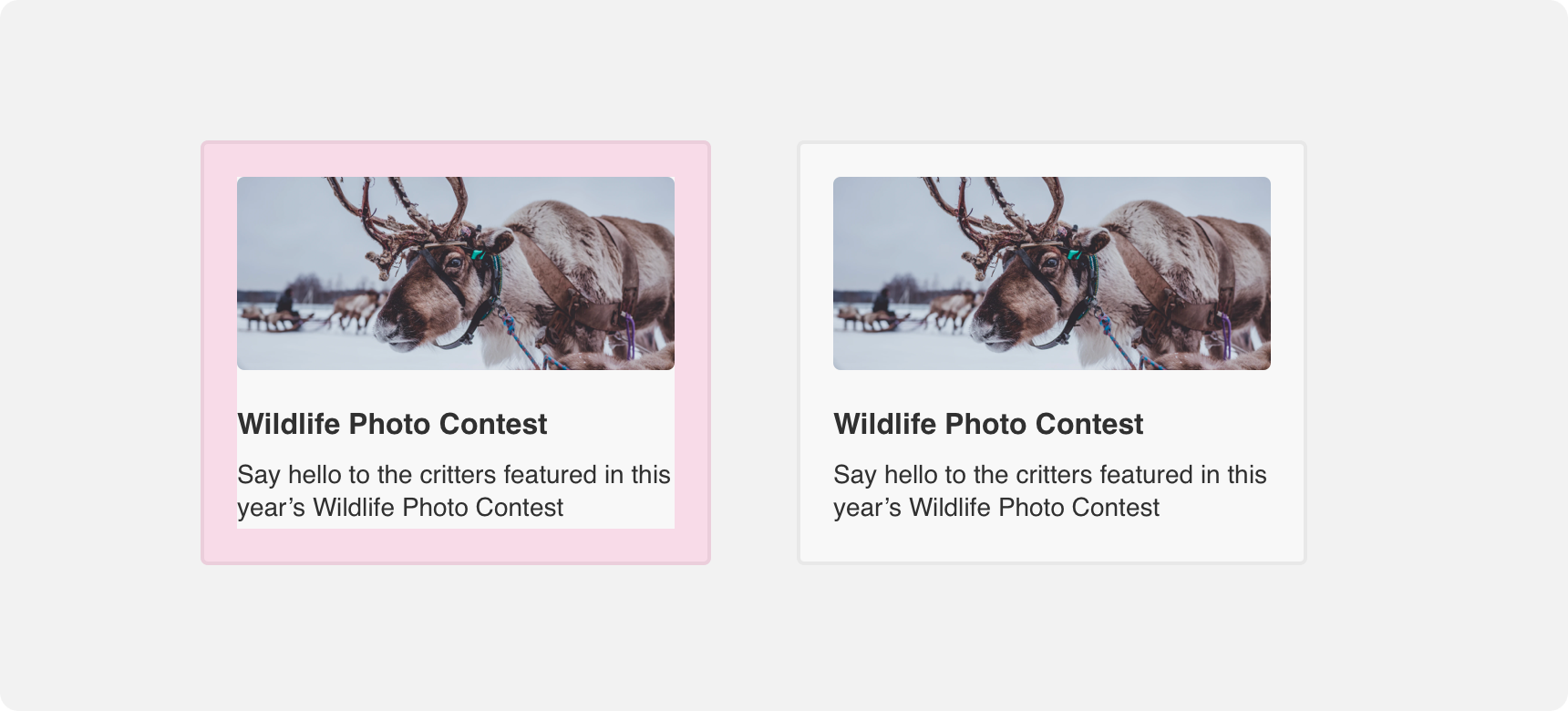
The image and text within this box have even padding on all sides.
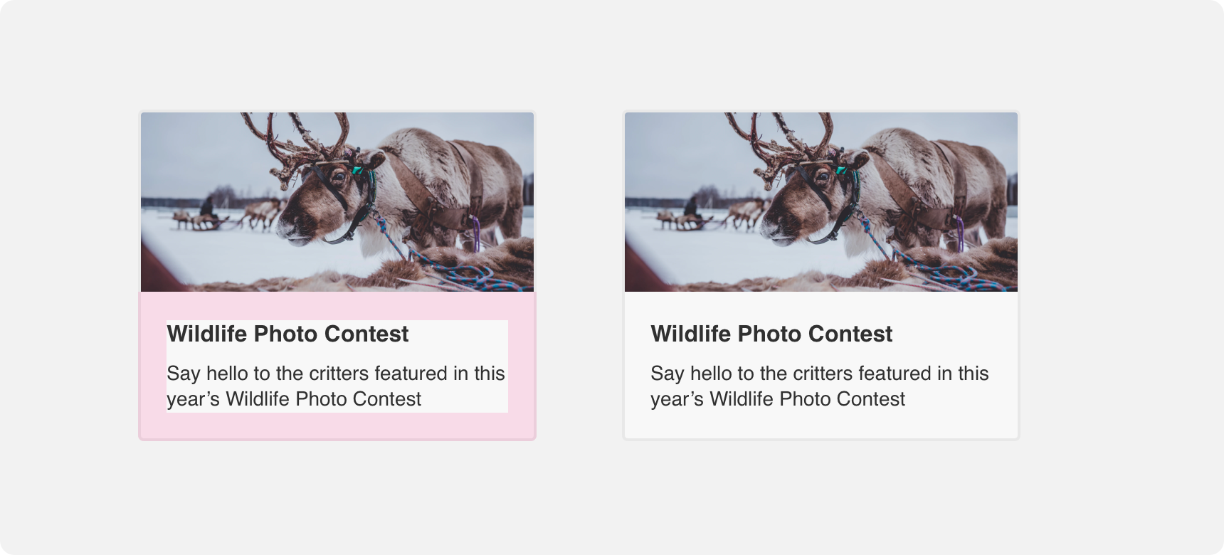
The image spans the full width of the box and is not surrounded by padding on the top,left, or right. The bottom of the image and the text are surrounded by even padding.
Flexible content
Boxes exist to group related content. For this reason, almost anything can justifiably be grouped within a box. However, it is important to apply rules of hierarchy when positioning content inside a box so that a user is able to quickly scan and understand the content. Examples of box content includes related images, body text, buttons, charts, icons, titles, subtitles, footer, menus, and UI controls.
The text within this box has even padding on all sides. The image spans the full width of the box and is not surrounded by padding.
Placement
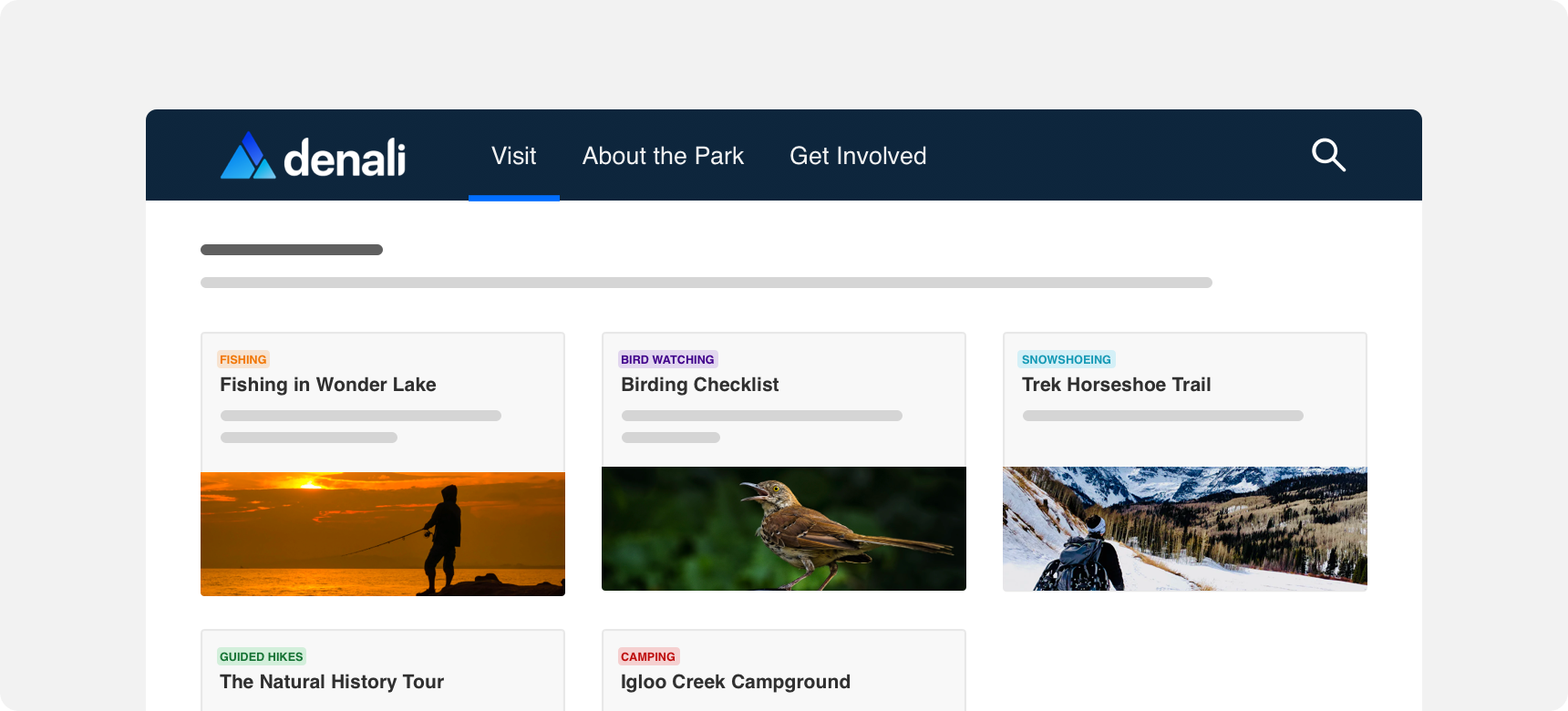
Boxes can be used almost everywhere and there is no limit to how many can appear on a page. Dashboards are a common example of a prodcut that is comprised entirely of boxes.
General usage
As demonstrated, boxes are very flexible components. This is true not only of what they can contain but also where they can be placed within a UI. Boxes can exist almost anywhere in a UI where you need to group related information.
A box can be used to group related information anywhere on the screen. Using boxes in this way allows you to give prominence to content that might otherwise get lost on the screen.
Hierarchy
No matter where you place a box, always ensure you do so in a way that supports visual hierarchy. This is true of the placement of the box itself but also of the content within the box.
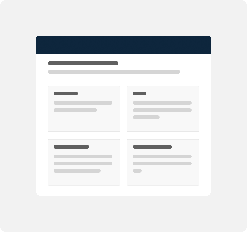
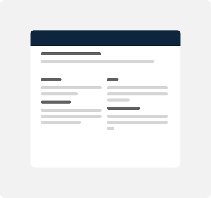
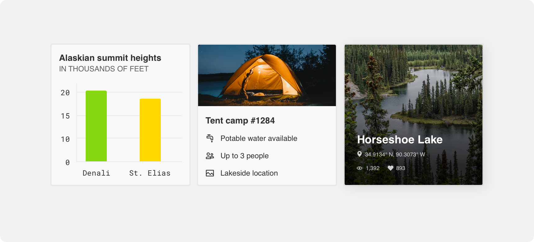
Clearly establish the purpose of the card with title text or prominent imagery. Place the most relevant content within the upper half of the box and secondary information in the lower half or within a footer.
The elements in this box are easy to parse because they are arranged in a way that supports visual hierarchy.
place a box within a box as this can create a confusing visual hierarchy.
Margins
Always provide adequate margins around a box to support visual hierarchy and balance. This applies to boxes placed side by side with each other as well. We recommend a minimum 20 pixel margin between boxes and other elements, however this can be adjusted based on page density.
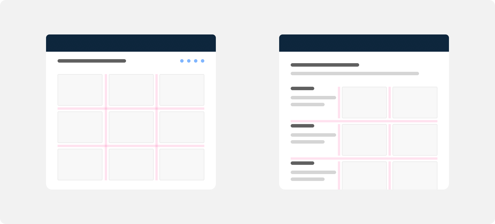
Even and adequate margins are provided between boxes and other boxes as well as boxes and all other elements.
Themeing
Denali’s components are completely themeable. This allows you to use our framework and adapt the visual style of Denali’s components to match your prodcut’s unique visual brand. Check out our guide to themeing with Denali to find out more.
For all variables visit the CSS documentation page for boxes.
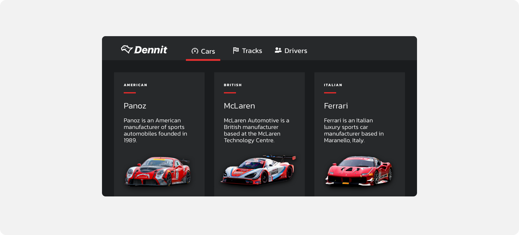
Dennit Racing Theme
Dennit Racing uses a customized Denali theme that aligns visually with their brand. Dennit’s boxes feature custom type, background, border radius, and border color theming.