Loader
Loaders visually indicate to users that something is loading or processing on a page. Denali’s loader does not indicate a specific wait time. It only indicates that a process is taking place for an undetermined amount of time.
Developer Docs
Foundation
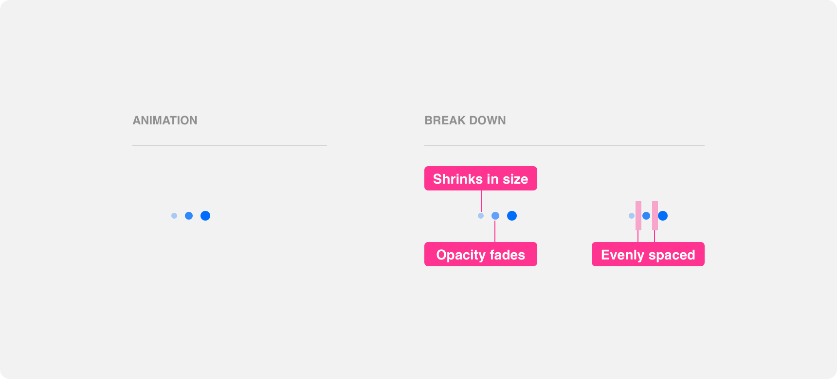
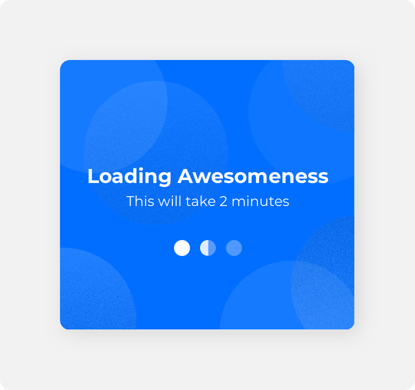
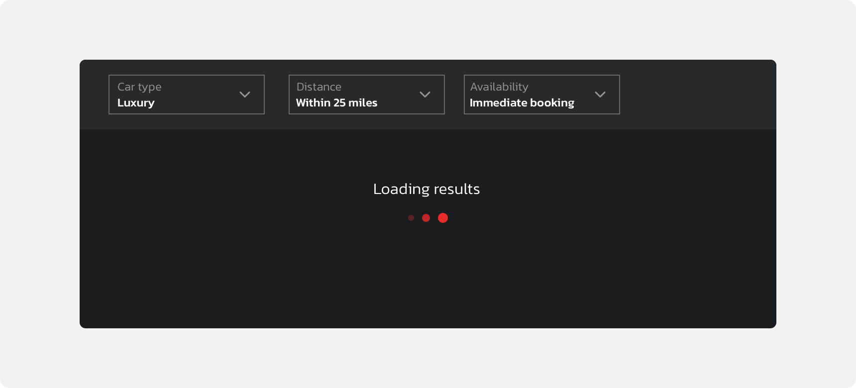
Denali’s loader uses three inline circles that shrink in size and fade from left to right to indicate progression.
Appearance
Loaders use three identical circles evenly spaced out in a line to indicate progression. Keeping the circles uniform in size, color, and proximity helps convey the idea that they are a single unit conveying the passage of time.
use consistent timing, color, size, and padding across the three dots because it makes it clear that the loader is a single unit.
use inconsistent timing, colors, sizes, or padding across the three dots because it makes it difficult to perceive the loader as a cohesive unit.
Animation
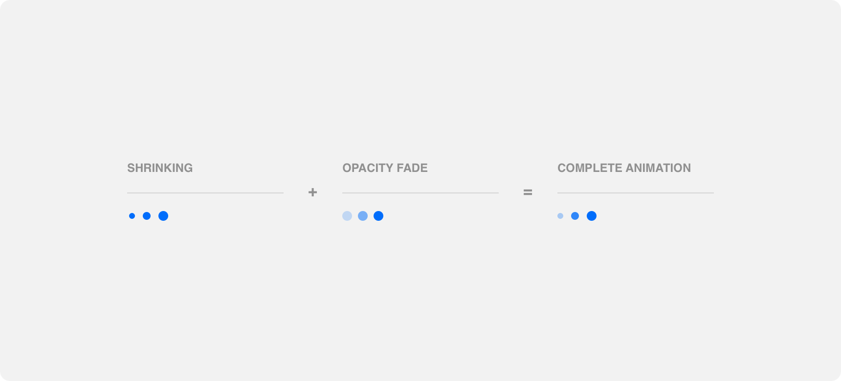
Animation is the key to indicating progression with loaders. Denali’s loaders use scale and opacity animations simultaneously to indicate progression. Each circle shrinks in size as it’s color fades from a solid fill to an increasingly lower opacity. As one circle shrinks and fades, the animation begins on the next circle until all three have disappeared. This results in a “domino effect” in which each circle is animated to disappear from left to right until the animation resets and begins again.
Loader animation takes about two seconds to complete. This timing, along with the scale and opacity animations, are designed to indicate a non-specific load time. Timing and animations should not be modified in an attempt to indicate a specific load time because the design of the three dot loader is not set up to properly indicate specific load times.

use a loader’s built in animations and timing to indicate that something is loading for an unspecified amount of time.
alter loader animations or slow down timing to indicate a longer load time or to match “real-time” load times. Doing so may cause the animation to become so slow that the impression of loading becomes lost.
Placement
Loaders should be placed in proximity to the process they represent in order to clearly establish the relationship between the loader and its process.
General usage
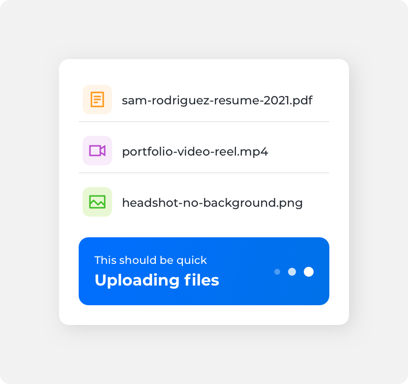
Loaders can represent a wide range of processes. Always place the loader in close proximity to the process it represents. This can be achieved by placing the loader adjacent to the process, replacing the process with the loader while the process is running, or using an overlay to place the loader on top of the process.
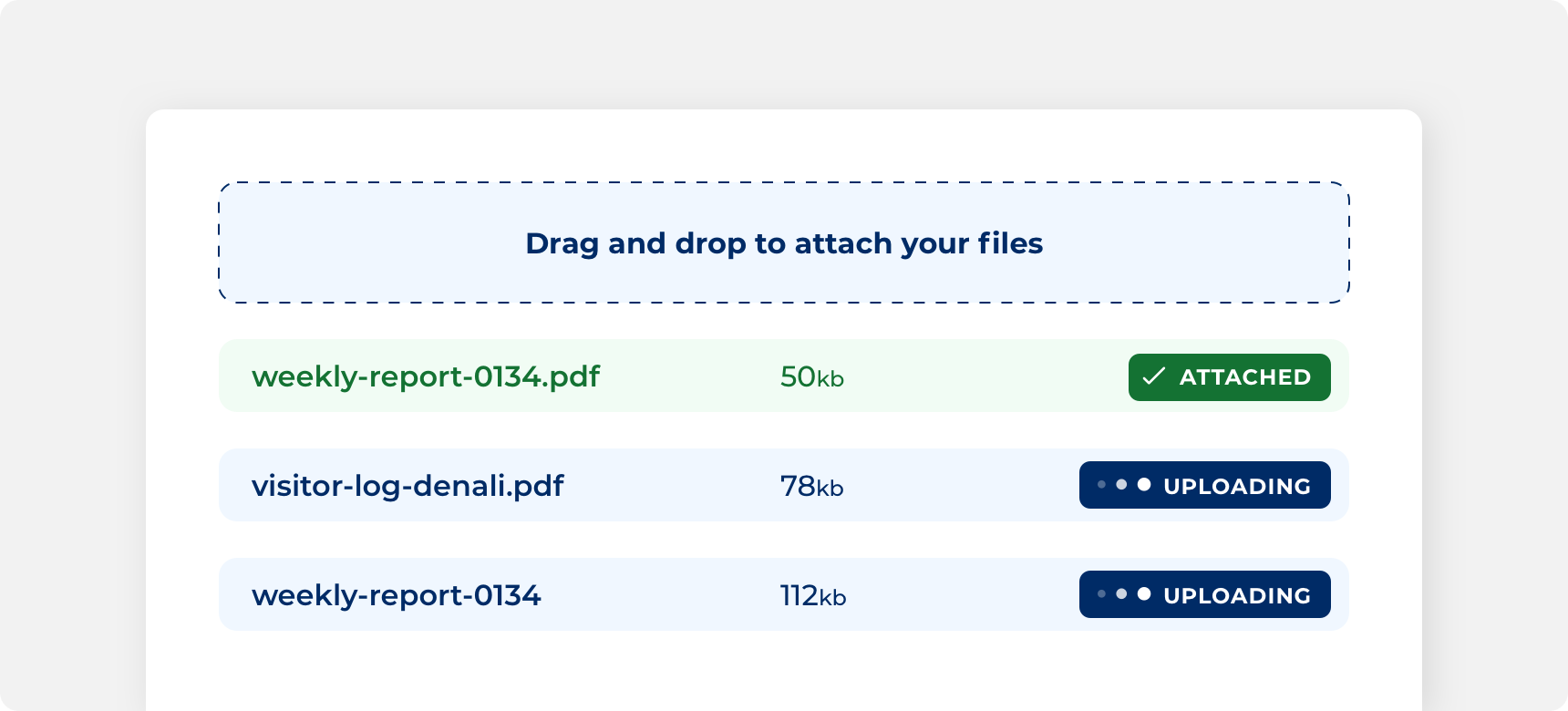
Placing the loader adjacent to the “uploading” text conveys to the user that the loader represents the uploading process.
Placing the loader within an overlay conveys to the user that all content contained within the overlay is processing.
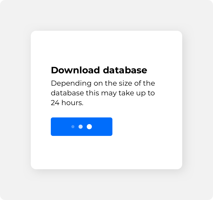
Replacing button text with a loader and bringing back the text once the process has concluded conveys to the user that the process is directly related to selecting that button.
Timing
Loaders do not represent a determinate amount of time. For that reason, loaders should only be used to represent processes that are relatively short to avoid confusion or incorrectly implying that the animation represents the actual processing time. If taking an action initiates a lengthy processing time consider using other components, such as inline alerts, to notify users of their wait time. That way, the user does not remain on the page waiting for the process to complete.
use other components to indicate lengthy wait times.
use loaders to indicate lengthy wait times.
Similarly, if a process happens instantly the user does not need to be shown a loader as it brings unnecessary attention to that process. Before adding a loader to content consider whether or not the user will benefit from seeing that feedback.
add a loader to provide feedback on a relatively short process.
add loaders to components that have an instant processing time such as page links.
If you need to indicate a determinate amount of time consider using our progress bar component
Button
Loaders can appear within a button after the button has been clicked. Using loaders inside buttons provides feedback to users to let them know that clicking on the button has initiated a process. Loaders can be placed alongside button text or they can replace the button’s text label entirely. Once the process has concluded, the loader should disappear from the button. Avoid adding loaders to buttons whose actions don’t require progression feedback or representing long load times within buttons as this could create confusion.

Themeing
Denali’s components are completely themeable. This allows you to use our framework and adapt the visual style of Denali’s components to match your prodcut’s unique visual brand. Check out our guide to themeing with Denali to find out more.
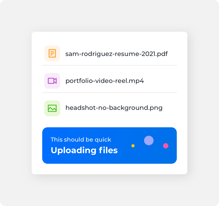
Dennit Racing Theme
Dennit Racing uses a customized Denali theme that aligns visually with their brand. Dennit’s loaders feature a custom color.
For all variables visit the CSS documentation page for loader.