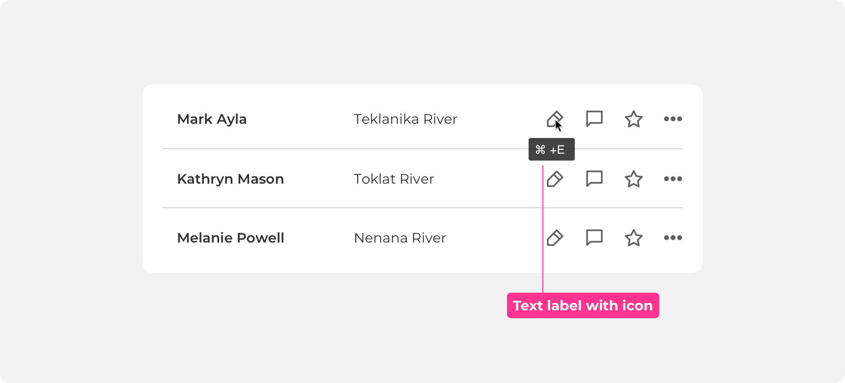
Tooltip
Tooltips provide short, descriptive information when a user hovers over an element.
Developer Docs
Foundation
Tooltips are composed of a container and a text label.
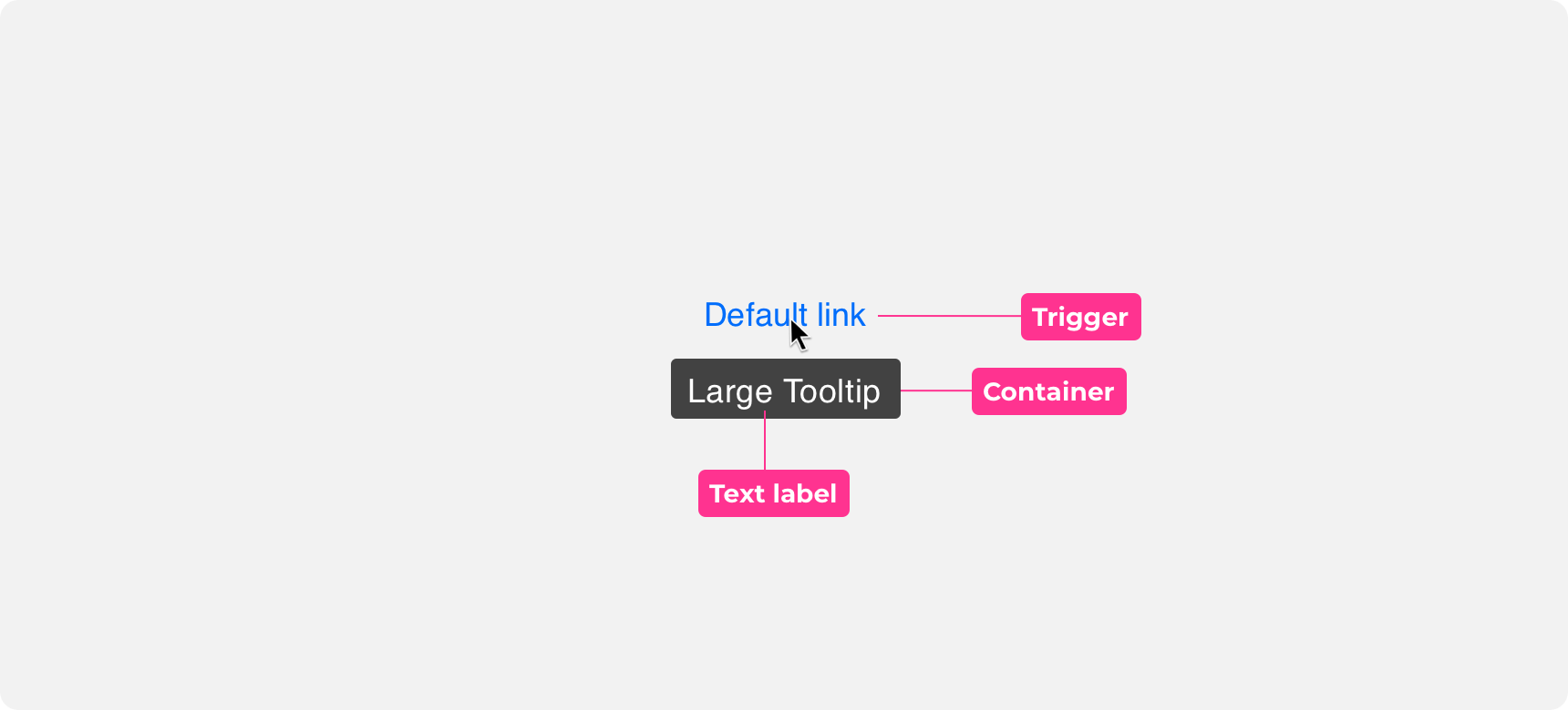
Trigger
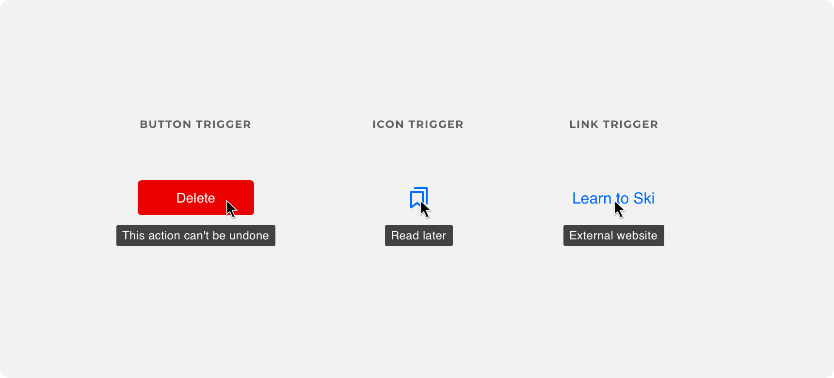
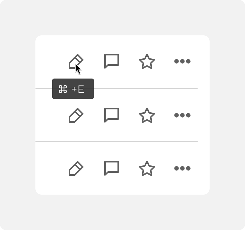
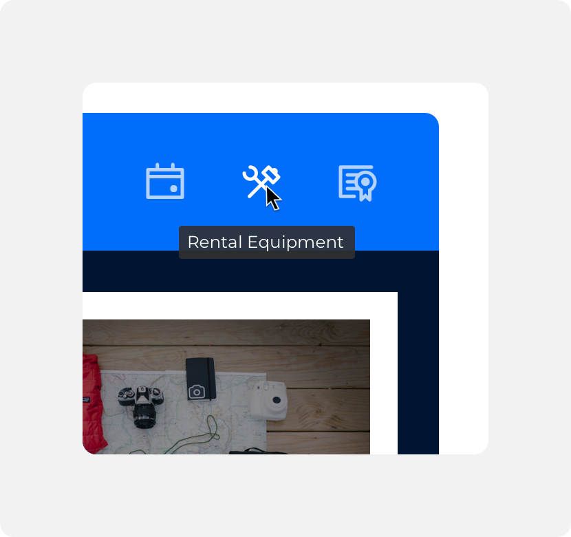
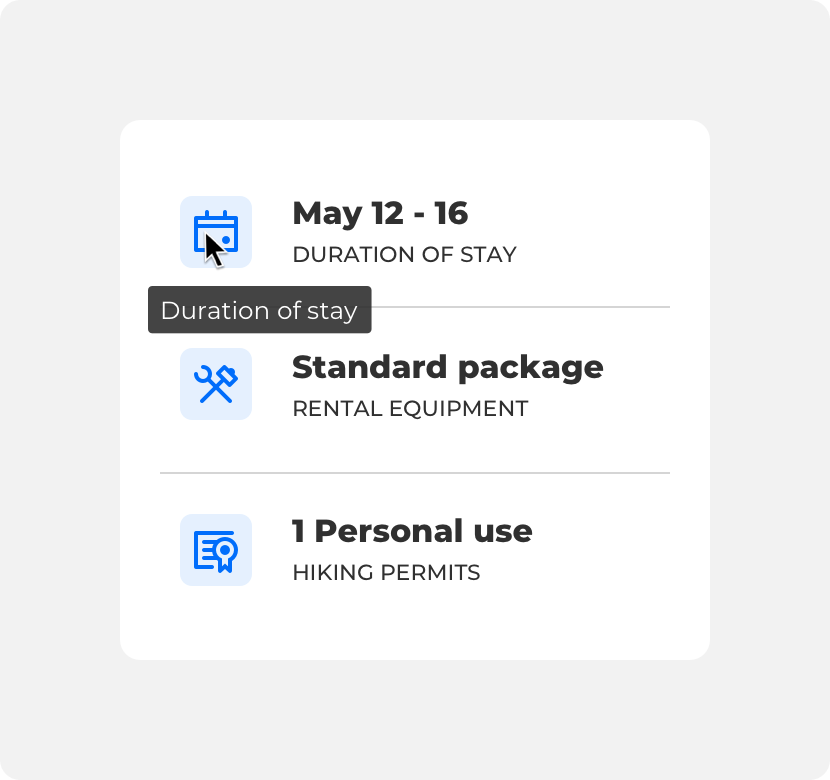
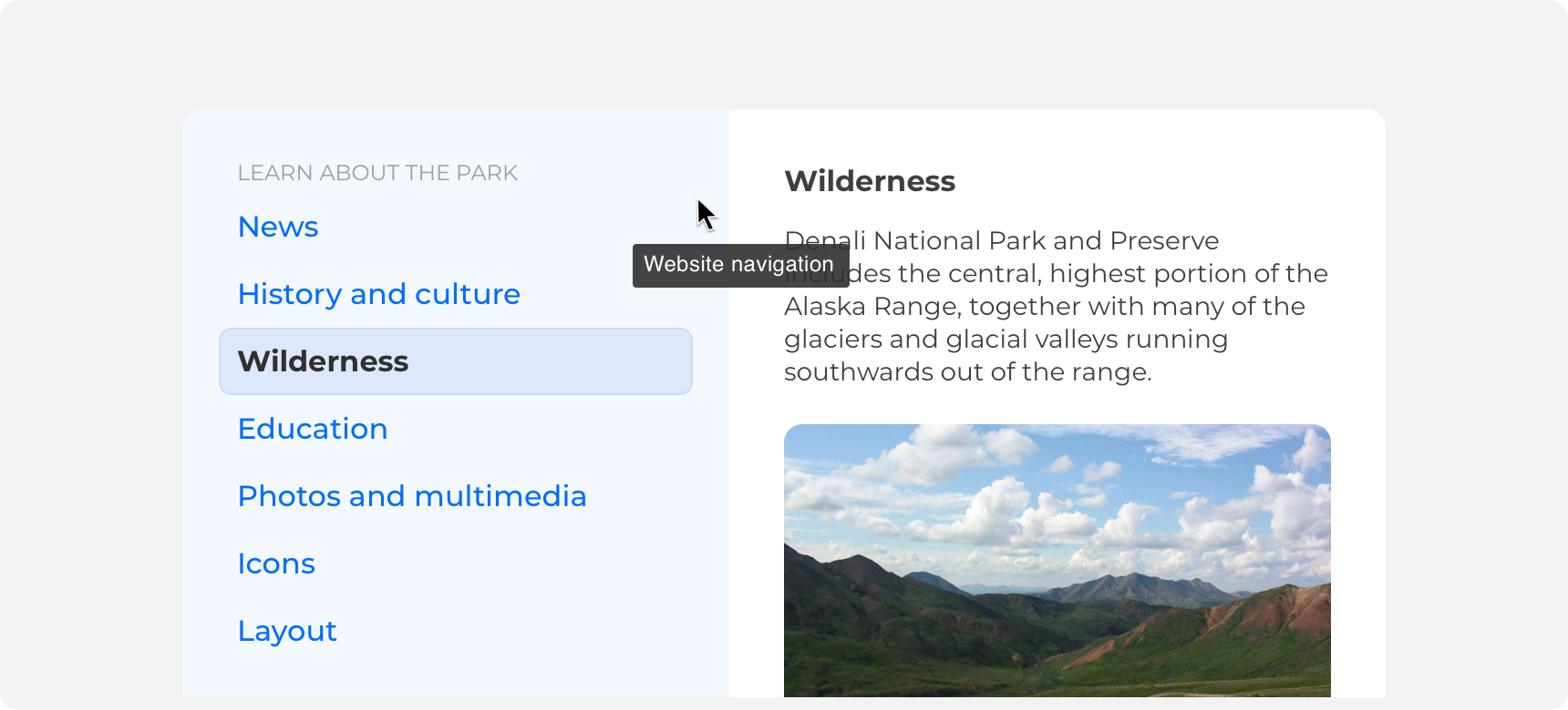
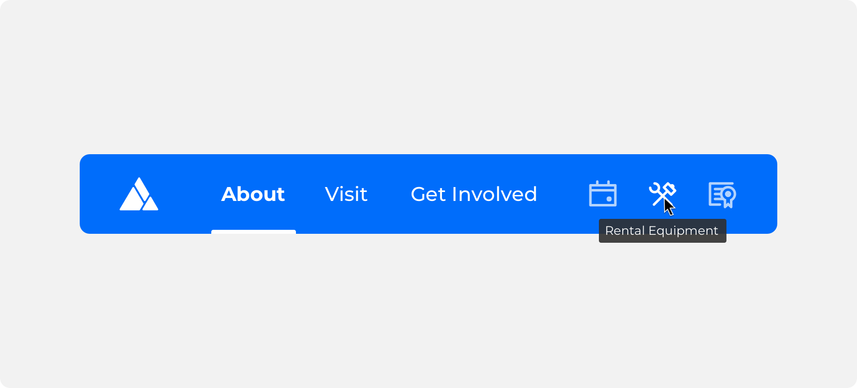
Tooltips appear when a user hovers over a trigger. A trigger can be any element you assign a tooltip to. Common tooltip triggers include icons and links. Only add a tooltip to an element if doing so increases the user’s comprehension.
Container
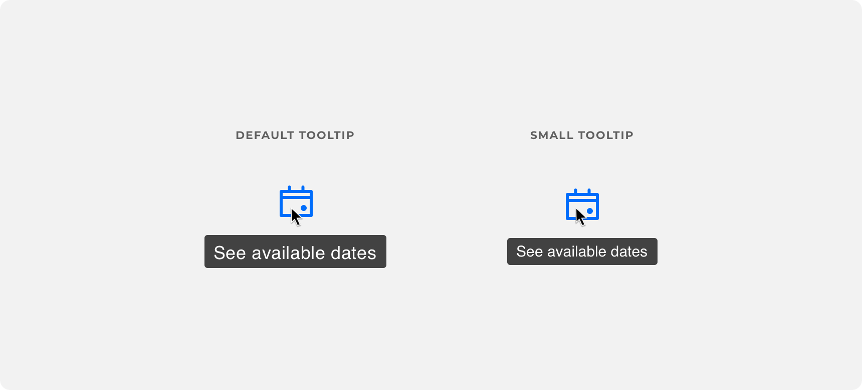
Tooltip containers are compact in size, have rounded corners, and a semi transparent fill. This allows them to draw attention to themselves without being overly distracting. Denali offers default and small tooltip container sizing.
keep tooltips compact in size and use a fill color that visually differentiates the tooltip from the rest of the UI.
size up tooltips to the point that they become visually overwhelming or use a fill color that blends into the rest of the UI.
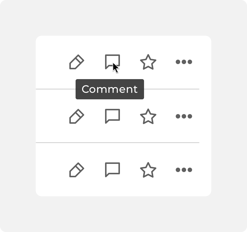
Text labels and icons
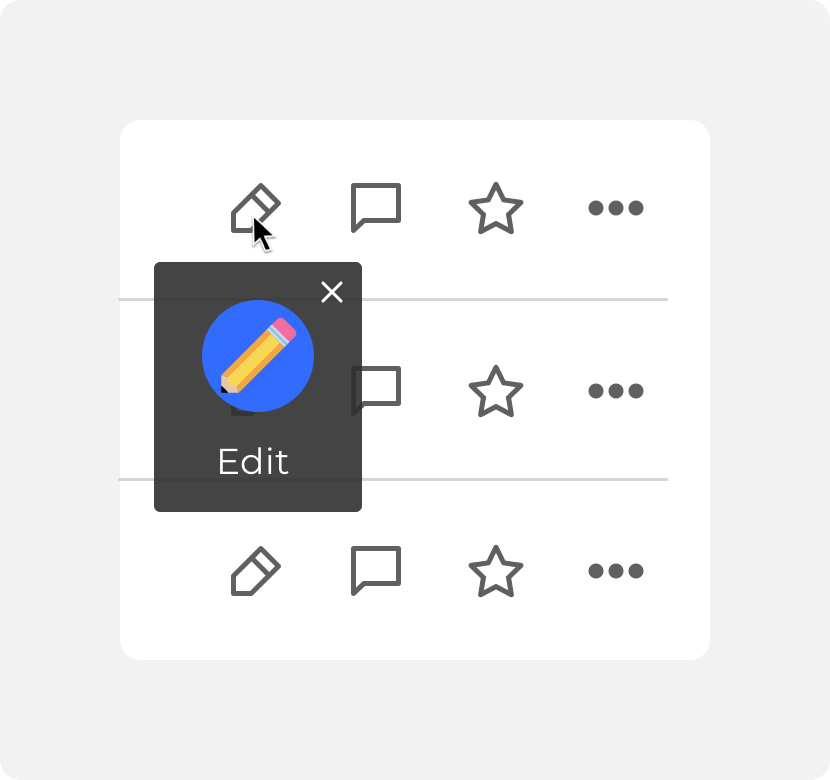
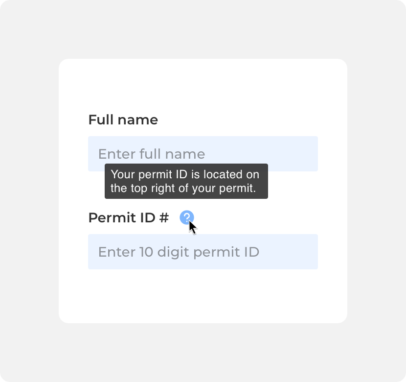
Within tooltips are text labels that describe the element the tooltip is attached to. The text color of text labels should contrast with the container fill so that they are legible. Text labels should be kept as short and concise as possible. If an element requires a lengthy description consider using another component to support that use case.
use concise descriptions within tooltips. Image at 200%.
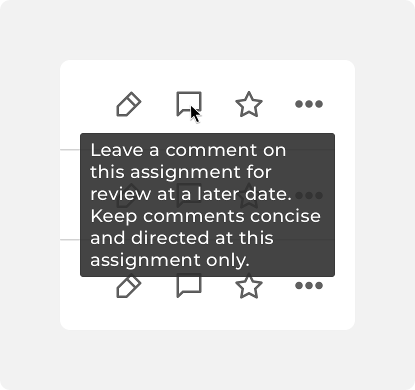
wordy or lengthy descriptions within tooltips. Image at 200%.
Icons can be added to tooltips if doing so provides greater context to the text label. Avoid using large or detailed imagery within tooltips as well as “close” or action based icons that imply a user can interact with the tooltip.
use concise descriptions within tooltips. Image at 200%.
wordy or lengthy descriptions within tooltips. Image at 200%.
Placement
Where it makes sense to do, tooltips can be applied to almost any element.
General usage
A tooltip can be added to any element if adding the tooltip increases the user’s comprehension. It is common to see tooltips added to icons, fields, and links. However it is important to use reason when adding tooltips to elements. Avoid adding tooltips to elements that don’t need description or elements that are so large it would be difficult to understand what the tooltip is describing.
add tooltips to icons in order to increase user comprehension.
add tooltips that repeat information that is already clear to users.
add tooltips to large components that don’t need a description.
Positioning
Always keep tooltips in close proximity to the elements that trigger them. Tooltips can appear to the bottom, top, left, or right of their triggering elements. Always ensure that tooltip text is legible by positioning the tooltip so that it does not get cut off by another element on the screen or the viewport.
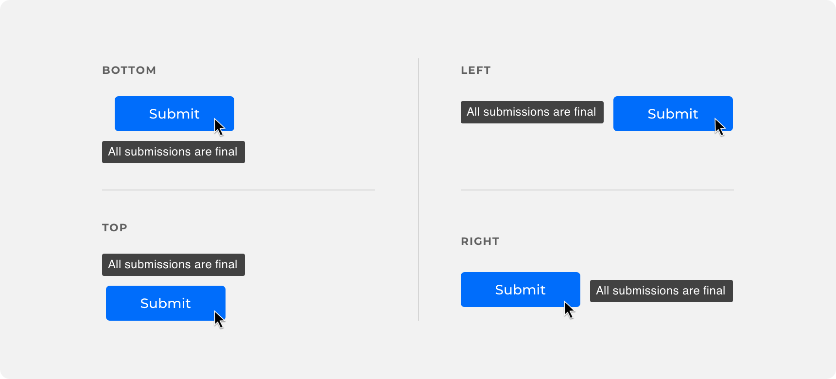
ensure your tooltip is positioned so that it is legible.
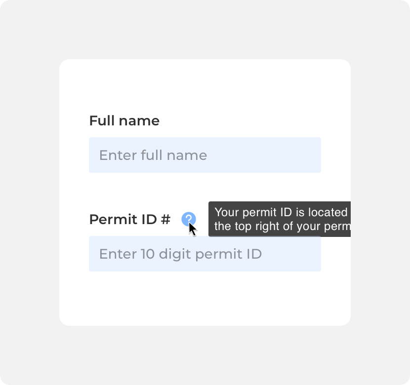
position the tooltip in a way that it gets cut off.
Timing
Tooltips appear and disappear on hover. The tooltip should remain visible until the user mouses away from the element that triggered the tooltip.
Themeing
Denali’s components are completely themeable. This allows you to use our framework and adapt the visual style of Denali’s components to match your prodcut’s unique visual brand. Check out our guide to themeing with Denali to find out more.
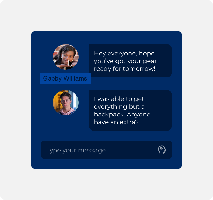
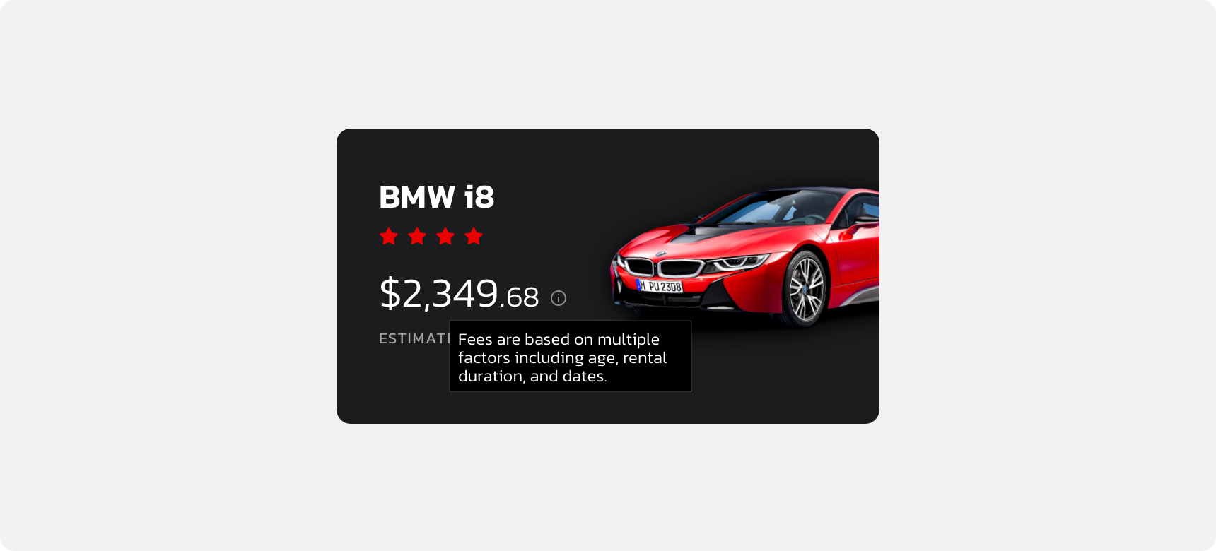
Dennit Racing Theme
Dennit Racing uses a customized Denali theme that aligns visually with their brand. Dennit’s tooltip features a custom container radius, fill, and type.
For all variables visit the CSS documentation page for tooltip.