Title
Titles are stylized headings that call out important information or data. They are most commonly seen within data dashboards.
Developer Docs
Foundation
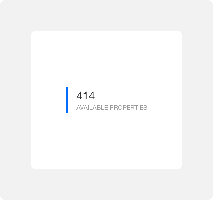
Titles are comprised of a title bar, headline, and caption.
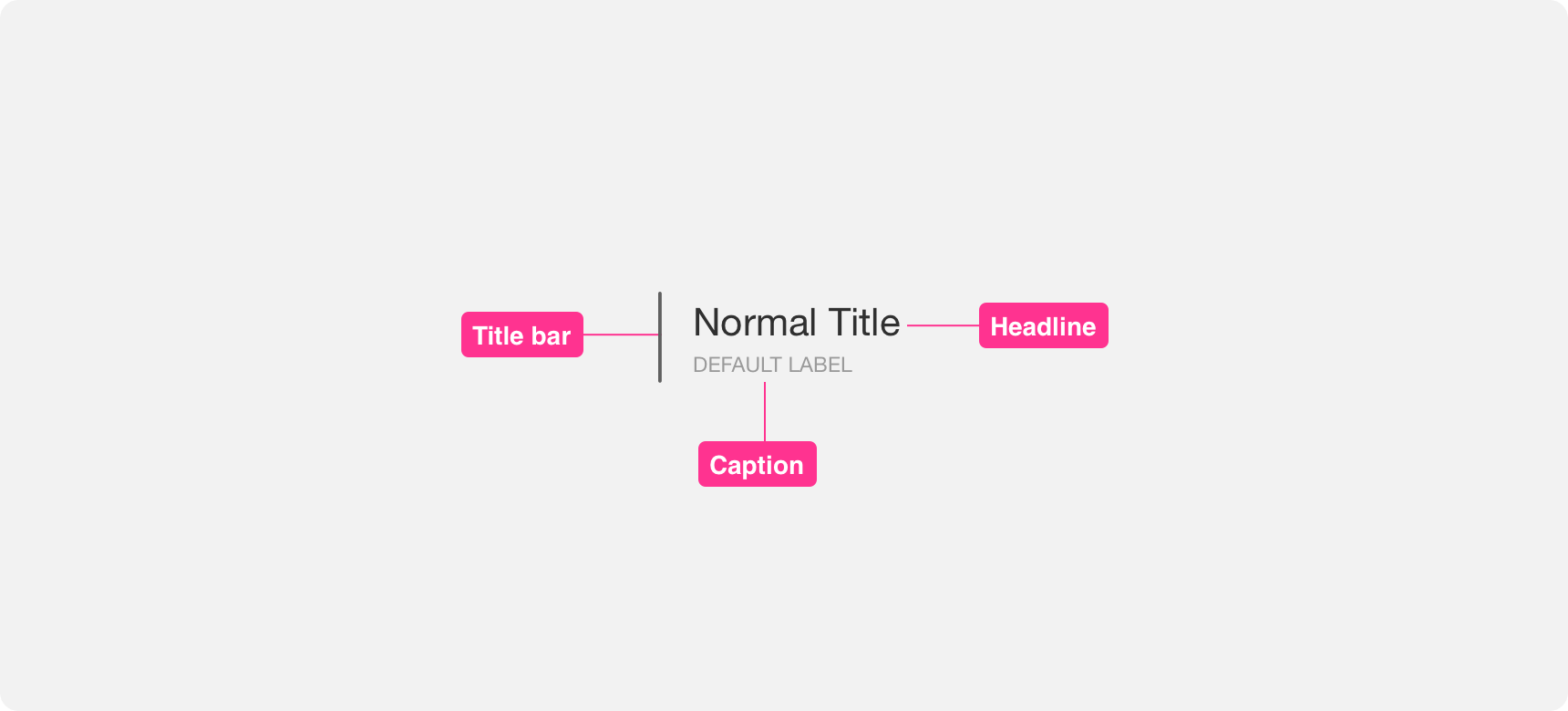
Title bar
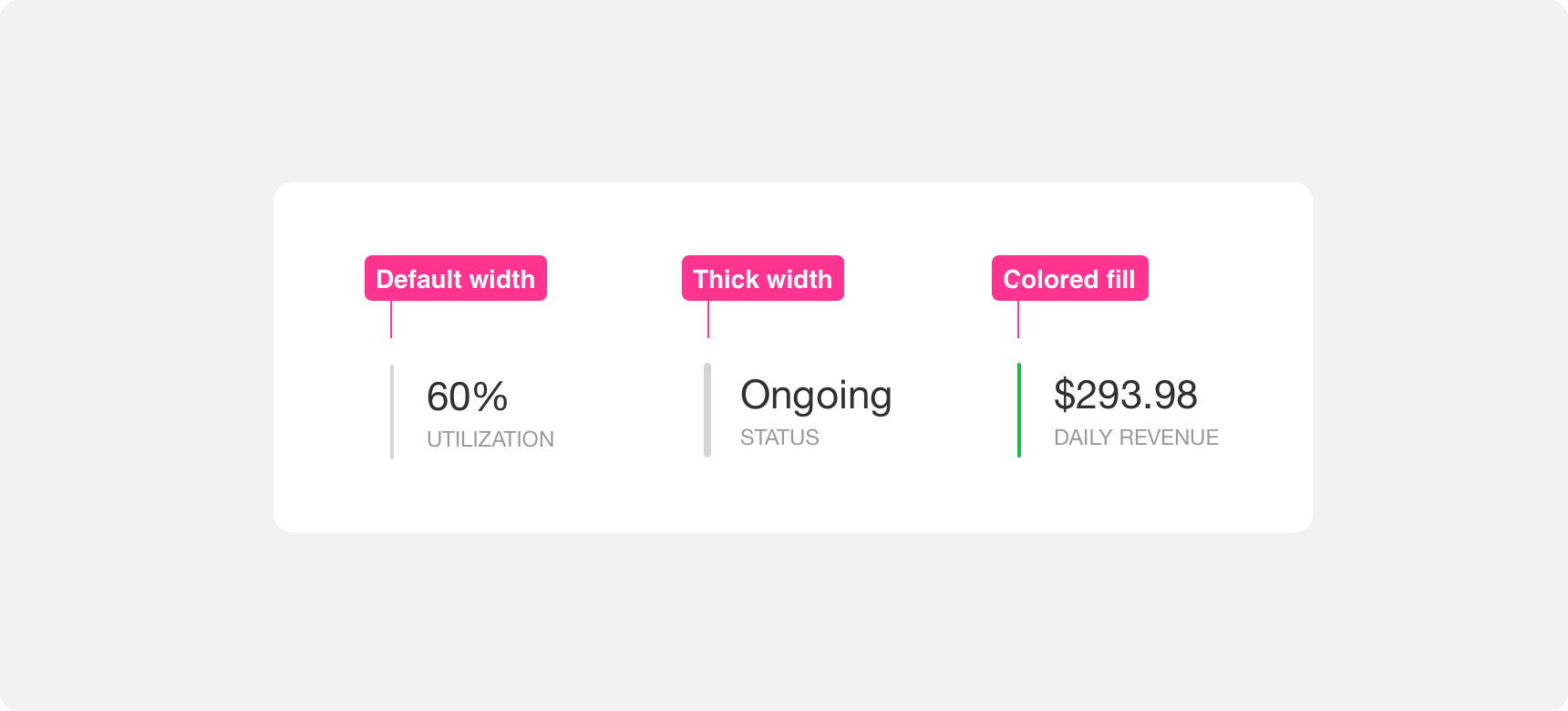
Title bars appear to the left of the title component. The width of the bar can vary between light or thick. Additionally the bar fill color can be customized to have either high or low visual prominence. By default the bar radius is rounded, but this can be customized if necessary.
Headline
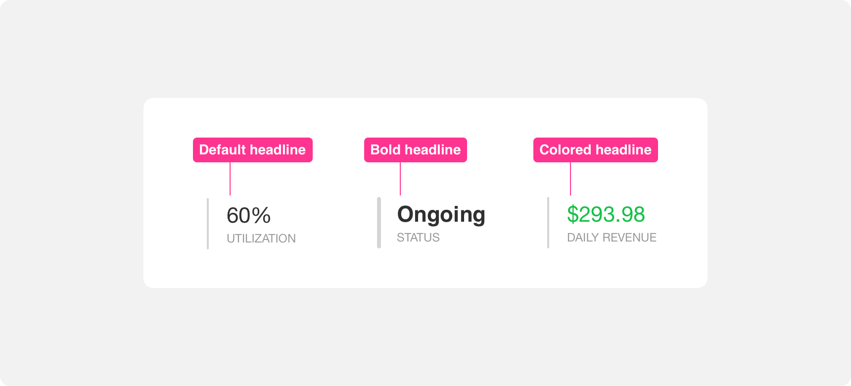
The headline is the larger text label within a title. If a caption is present the headline sits on top of the caption. The headline text label is larger in size than the caption text label. Headline font weight can be bolded and colored to provide greater visual emphasis. Headlines can be numbers or descriptive text. As with most text labels, it is important to keep titles as concise as possible.
Caption
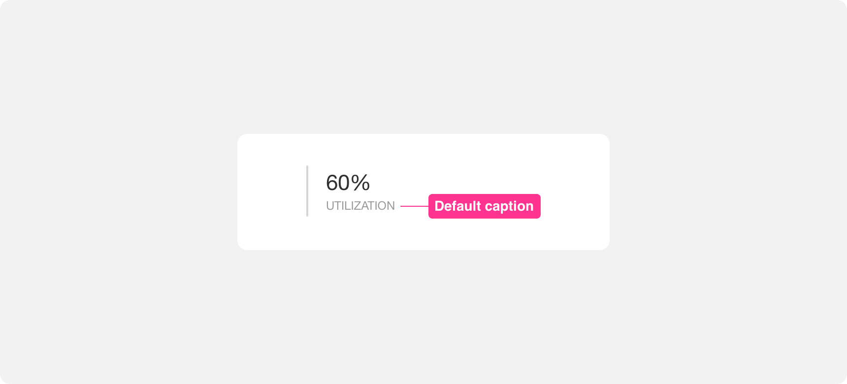
The caption is the smaller text label within a title. It sits underneath the title headline. Caption text labels are smaller in size than the headline text label. Generally captions are lighter in color than headlines in order to reduce their visual prominence. Captions should be kept concise.
use concise headlines and captions within titles.
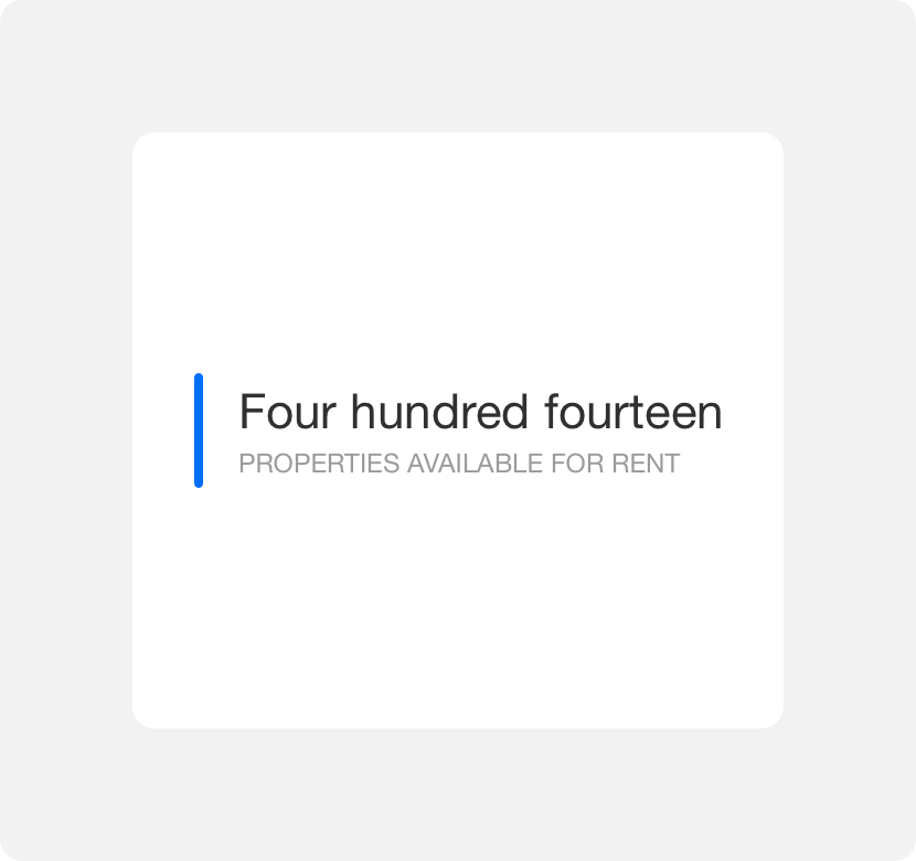
use wordy headlines or captions within titles.
Placement
So long as chips are kept in close proximity to the content they are supporting, the placement of chips around that content is very flexible. Keeping chips in close proximity to the content they support is important because it allows users to make the connection between the two.
General usage
Titles can be used anywhere you need to display small pieces of data. For this reason they are often seen in data dashboards. When used in dashboards, titles generally work best at the top of a screen. This positioning makes it easy for users to find the information quickly and easily. If pairing the title with another element or within a larger grouping of elements, always ensure enough negative space around the title so that it can be discovered easily.
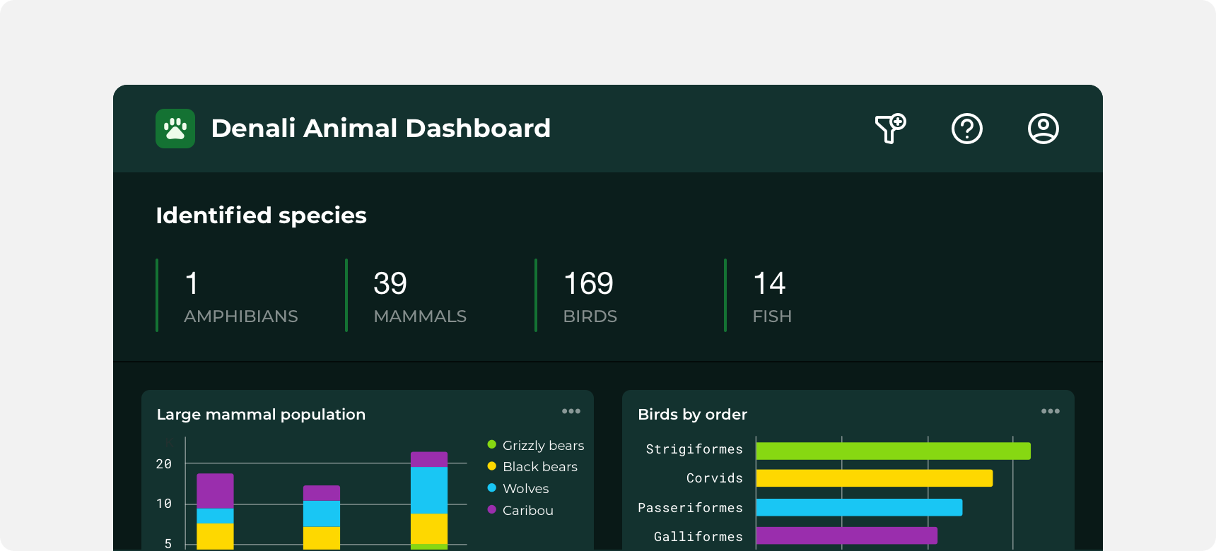
Titles at the top of a dashboard.
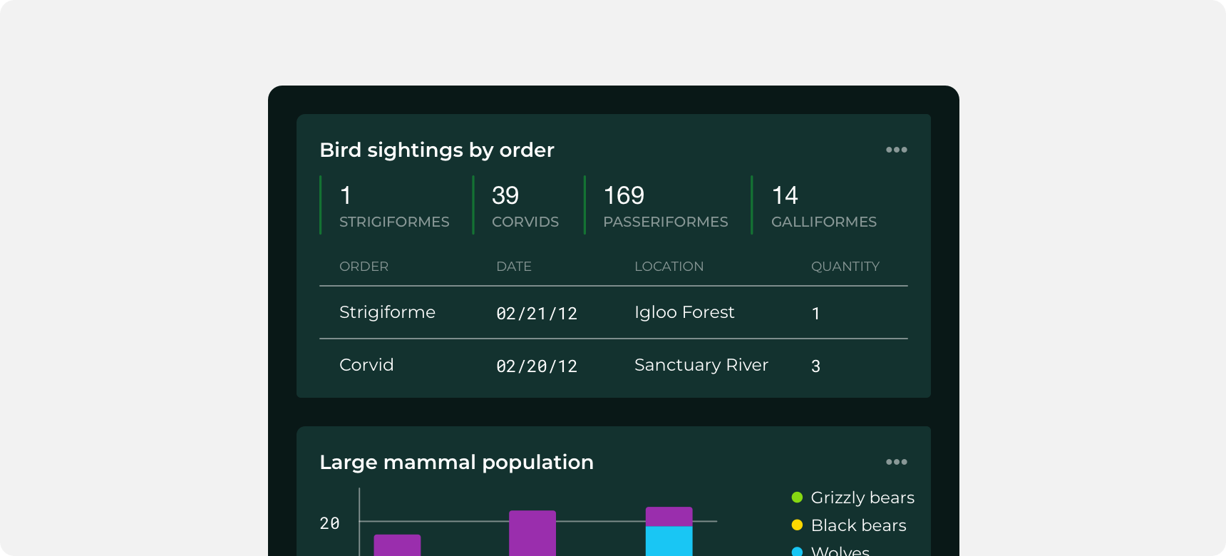
Titles within a widget.
Themeing
Denali’s components are completely themeable. This allows you to use our framework and adapt the visual style of Denali’s components to match your prodcut’s unique visual brand. Check out our guide to themeing with Denali to find out more.
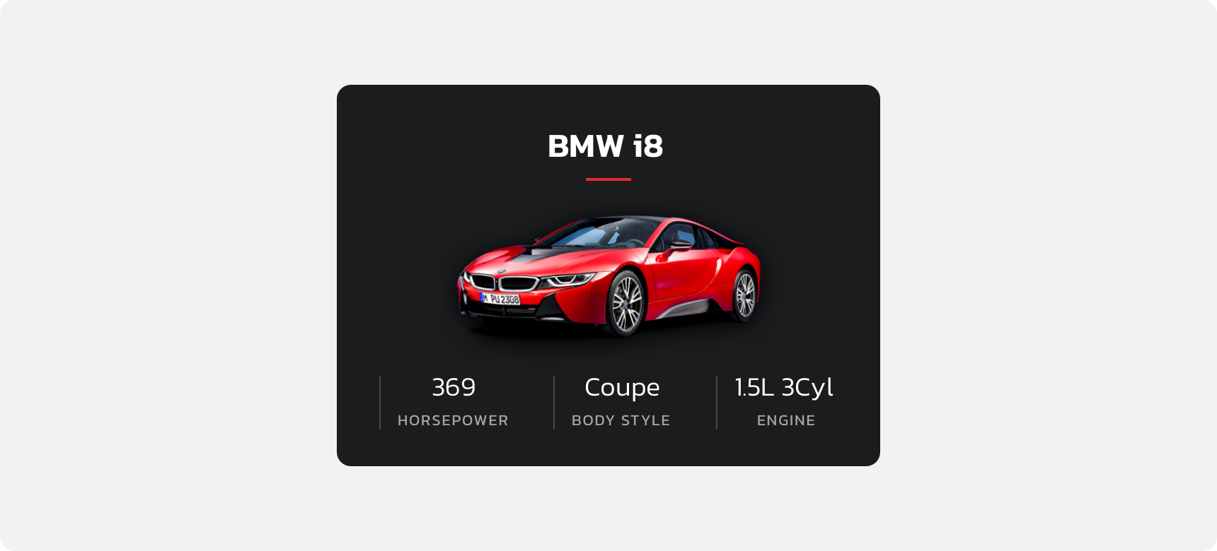
Dennit Racing Theme
Dennit Racing uses a customized Denali theme that aligns visually with their brand. Dennit’s titles feature a custom title bar as well as custom header and caption type.
For all variables visit the CSS documentation page for title.