Modals
Modals are used to present an important message or required task(s) to a user. Modals can be placed in front of a locked screen with a slight background or completely cover an existing page. Ideally all modal should contain a way for the user to return to the previous page, whether it be by a close icon or a close button.
Developer Docs
Foundation
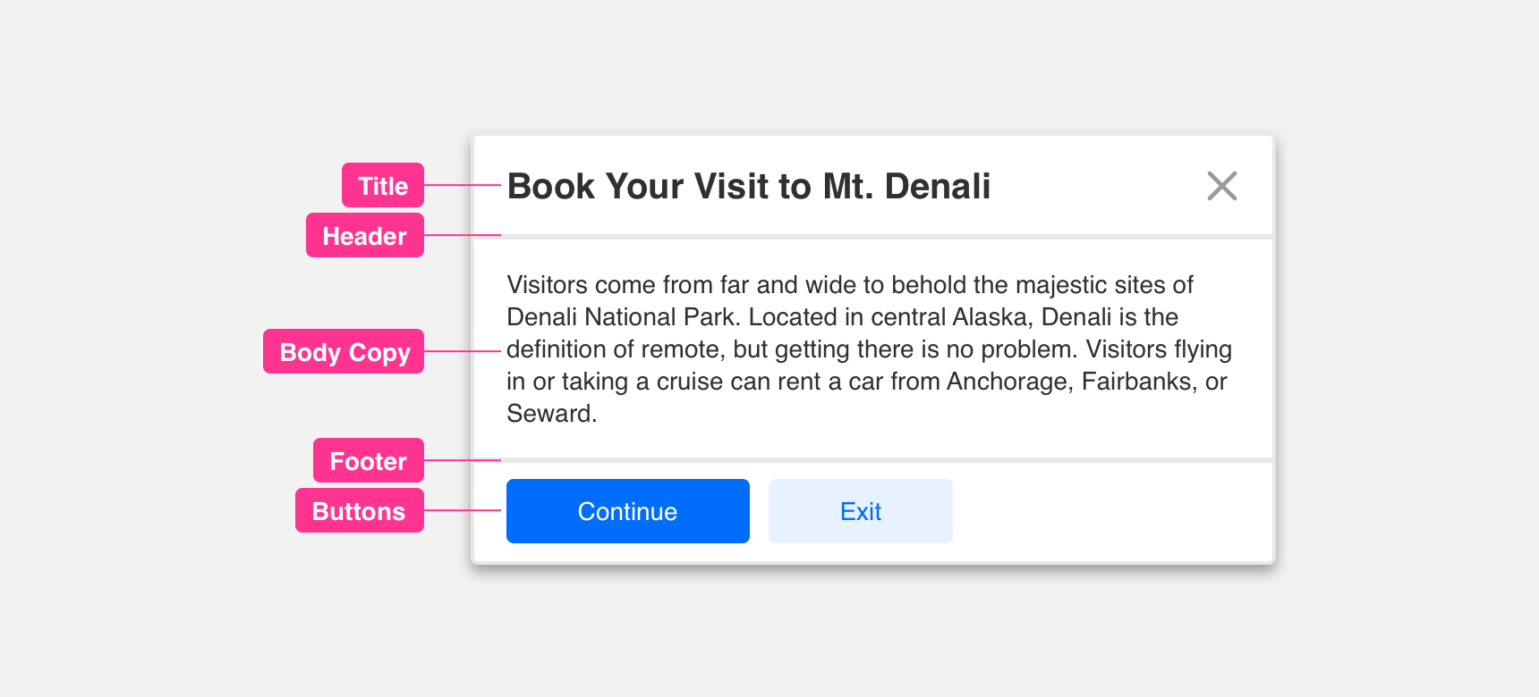
Modals are constructed within a background overlay (Scrim) and container. They are a very flexible component in that they can be filled with a variety of content. Typically you can find a combination of the following components: Title, Header, Footer, Body Copy and a Button.
Title
Titles within a modal should contain text that directly refers to the message or task(s) displayed below.
Body Copy
The body copy within a modal is utilized to further clear up a message or task(s) being presented.
Header
A header can be added to a modal to create visual separation between content inside the modal. A header is indicated by a divider in the top half of the container. Headers also contain an “X” icon which is used to allow the user and exit from the modal experience.
Footer
A footer can be added to a modal to create visual separation between content inside the modal. A footer is indicated by a divider in the lower half of the container.
Button
Buttons in a modal are used to either confirm or deny the message or task(s) being presented to the user.
Padding
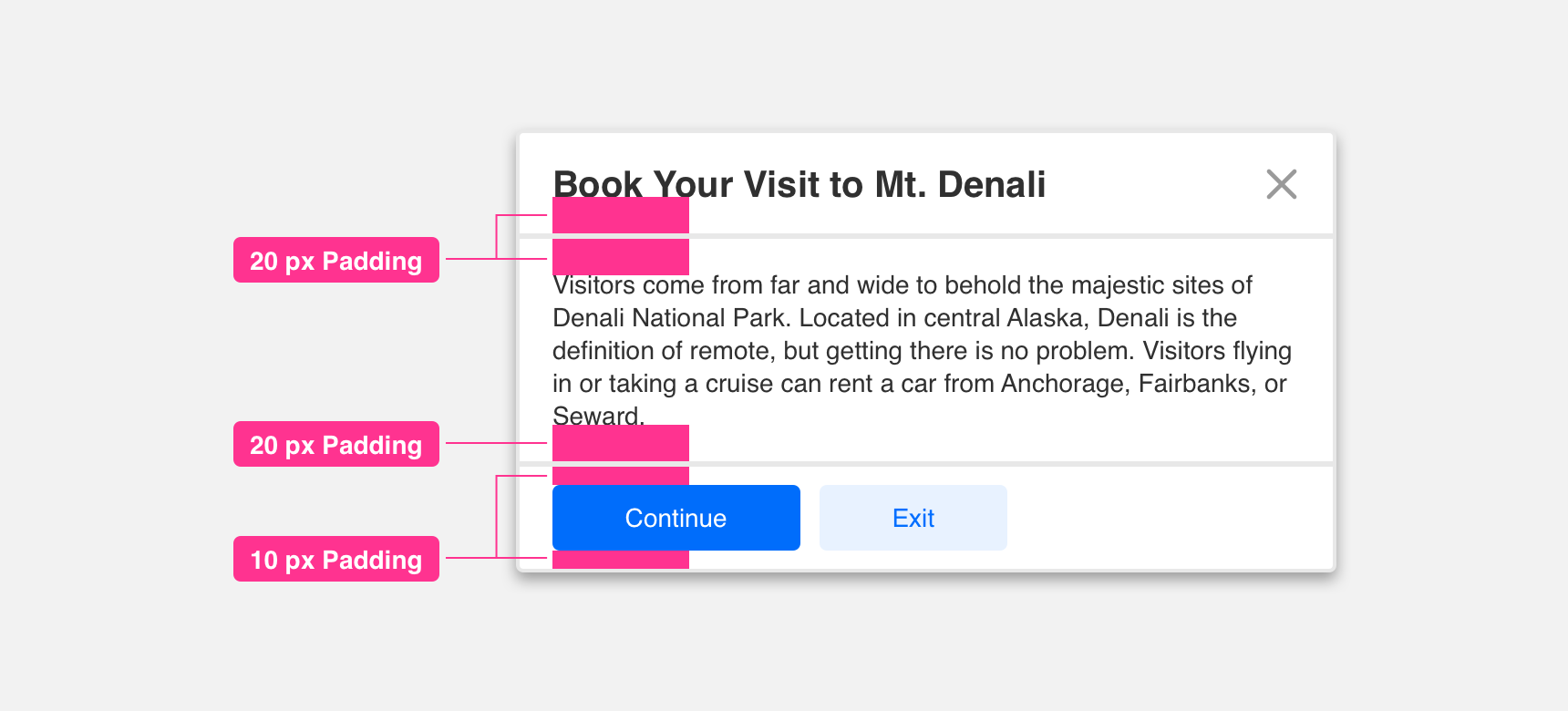
Components in a modal should have consistent padding between each other to be clearly legible and scannable. We recommend providing a minimum padding of 10 px along the top, bottom, right, and left of each component in a modal.
Placement
General usage
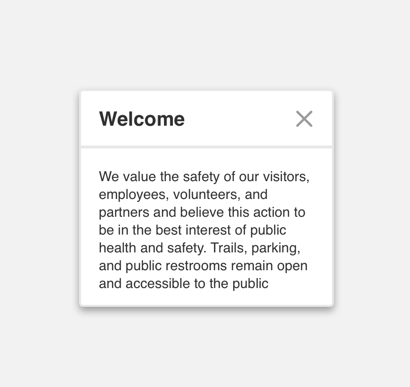
We suggest always placing modals in the middle of the UI. Additionally please keep in mind of the amount of content within a modal and provide the adequate size container to house the content.
use a small modal to contain an alert.
use a large modal to contain an alert.
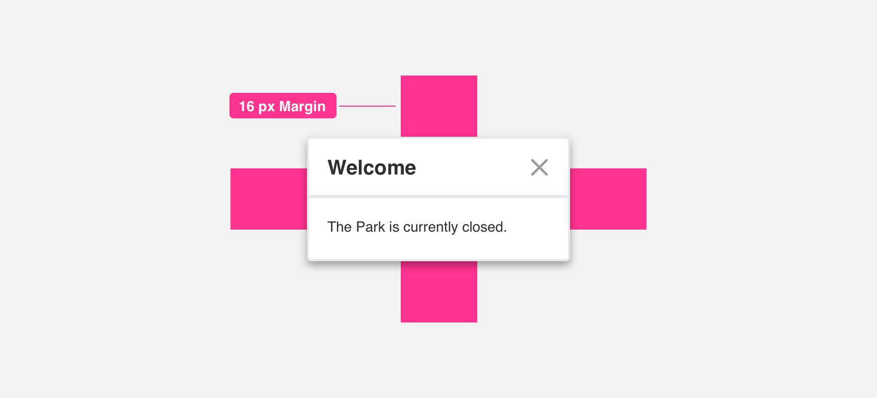
Margin
Adequate margins between Modal components and edge of page is important to maintaining discoverability. We recommend maintaining a minimum 60 pixel margin between the modal and the edge of the page.
Themeing
Denali’s components are completely themeable. This allows you to use our framework and adapt the visual style of Denali’s components to match your prodcut’s unique visual brand. Check out our guide to themeing with Denali to find out more.
Dennit Racing Theme
Dennit Racing uses a customized Denali theme that aligns visually with their brand. Dennit’s Modal features custom type, buttons and color theming.

For all variables visit the CSS documentation page for modals.