Buttons
Buttons allow users to take actions within your product.
Developer Docs
Foundation
Regardless of their size or style, Denali buttons are comprised of the following foundational elements:
Labels
The basic element of a button is a label. Labels inform users of the action that will occur if they click the button.
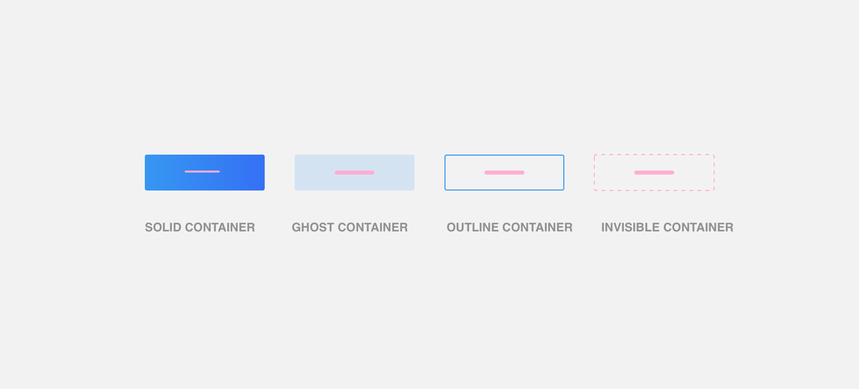
Container
Labels are housed within containers to provide greater visual contrast and negative space between the button and surrounding elements.
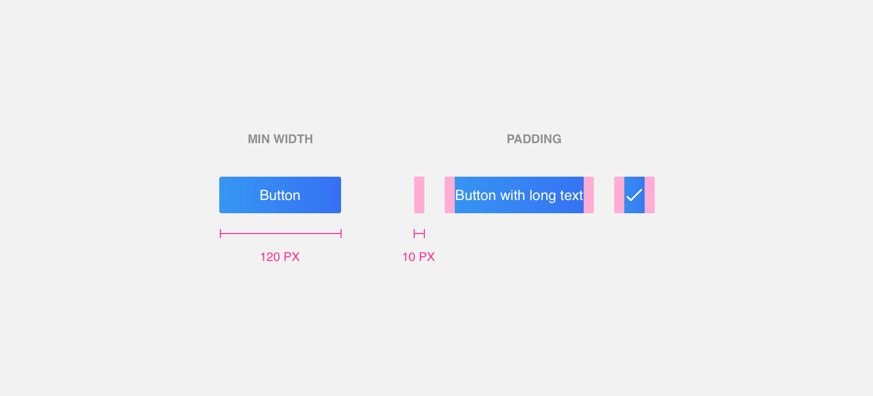
Minimum width & padding
Buttons with text and text with labels have a minimum width of 120 pixels. Wider buttons and buttons with an icon only label must maintain a minimum 10 pixel padding on the left and right. This ensures that the label is legible and clear. In special cases, such as with loader labels, additional padding to the right is required.
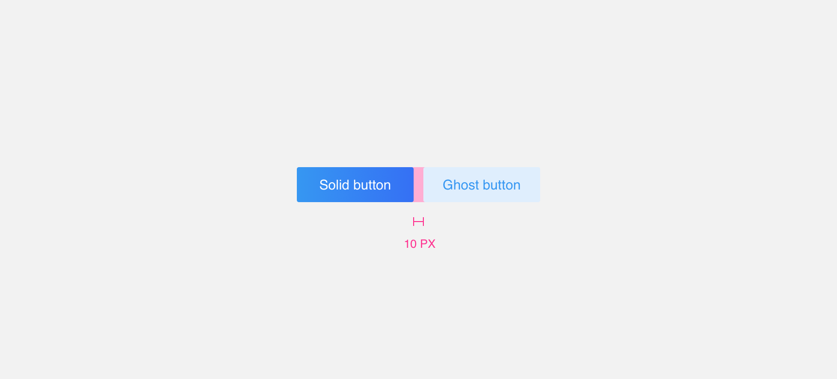
Margins
Always maintain a minimum 10 pixel margin between buttons and other buttons or components so that they do not become lost.
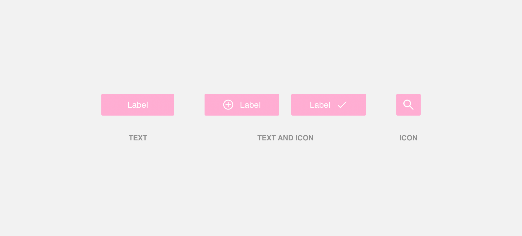
Labels
Labels can be comprised of text, a single icon followed by text, or an icon on its own.
Concise and informative
Labels should be concise and informative so that users know what action will be triggered when they click the button. Icon-only labels can be used in situations where an icon alone is sufficient to communicate button actions, otherwise we suggest using a text only label or an icon and text label.
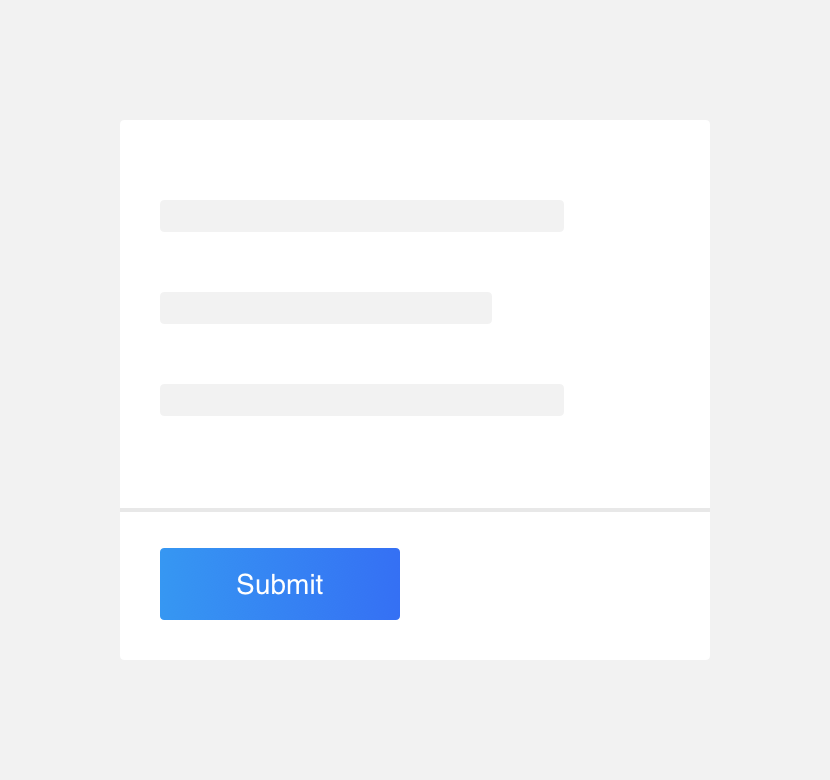
use direct and concise button labels.
use multiple icons or unnecessarily long button labels.
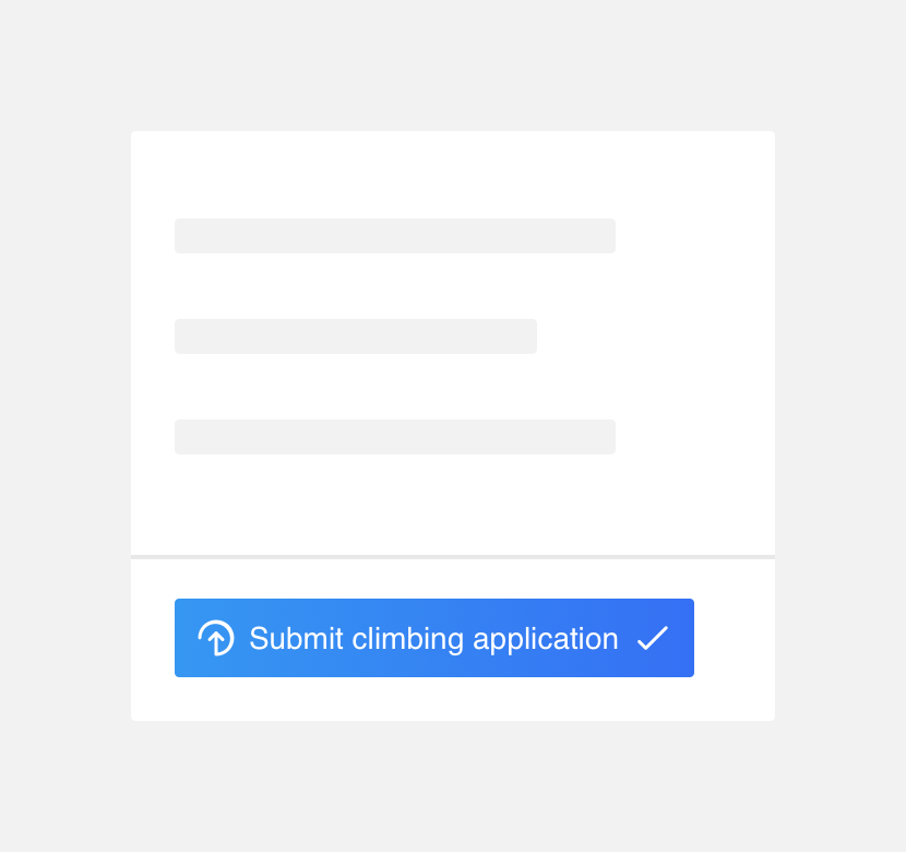
Loading labels
Loader labels are a special type of label that contain text followed by an animated loader icon. By default loader labels display text, but when clicked an animated loader icon appears to the right of the text to indicate that an action is in progress.
Submit button is a loader button that animates on click.
Density
In general you should aim to have only one high prominence button per layout in order to ensure that the most important or essential action is immediately clear. From there, it is important to have a balanced mix of buttons styles and sizes based on the density of the layout. Smaller and less visually prominent buttons should be used in high density layouts while larger more visually prominent buttons and sizes can be used in lower density layouts.
Layout with a balanced mix of buttons styles and sizes.
Styles
Different button styles command different levels of visual prominence. As a general rule, the importance of a button’s action should match the visual prominence of the button itself. For example, an essential action should be signified with a button of high visual prominence such as a Solid button.
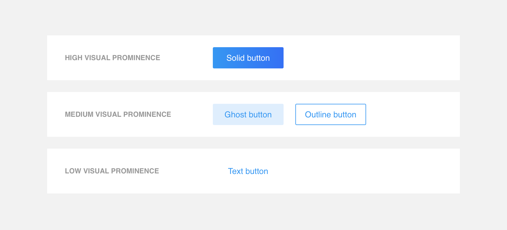
In this layout a Solid button is used to call out a primary action while a Ghost button is used to call out a secondary action.
Sizes
As with button styles, different button sizes command different levels of visual prominence. When selecting button sizes it is important to consider the density of the page. Smaller buttons should be used in high density layouts while larger buttons can be used in lower density layouts.
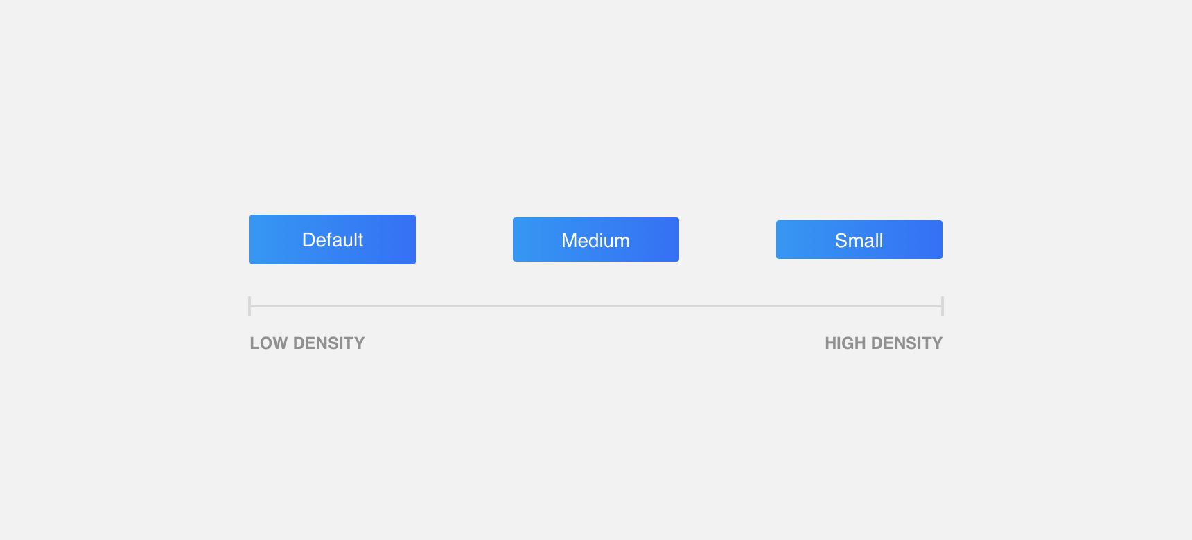
Density scale according to button size.
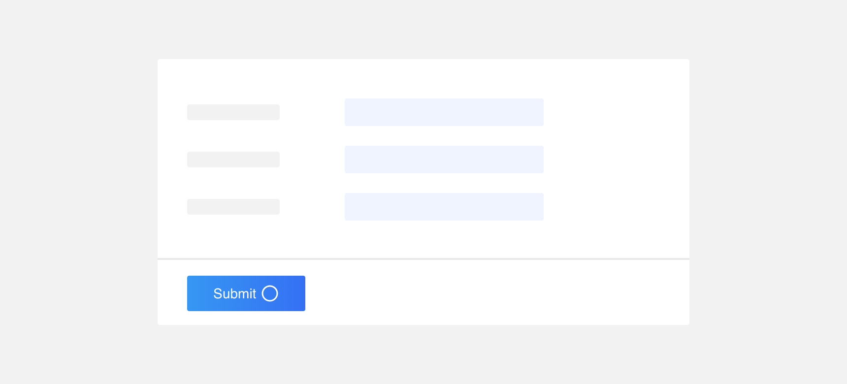
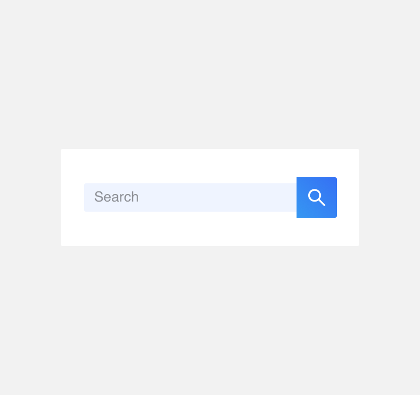
Additionally, buttons that are used in conjunction with other elements such as form fields should be sized the same so that they appear as a single component unit
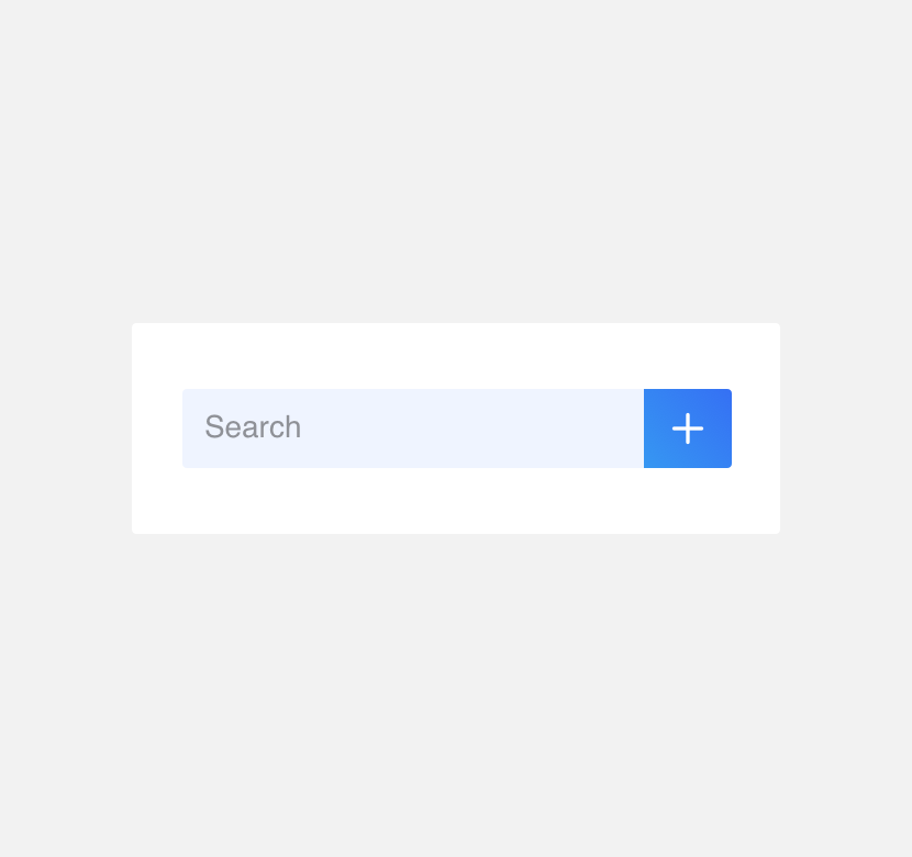
use a default sized field with a default sized button.
use a small sized field with a default sized button.
Placement
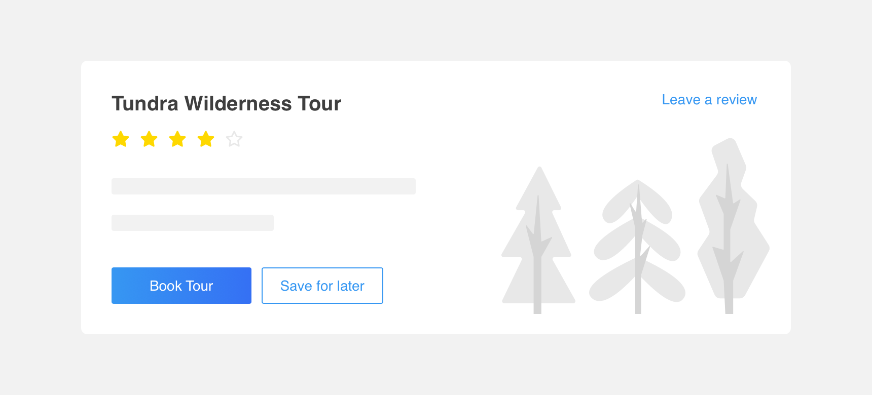
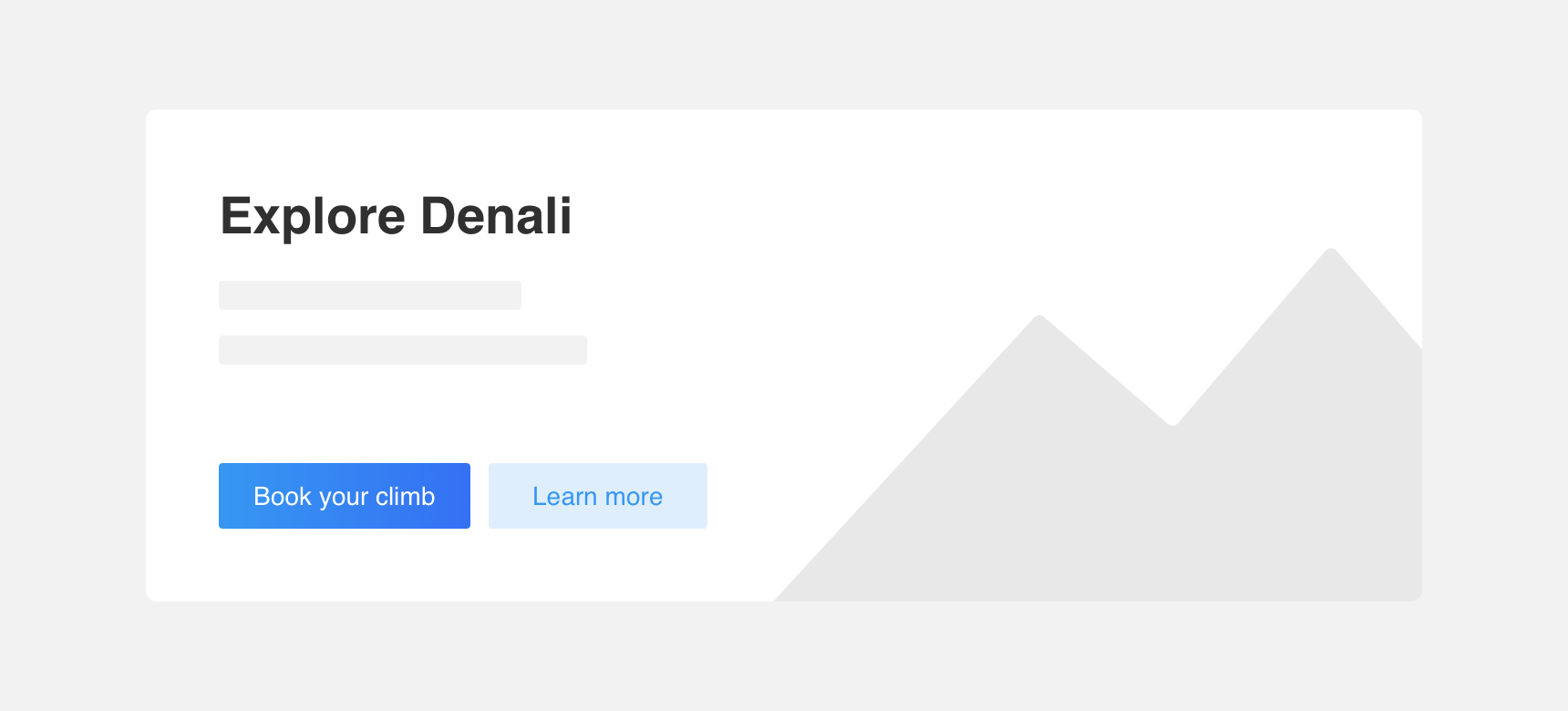
Multiple button styles can be placed alongside each other to convey the various actions a user may take as well as the importance of one action over another. Avoid placing the same button styles directly adjacent to each other as it gives both actions the same importance which may cause confusion or lack of direction.
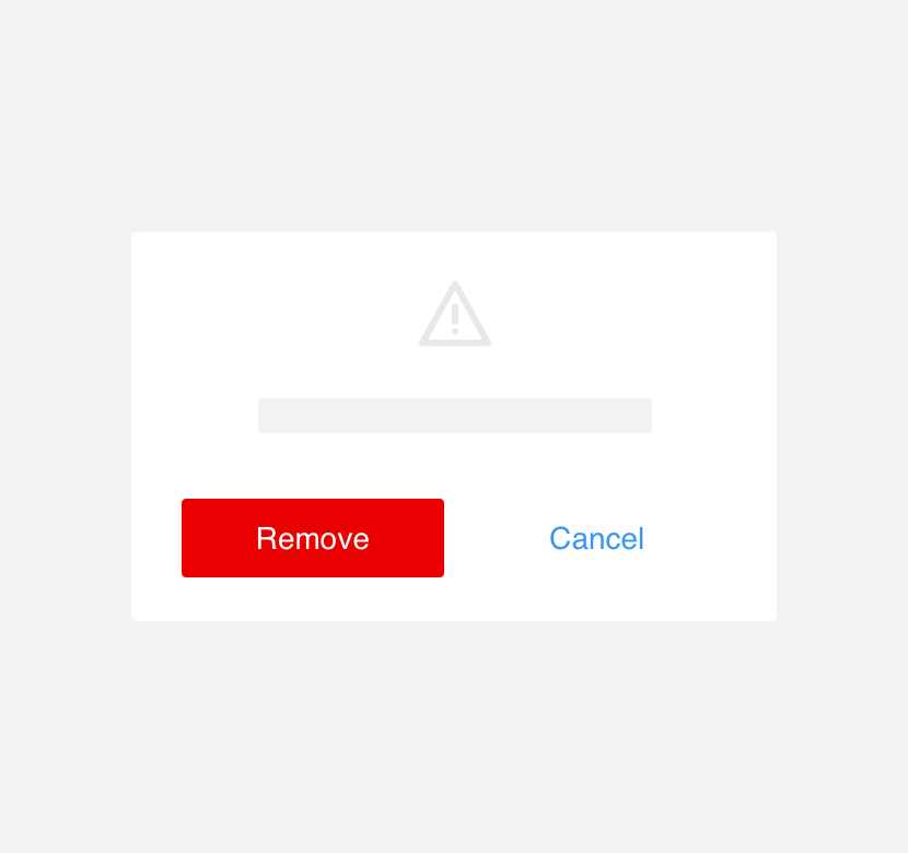
use buttons with different visual prominence to convey actions with different levels of importance .
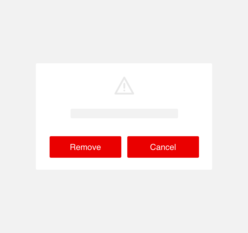
use buttons with the same visual prominence to convey actions with different levels of importance.
Themeing
Denali’s components are completely themeable. This allows you to use our framework and adapt the visual style of Denali’s components to match your prodcut’s unique visual brand. Check out our guide to themeing with Denali to find out more.
For all variables visit the CSS documentation page for buttons.