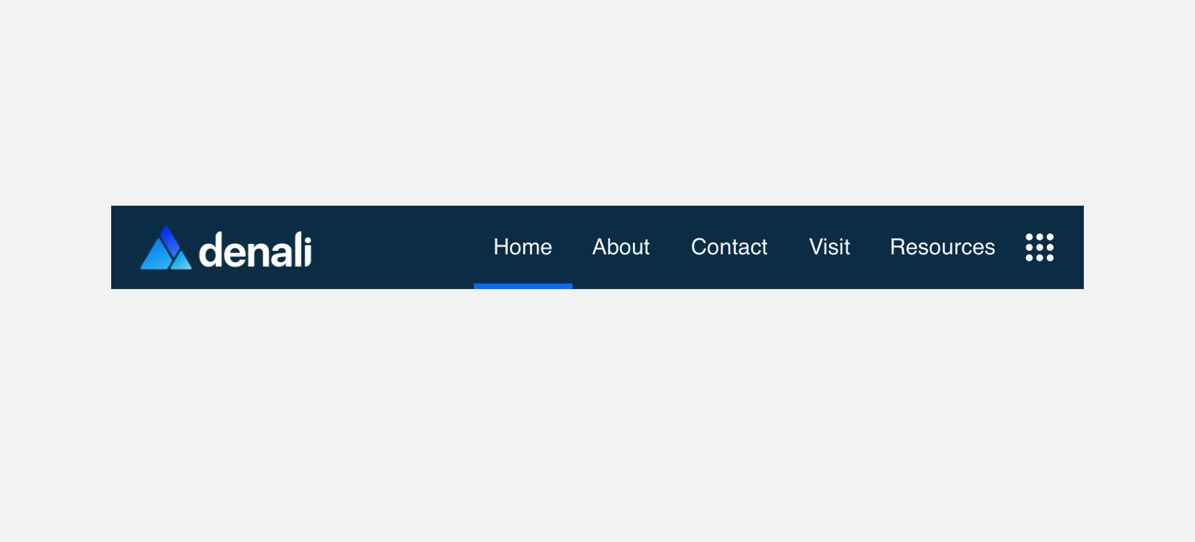
Navbar
Navbar is generally the top most component placed within a UI. Nav bar is consistent experience across a product or service to visually show the user they are in the experience.
Developer Docs
Foundation
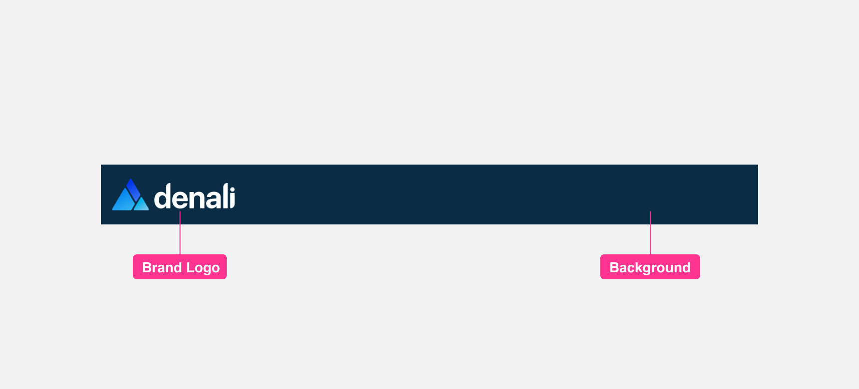
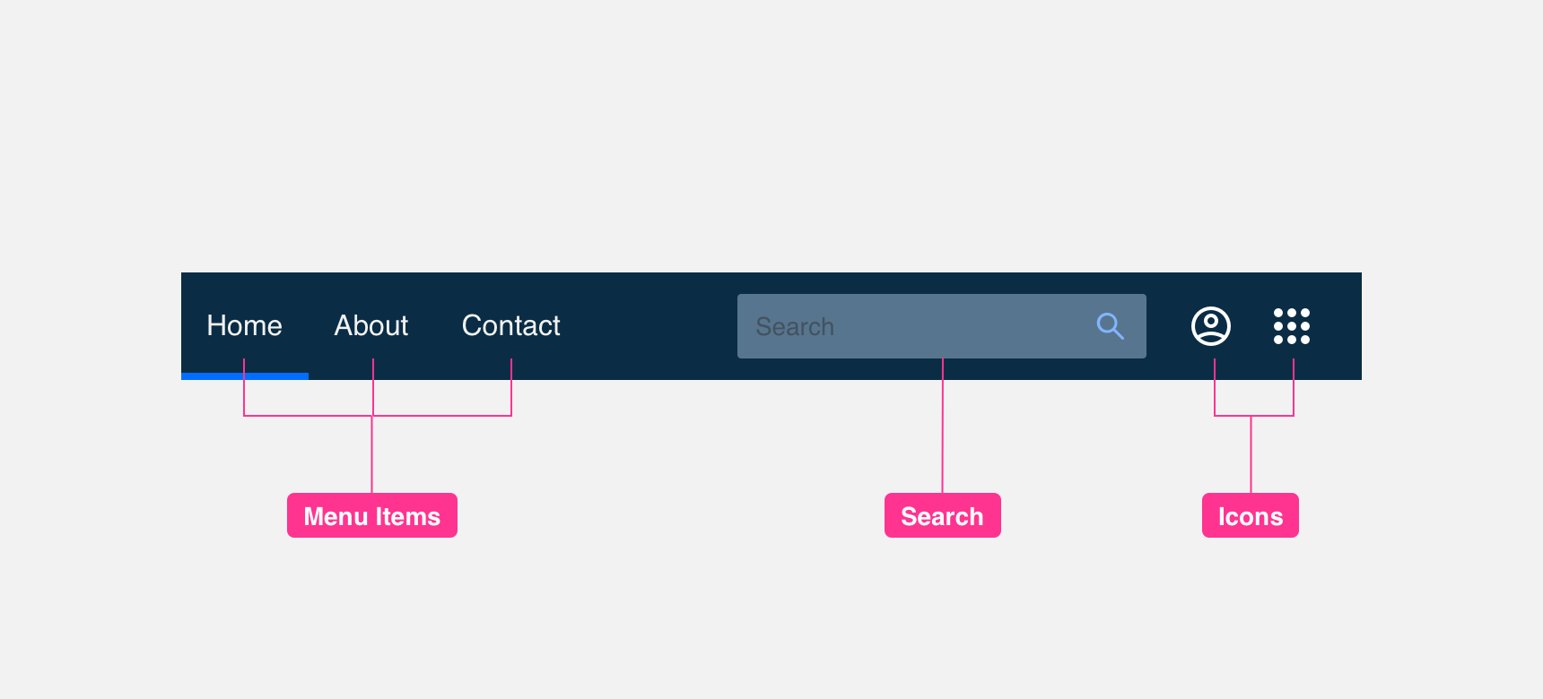
Navbar can contain any combination of the following sub-components: A background, a logo of the product or service, Menu Items to supporting pages, a search field and icons that can be used for a number of actions.
Title
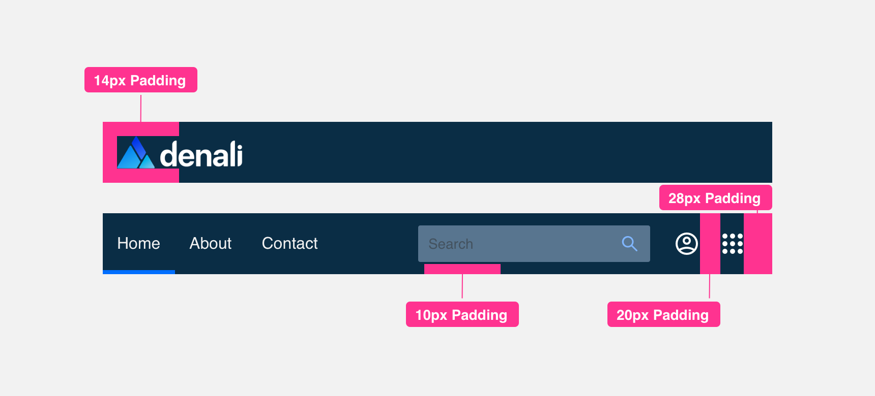
Backgrounds should be 60 px tall and have a width that is determined by the width of the window. Backgrounds should be colored appropriately to align with branding of product or service.
Logo
svg or png versions of the logo should not exceed a maximum height of 34 px in order to provide enough margin around the logo to be clearly legible.
Menu Items
These are links to supporting pages. An underline, color change of weight change is used to show the user what page they are currently on.
Search
A search in the navbar acts as a global search across the product or service.
Icons
Icons are used for a number of different uses. You can use an icon such as menu-dialpad to house a menu to other products. You can use Icons such as question-mark or user-profile to present alternative product or service level settings. You can also include third-party icons such as slack to allow a user links to external platforms
Padding
Components in a Navbar should maintain a minimum padding of 10 px along the top, bottom, right, and left of each component to provide proper legibility.
Placement
General usage
We suggest always placing Navbars at the top most area of a UI. Please keep in mind the amount of components within a Navbar as it is not advisable to over saturate this component.
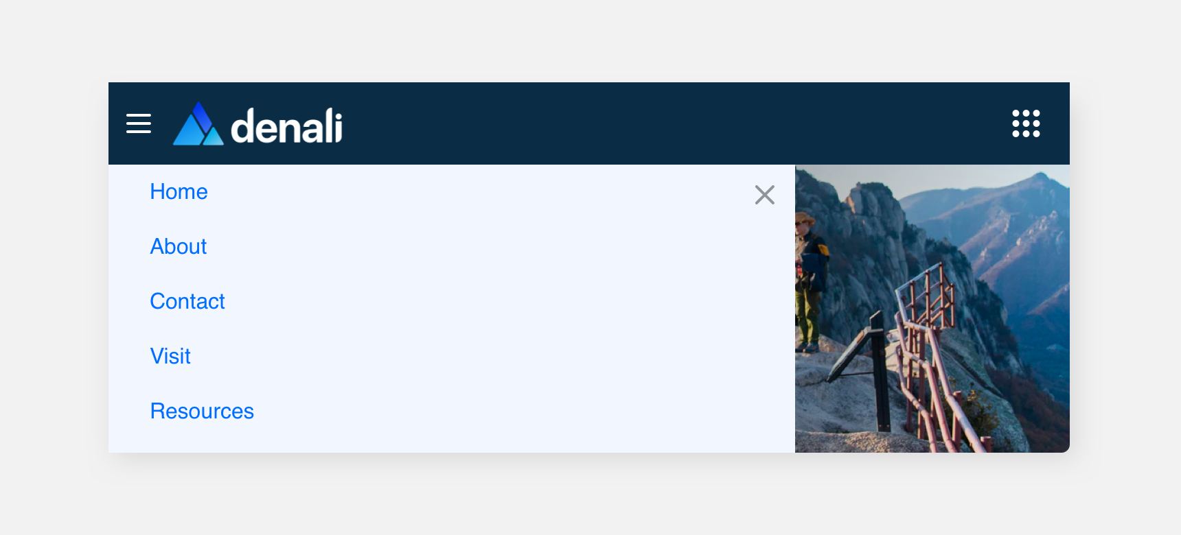
use a hamburger icon to house menu items if you they get long enough to interfier with other elements padding.
place more than menu items on a navbar than you have space for.
Themeing
Denali’s components are completely themeable. This allows you to use our framework and adapt the visual style of Denali’s components to match your prodcut’s unique visual brand. Check out our guide to themeing with Denali to find out more.
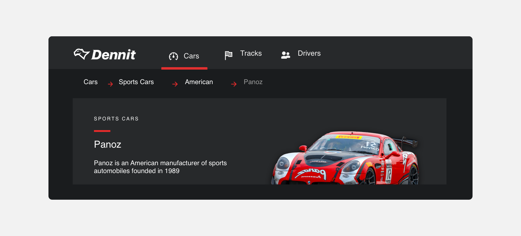
Dennit Racing Theme
Dennit Racing uses a customized Denali theme that aligns visually with their brand. Dennit’s Modal features custom type, icons, and color theming.
For all variables visit the CSS documentation page for navbar.