Sidebar
Sidebars are a form of secondary navigation. They provide access to content within a primary page.
Developer Docs
Foundation
Side bars consist of a container that holds links and text labels.
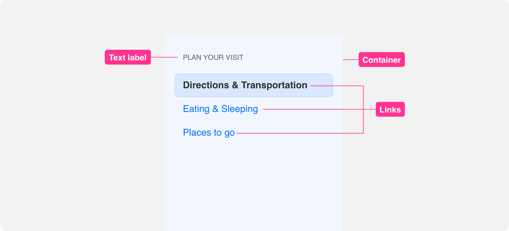
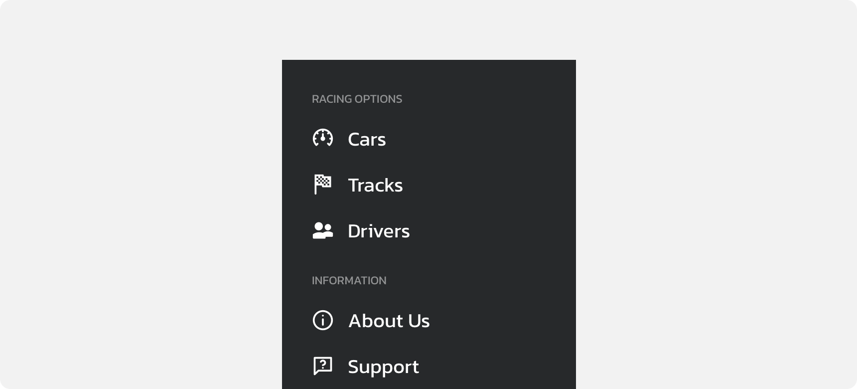
Container
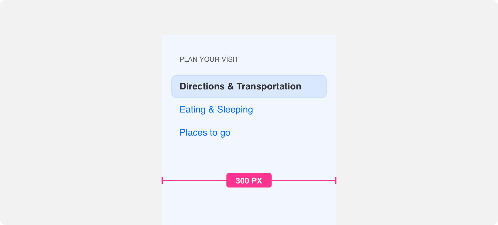
The base element of a sidebar is a container. The container background should be set to a color that clearly distinguishes it from the rest of the page. By default the width of Denali’s sidebar is set to 300 pixels. This width is optimized for use with Denali’s grid. We recommend using this default in order to provide the best user experience. However, the width of the container can be reduced to support dense layouts. If adjusting container width, ensure you provide enough padding to support the legibility of the links that will reside within the container. We do not recommend assigning a width greater than 300 pixels to sidebar containers because it gives unnecessary prominence to the sidebar within the page’s layout.
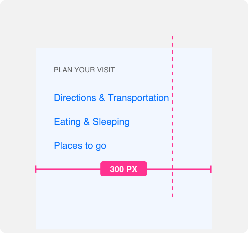
provide a container that is wide enough to support link legibility.
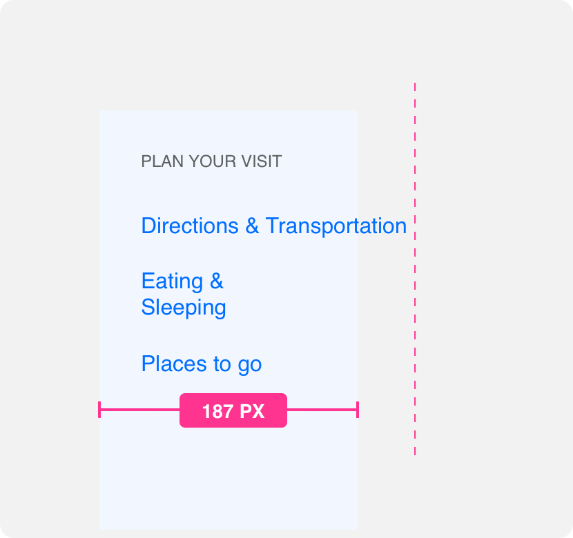
wrap links extensively or bleed links outside of the container as they will become difficult to read.
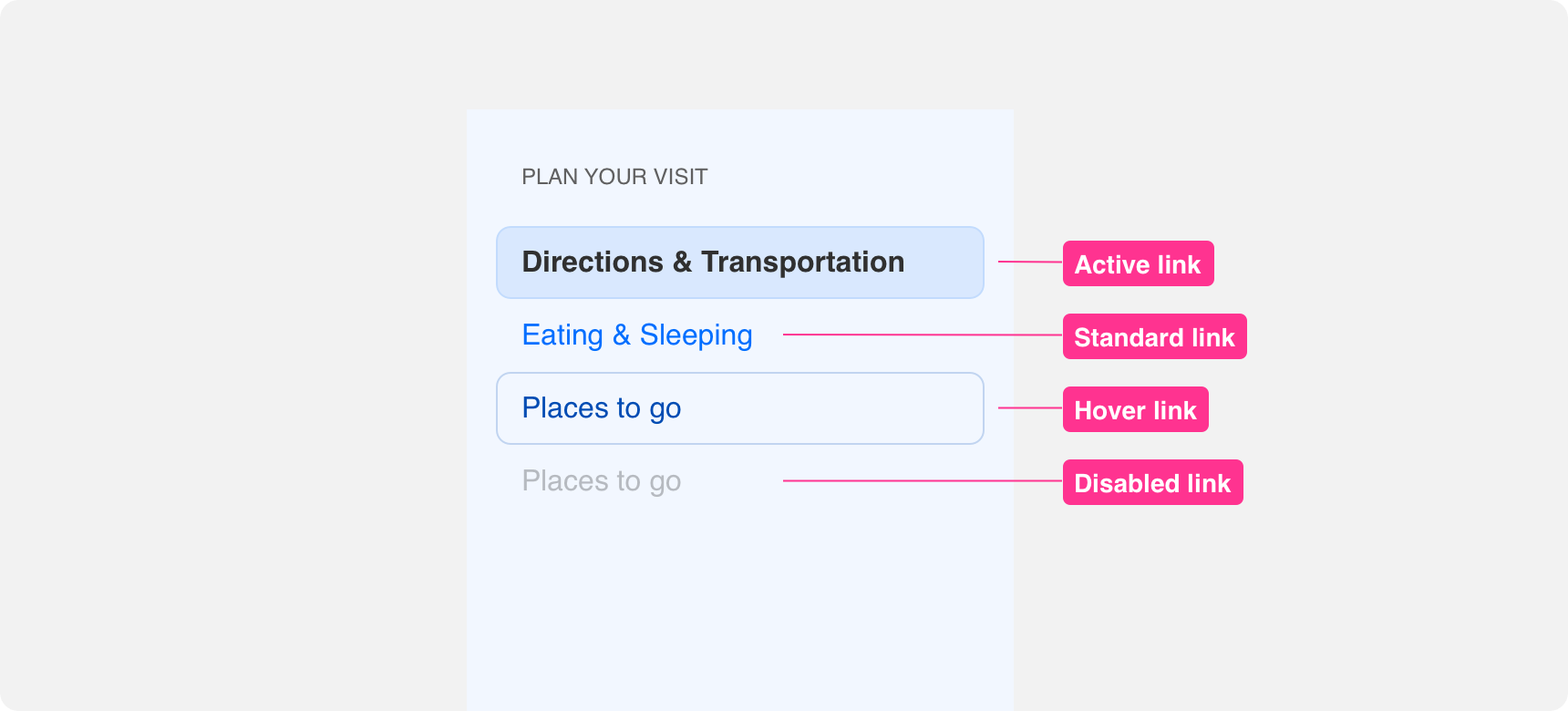
Links
Links are the primary element within a sidebar. They allow users to navigate between pages. When placing a link within a sidebar always use the shortest but most effective link description possible. This makes links easy to read within the sidebar container. Links should never be so long that they need to be truncated in any way. Additionally, you should not reduce the font size of a link to get it to fit within the container. As much as possible avoid wrapping text links as well.
Links within sidebars follow the similar principles as individual link components. Check out the link principles page for more information on the proper use of links.

use concise link descriptions that fit comfortably within a sidebar container.
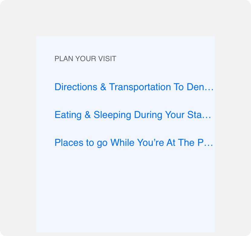
use link descriptions that are so long they need to be truncated to fit the container width.
Icons
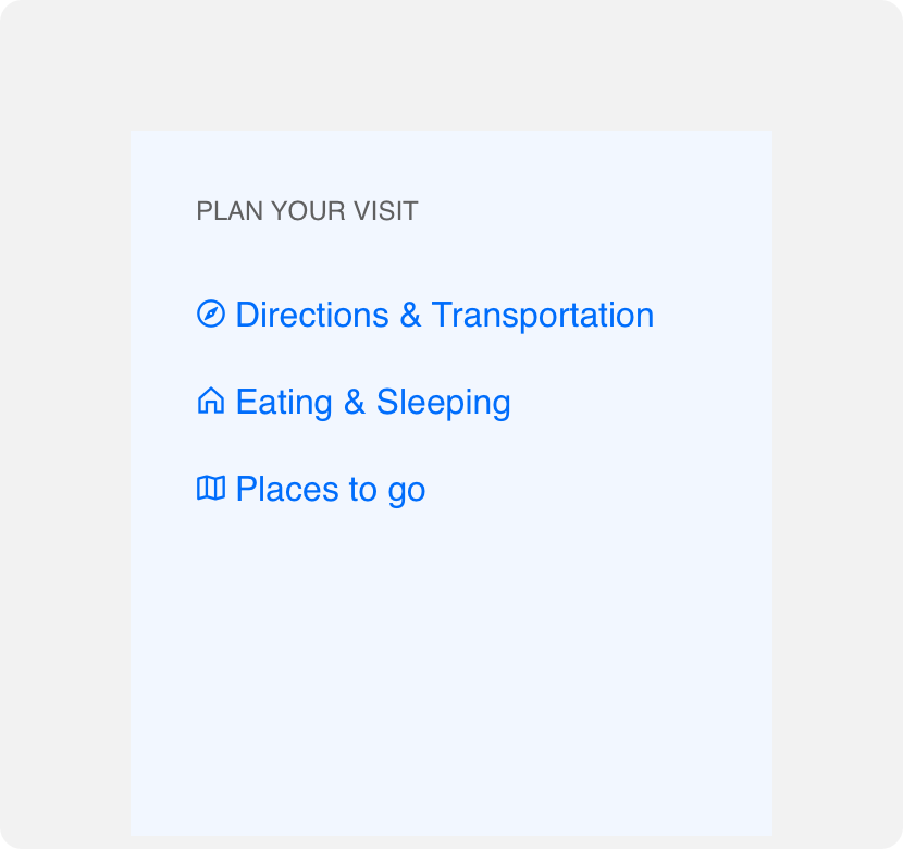
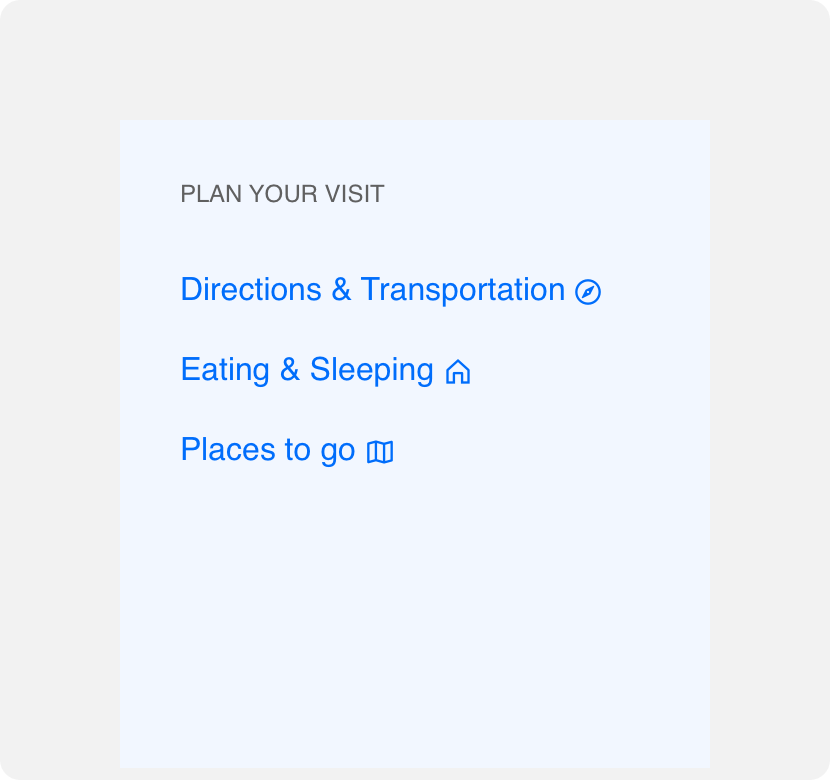
Since sidebar links are like any other link component, you can also include an icon before the link description. As with any link, ensure the icon you place before the link directly supports the link description. Avoid placing an icon at the end of a link as it could call unnecessary attention to the “ragging” created by the inconsistent link lengths and make sidebars more difficult to parse. Additionally you can use icon-only links in the sidebar, but we recommend adding tooltips on hover so that users understand what each icon represents.
add a supporting icon before links in a sidebar if desired.
add supporting icons to the end of links within a sidebar to avoid bringing unnecessary emphasis to the ragging of the links.
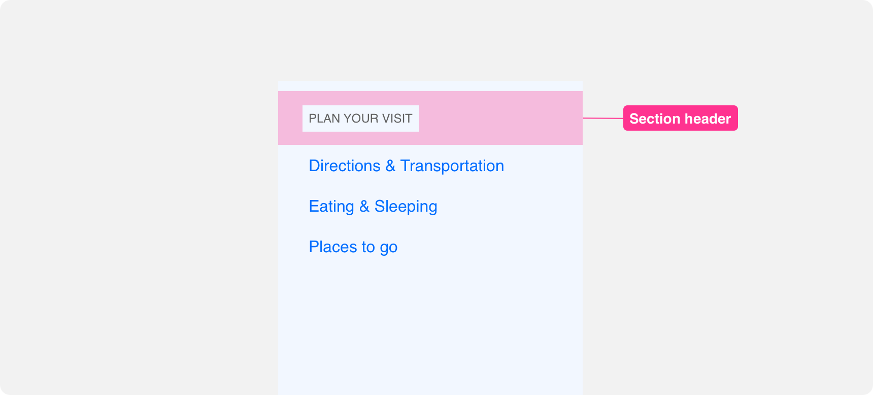
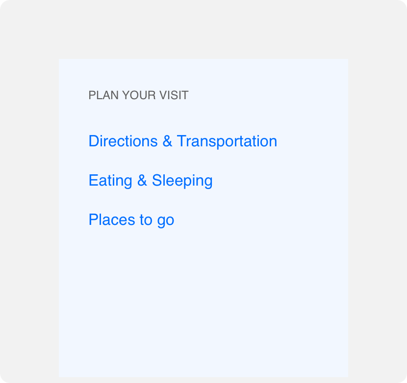
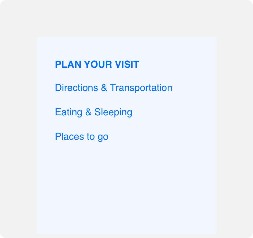
Section headers
Section headers can be used to group related links within a sidebar. When using section headers it is important to ensure that they are visually differentiated from links and deemphasized to avoid confusion or assigning too much prominence to them. Denali’s sidebar section headers use all-caps gray text set in a smaller type size. This differentiates them from the sentence cased, larger, blue appearance of Denali links while also deemphasizing them visually. As with link descriptions, section headers should be as concise as possible. Avoid using lengthy section headers that wrap or need to be truncated.
use concise link descriptions that fit comfortably within a sidebar container.
use link descriptions that are so long they need to be truncated to fit the container width.
Placement
Sidebars should always be placed to the left of the screen in countries where users are accustomed to reading from left to right. This places the navigation in a logical order on the screen.
General usage
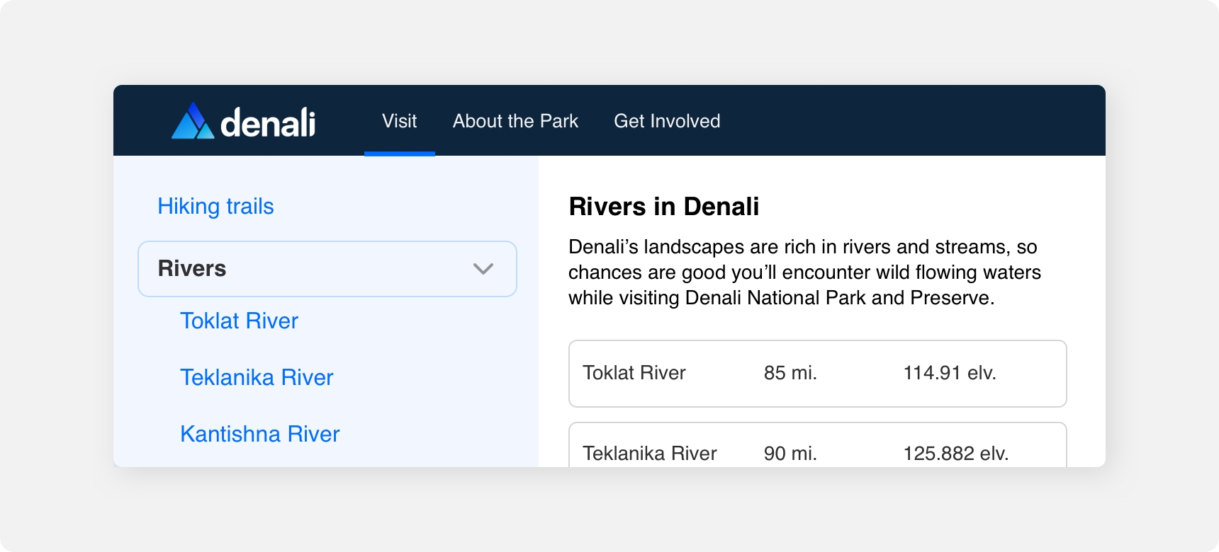
Generally sidebars are reserved for use as secondary navigation. This means that they are used in conjunction with primary navigation such as a nav bar. When a user navigates to a primary page within a nav bar, that page may be further divided into sections that can be accessed using the sidebar.
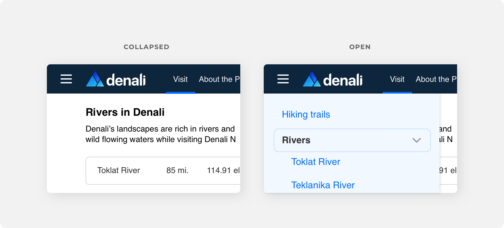
The example below shows a website that is clearly divided into sections using a primary navigation. From there, the pages are further organized using a sidebar as secondary navigation. If your website or app does not require a primary navbar to group its content, you may be able to rely on a sidebar as your primary navigation.
Responsive behavior
Sidebars should only be visible on tablet and desktop devices. Due to the small size of mobile devices, a sidebar cannot comfortably fit within a mobile viewport without taking up a significant amount of screen real estate. For that reason, a sidebar should collapse and become hidden behind a link in the nav when the screen size falls within the mobile screen size breakpoint. When the link that hides the sidebar is triggered, the sidebar should be revealed by pushing in from the left side of the screen.
Themeing
Denali’s components are completely themeable. This allows you to use our framework and adapt the visual style of Denali’s components to match your prodcut’s unique visual brand. Check out our guide to themeing with Denali to find out more.
Dennit Racing Theme
Dennit Racing uses a customized Denali theme that aligns visually with their brand. Dennit’s checkboxes feature custom type, background color, border radius, border color and icons.
For all variables visit the CSS documentation page for sidebar.