Fields
Fields allow users to enter text information within your product.
Developer Docs
Foundation
Fields are comprised of the following foundational elements:
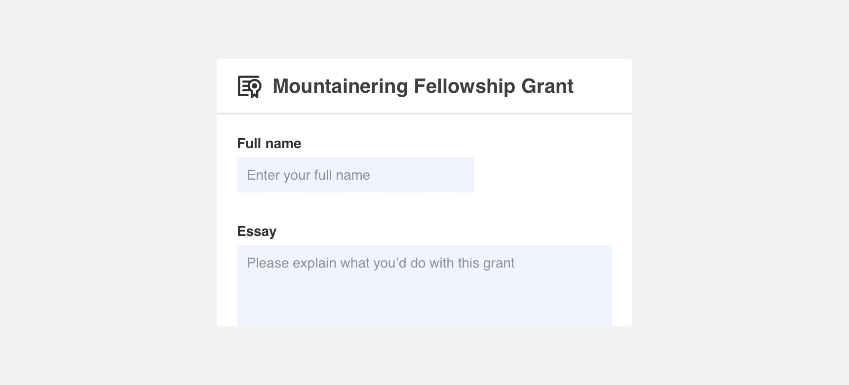
Container
The basic element of a field is a container. Containers differentiate fields from other elements on the page and enclose text a user enters and default information such as hint, prefix, and suffix text.
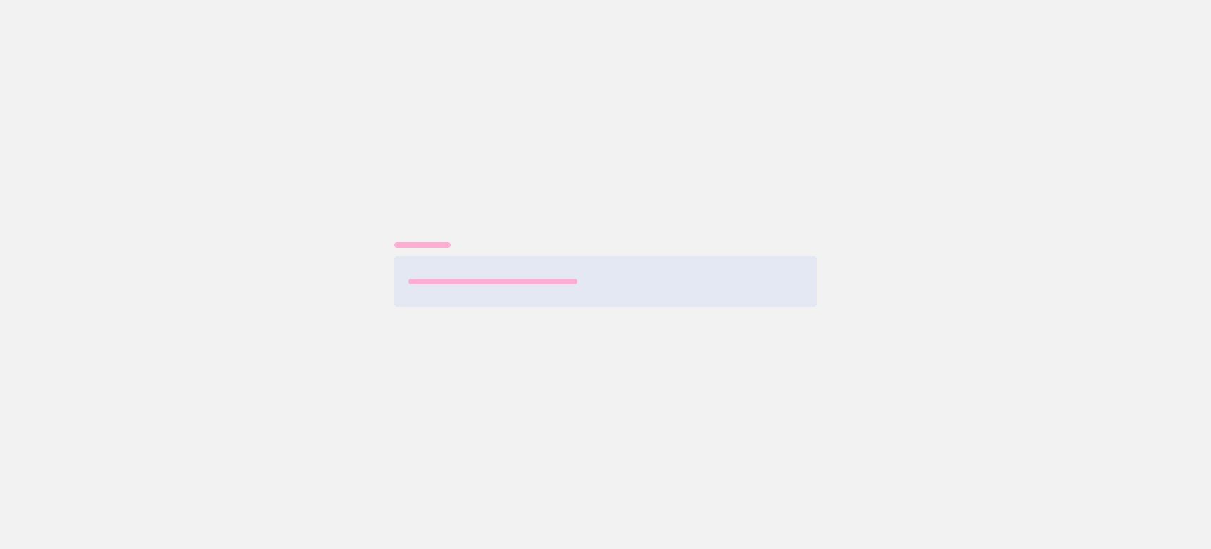
Label
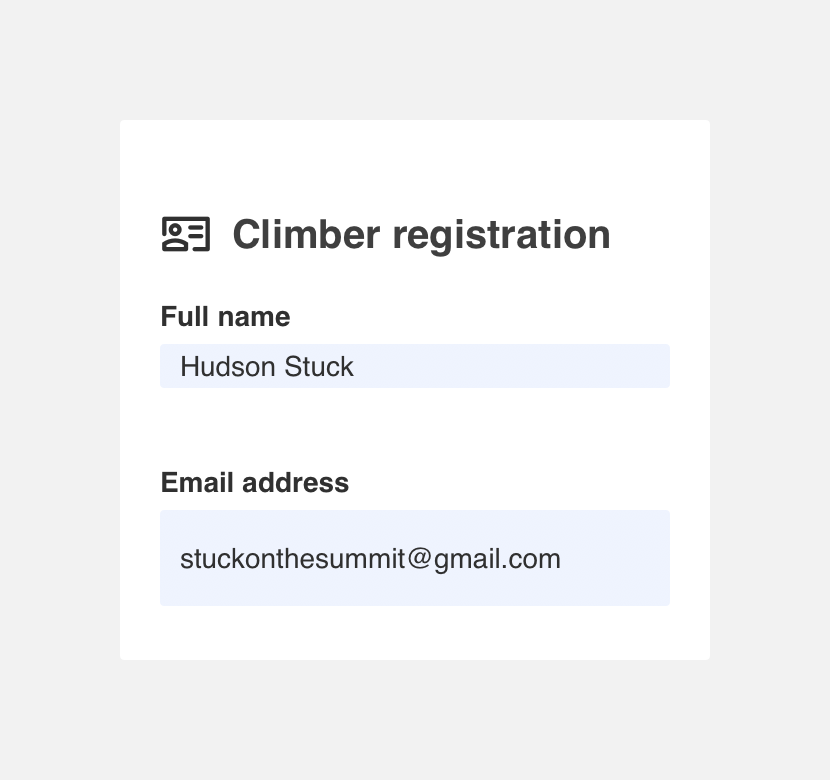
Labels call out the type of text information that should be entered in the field by a user. Labels can be placed to the left of fields or stacked on top. Label text should be concise and informative.
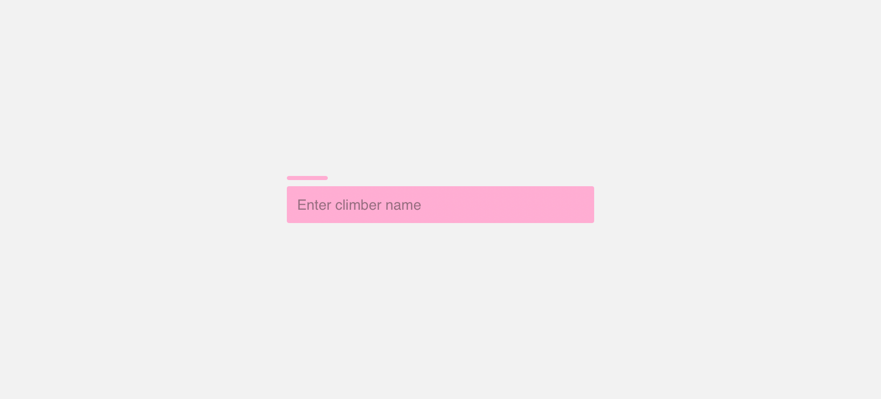
Hint text
Hint text appears within the field container. Hint text should be concise and provide users with an example of the text information that should be entered in the field. Hint text appears at a lower opacity and disappears as soon as a user begins to type text into the field.
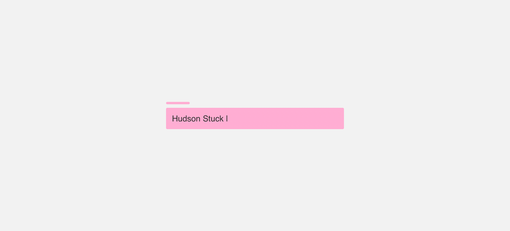
Input text
Input text is text that a user has entered into a field. Unlike hint text, input text appears at full opacity. When a user is actively typing within the field, input text should be followed by a blinking text cursor.
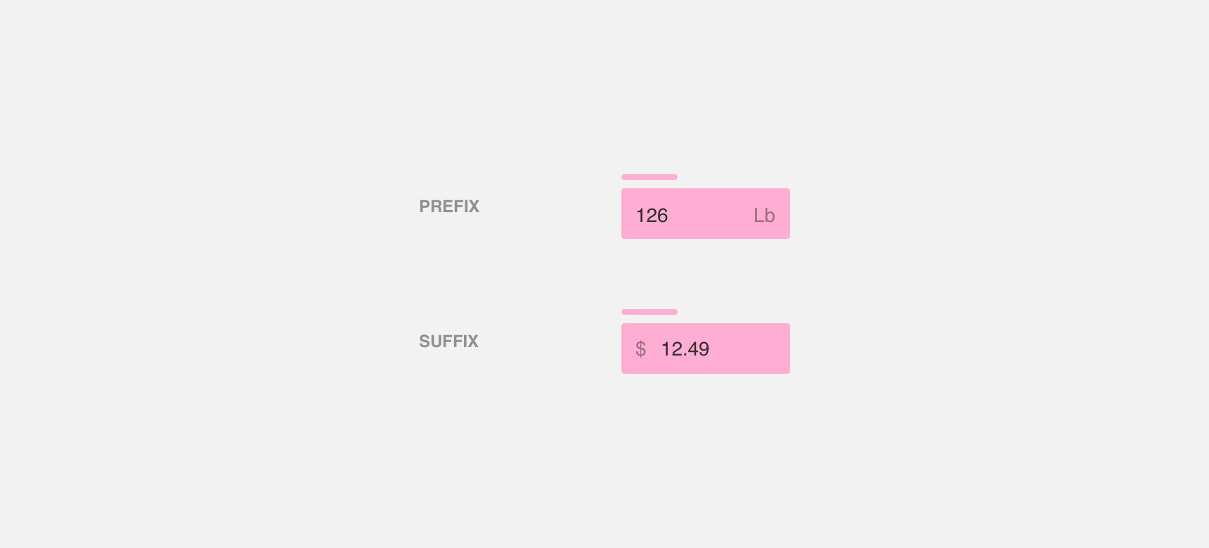
Prefix & suffix
Prefix and suffix text indicate the type of information that should be entered in the field. They appear at a lower opacity, but unlike hint text, prefix and suffix text resides in the field permanently. Examples include currency symbols or units of measurement.
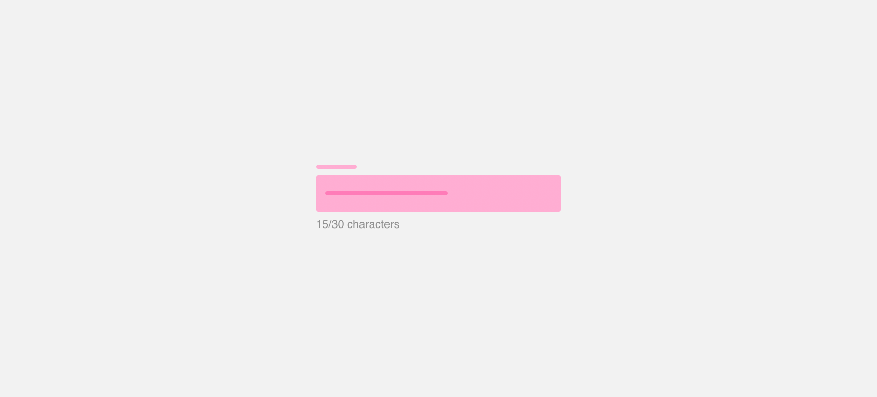
Descriptive Text
Descriptive text is text that provides further guidance about the type of information a user is expected to enter in the field. This includes descriptive text, character counts, and error messages.
Types
Denali offers three types of fields - inline, text area, and expanding. Each field type has specific use cases and usage recommendations.
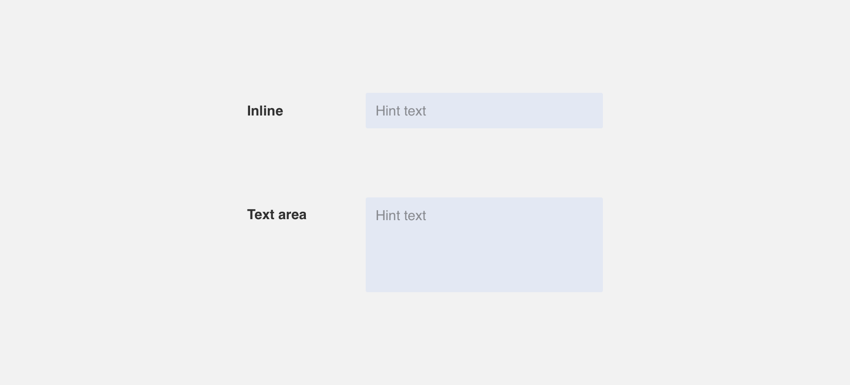
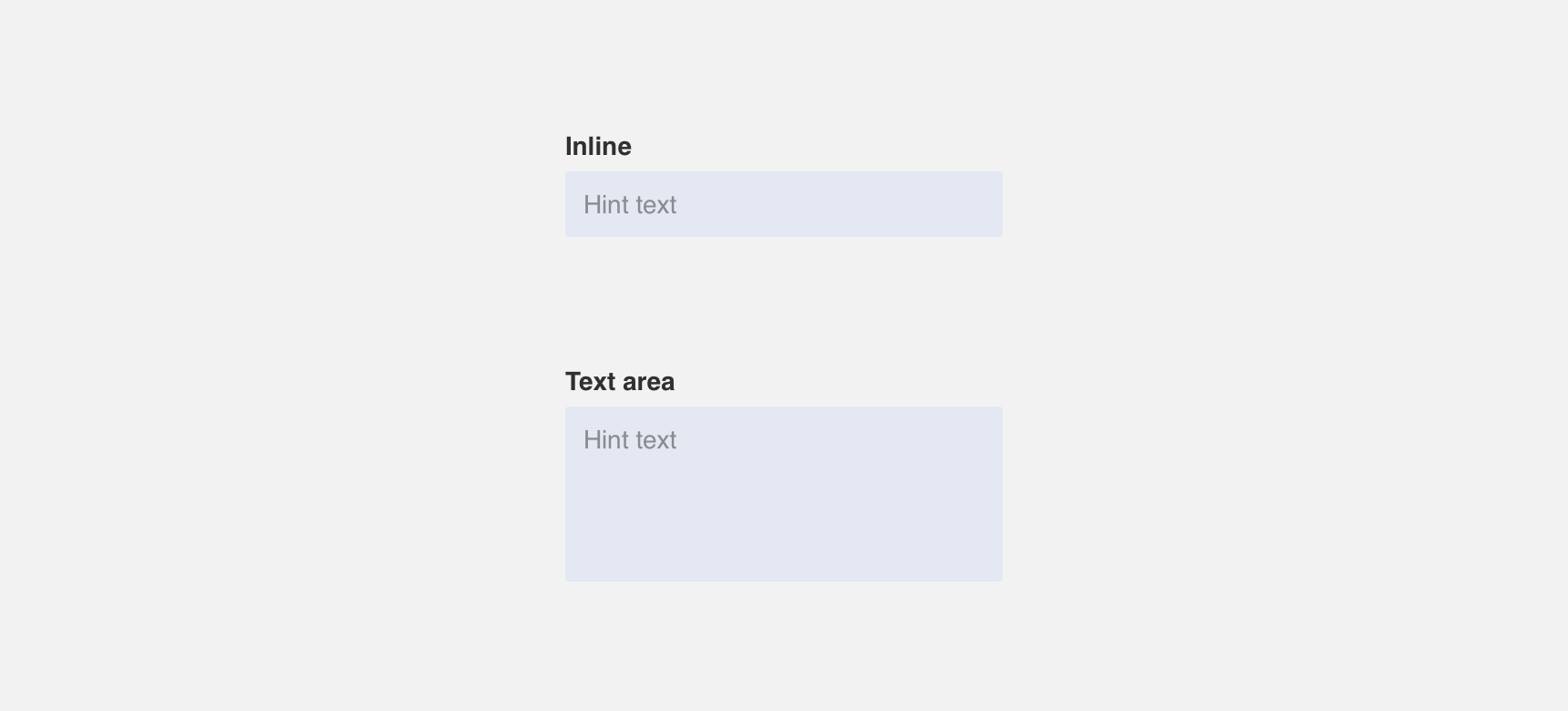
Inline
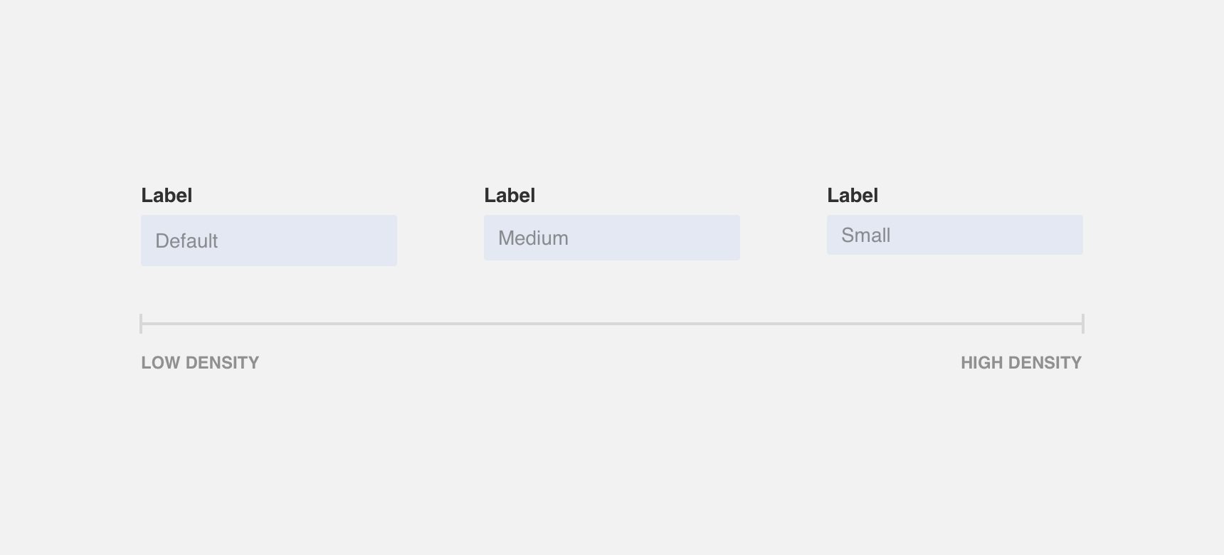
Inline fields are fields that appear inline. Denali provides 3 sizes for inline fields - default, medium, and small. We recommend selecting the size of your fields based on the density of your page. Small fields are recommended for use in high density pages and default fields are recommended for use in low density pages.
We recommend using inline text fields when the requested input text is expected to fit within the width of the inline field. Otherwise, the input text will become hidden behind a vertical scroll which can create frustration.
We recommend using inline text fields when the requested input text is expected to fit within the width of the inline field. Otherwise, the input text will become hidden behind a vertical scroll which can create frustration.
use an inline field when the requested input text is expected to fit within the width of the inline field.
use an inline field when there is a possibility that requested input text will not fit within the with of the field.
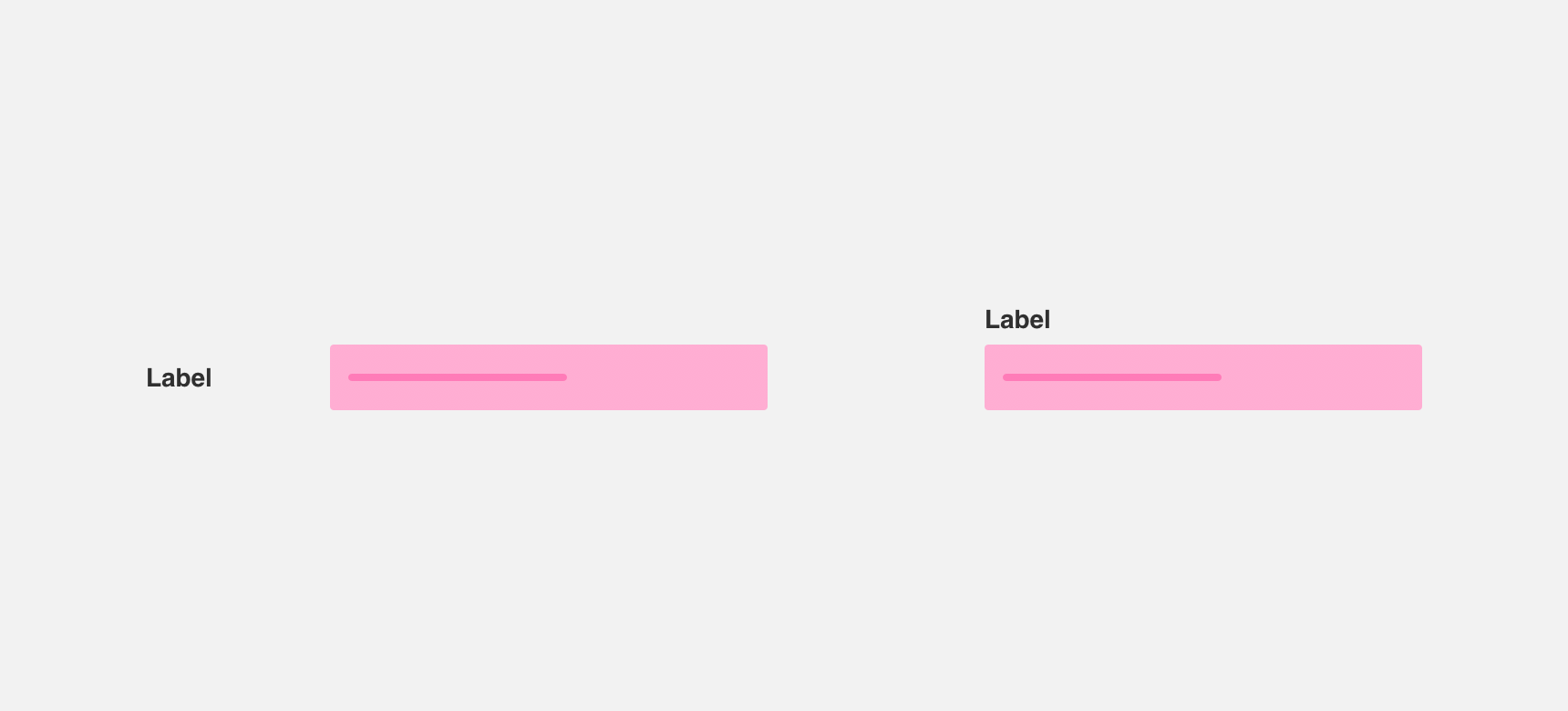
Inline fields that appear alongside each other should be the same size and height to maintain visual consistency and hierarchy.

use fields of the same size in a form.
don’t vary the sizes of fields in a form.
Text area
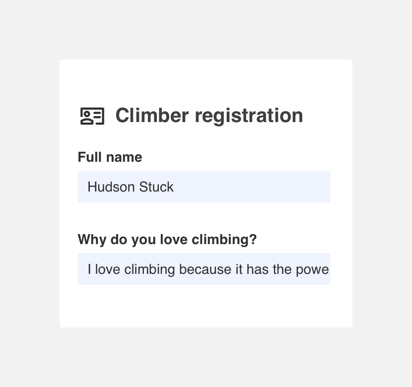
Text areas are fields that span multiple lines. We recommend using text area fields when the requested input text is expected to span multiple lines.
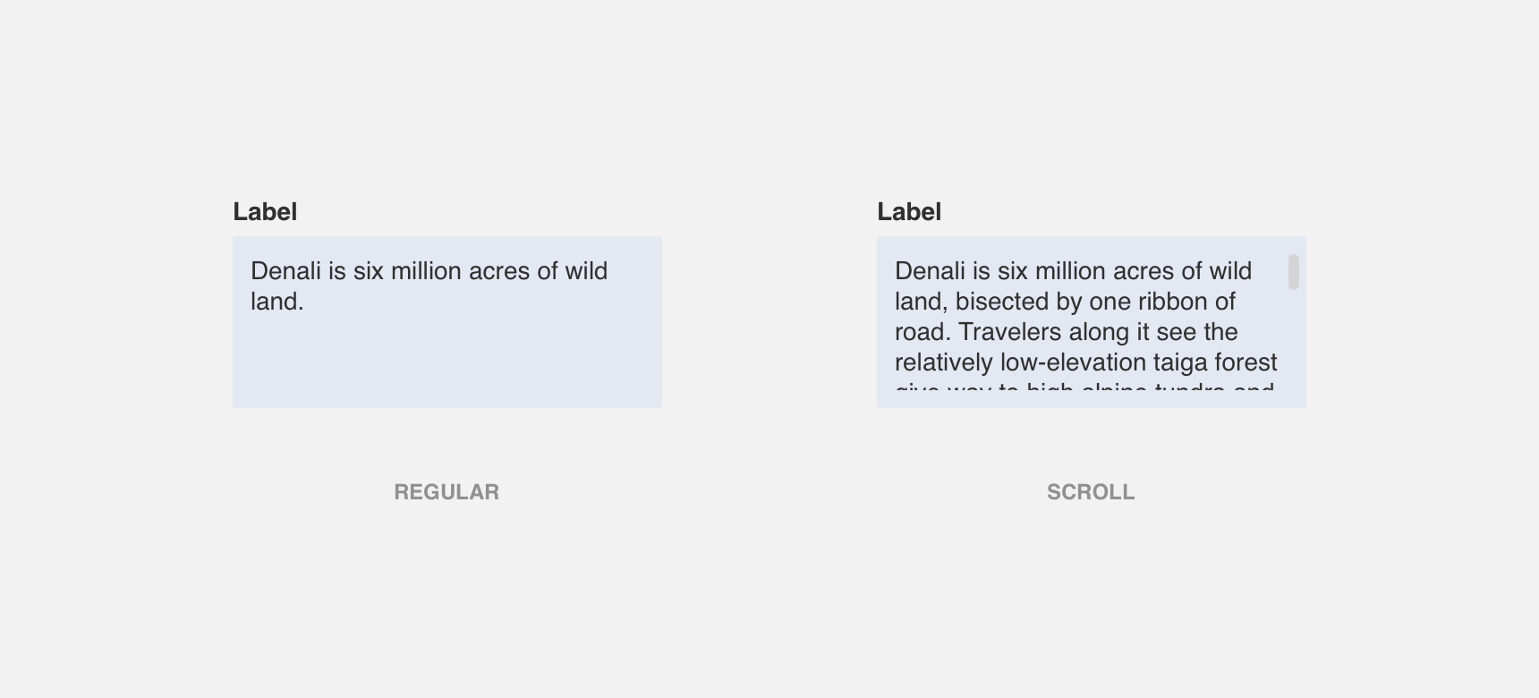
Denali does not offer fixed text area sizes. Instead, the height of text areas should be sized to accommodate the expected input text. If necessary, text areas can scroll vertically to accommodate input text that goes beyond the height of the field.
use a text area when the requested input text is expected to span multiple lines.
use a text area when the requested input text is not expected to span multiple lines.
Labels
Field labels can be placed either to the left of a field or stacked on top of a field. The recommended placement of labels varies by use case.
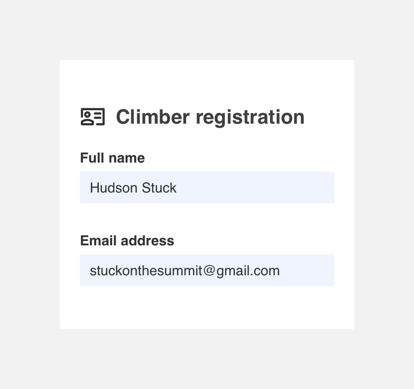
Left
Left aligned labels appear to the left of a field. We recommended using left aligned labels in low density pages where there is plenty of space for the label to be placed to the left.
Stacked
Stacked labels appear on top of a field. We recommended using stacked labels in high density pages. They are also recommended in situations where horizontal space is limited, such as mobile views.
Themeing
Denali’s components are completely themeable. This allows you to use our framework and adapt the visual style of Denali’s components to match your prodcut’s unique visual brand. Check out our guide to themeing with Denali to find out more.
For all variables visit the CSS documentation page for fields.