Table
Tables organize related data using columns and rows that make the information easy to consume.
Developer Docs
Foundation
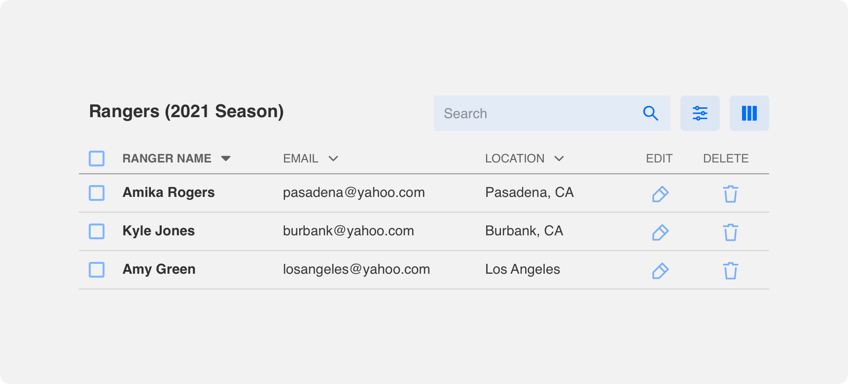
Rows and columns are the bread and butter of tables. Denali offers standard, striped, and card based tables that provide distinct visual treatments of a table’s columns and rows. Additional components such as headers, footers, chips, and selection controls can be added to tables to provide greater context and control over the information they present.
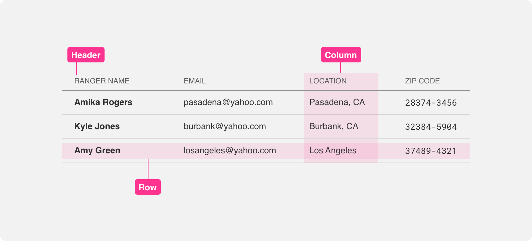
Rows
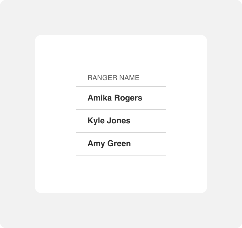
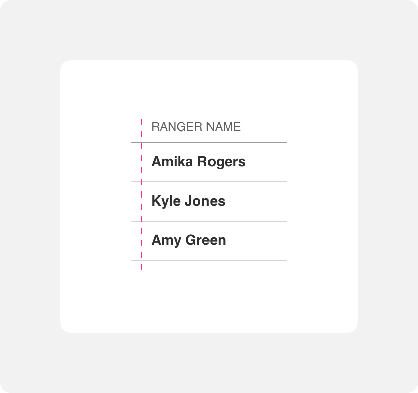
In countries where text is read from left to right, table rows are also read from left to right. Each row represents one data entry. If your row contains more than one piece of information, make sure you align that information into columns that can be utilized across each data entry. Always provide adequate padding on the top and bottom of rows to support legibility.
display one data entry per row and provide adequate padding within the row to support legibility.
try to fit more than one data entry in a row or neglect to provide enough padding.
Columns
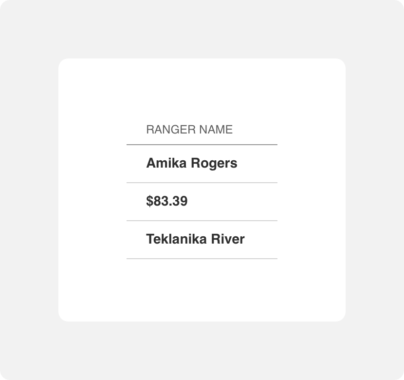
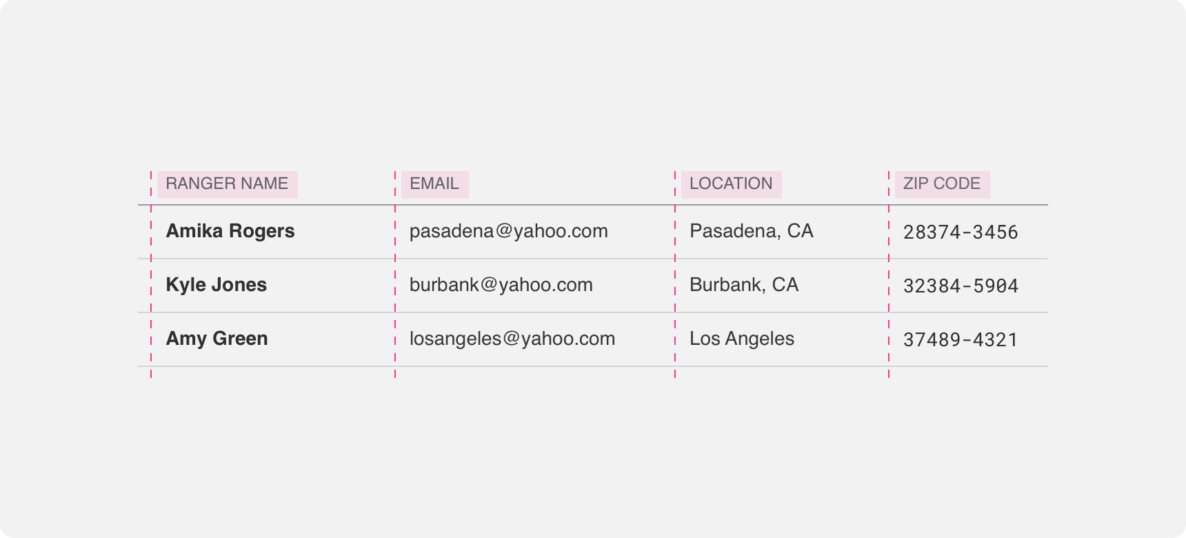
Columns are read from top to bottom. Unlike rows that are meant to be scanned from left to right, columns make it easy to scan for specific information across each data entry. This is because columns are organized using headers that call out what kind of information can be found in each column. Row data is organized so that it falls under the proper column heading. To avoid visual clutter, columns are not delineated by lines. Instead, adequate padding is used to the left and right of columns to ensure they are legible.
use columns to organize related information within data entries.
put information underneath columns that does not relate to the column header.
Alignment
Information in table columns can be aligned either to the left, center, or right. We recommend aligning columns that contain text to the left and aligning columns that contain numbers to the right for the best legibility. No matter what alignment you select, always ensure that each data entry within a column conforms to that alignment to avoid visual confusion.
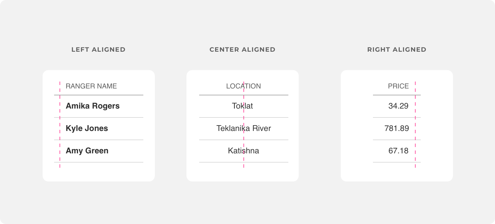
use the same alignment within each column.
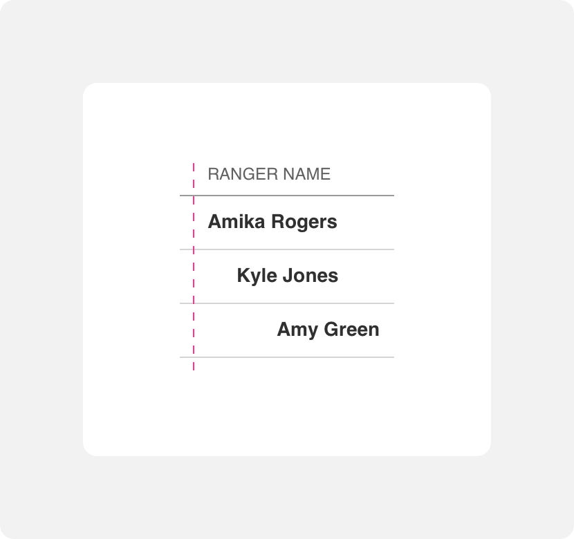
use different alignment within a column.
Headers
Headers are text labels that exist at the top of a table. Headers should be aligned with table columns so that users can easily scan the entire table based on the column sections.
Miscellaneous
Other components can be added to tables to provide greater context and allow users to manipulate the information presented so that they can find the information they need faster. These components include footers, chips, selection controls, buttons, icons, checkboxes, and sortable column headers.
Placement
Tables can be used wherever data needs to be organized. They can be used once on a page or they can make up an entire page.
General usage
Tables can be used to organize small or large amounts of data. In apps with dashboards, multiple data tables can be used alongside each other to display data that is related to a common theme. No matter where a table is placed, always ensure that there is adequate white space between the table and other components on the page to support visual hierarchy.
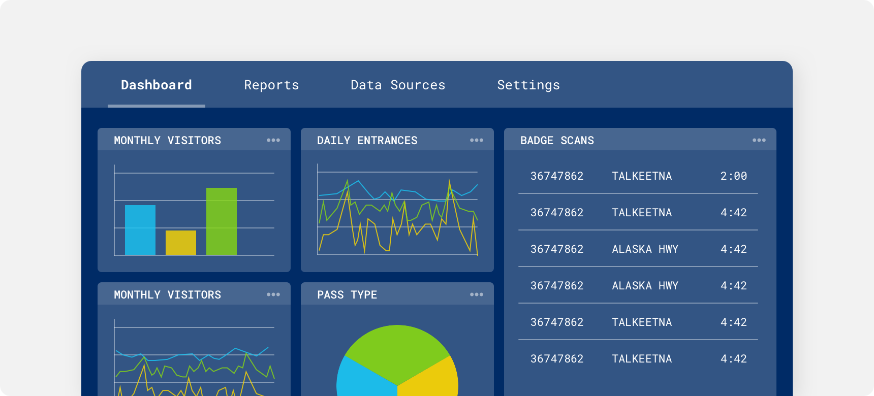
Tables within a dashboard.
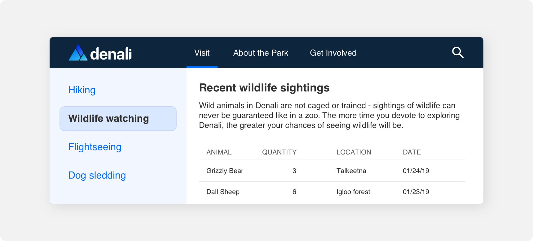
A table within a page.
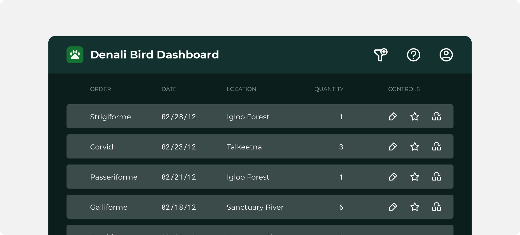
A page that is comprised of a large table.
Responsive behavior
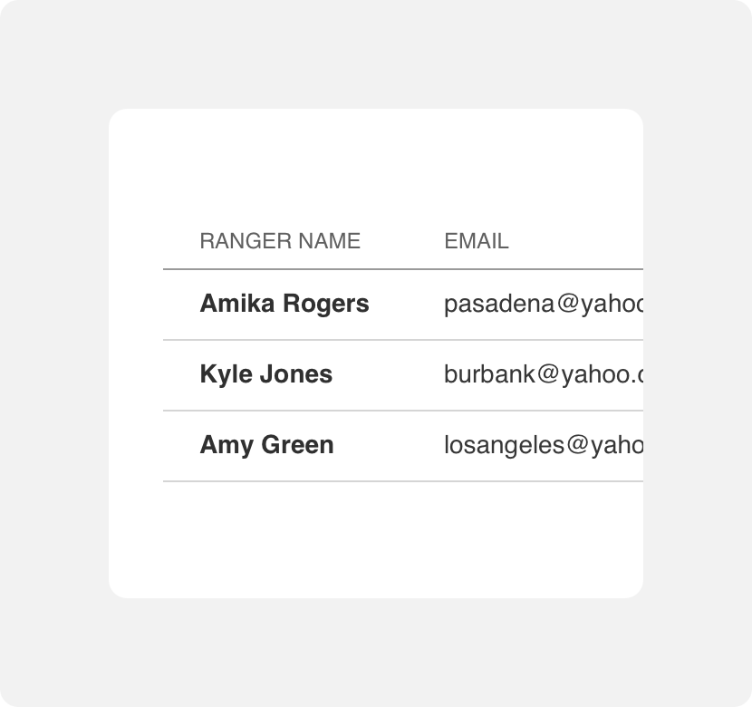
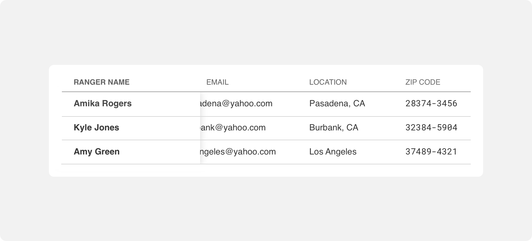
Data tables that contain large amounts of data per row can be made responsive with the addition of a “freeze” column. A freeze turns the first column of a table into a static section that the rest of the columns can scroll underneath. This allows users to horizontally scroll through the table without losing context.
Styles
Tables can be used wherever data needs to be organized. They can be used once on a page or they can make up an entire page.
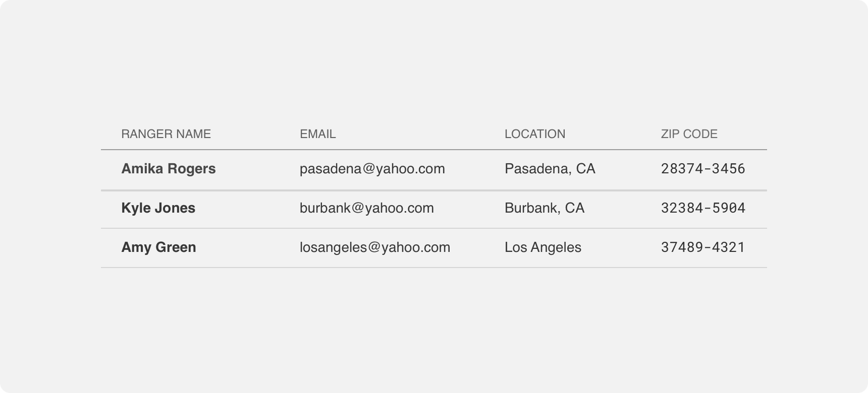
Standard
Standard tables present information in rows that are separated by a thin divider. Divider color and width should be kept light and thin so as to avoid bringing too much visual prominence to the divider. Columns in standard tables are indicated by white space and the alignment of the content in columns.
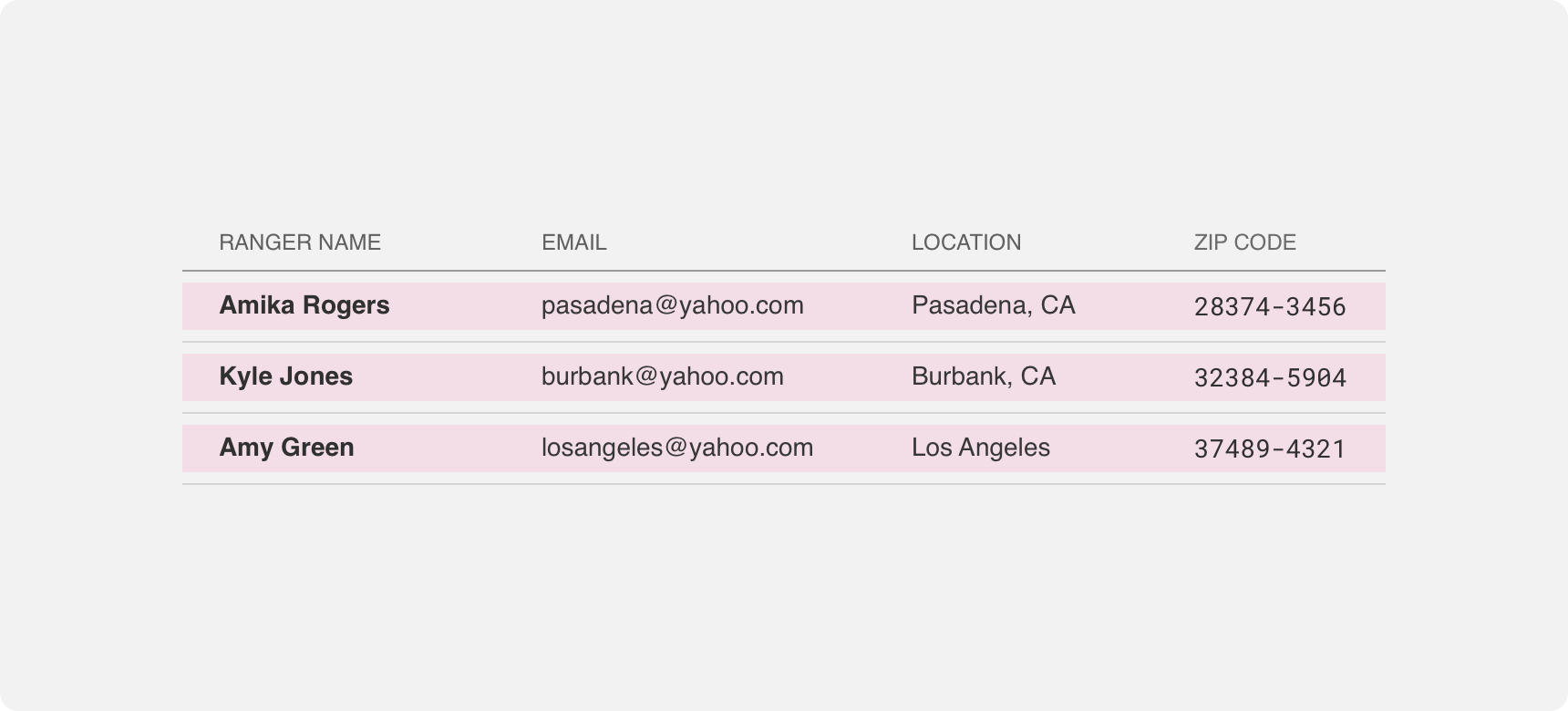
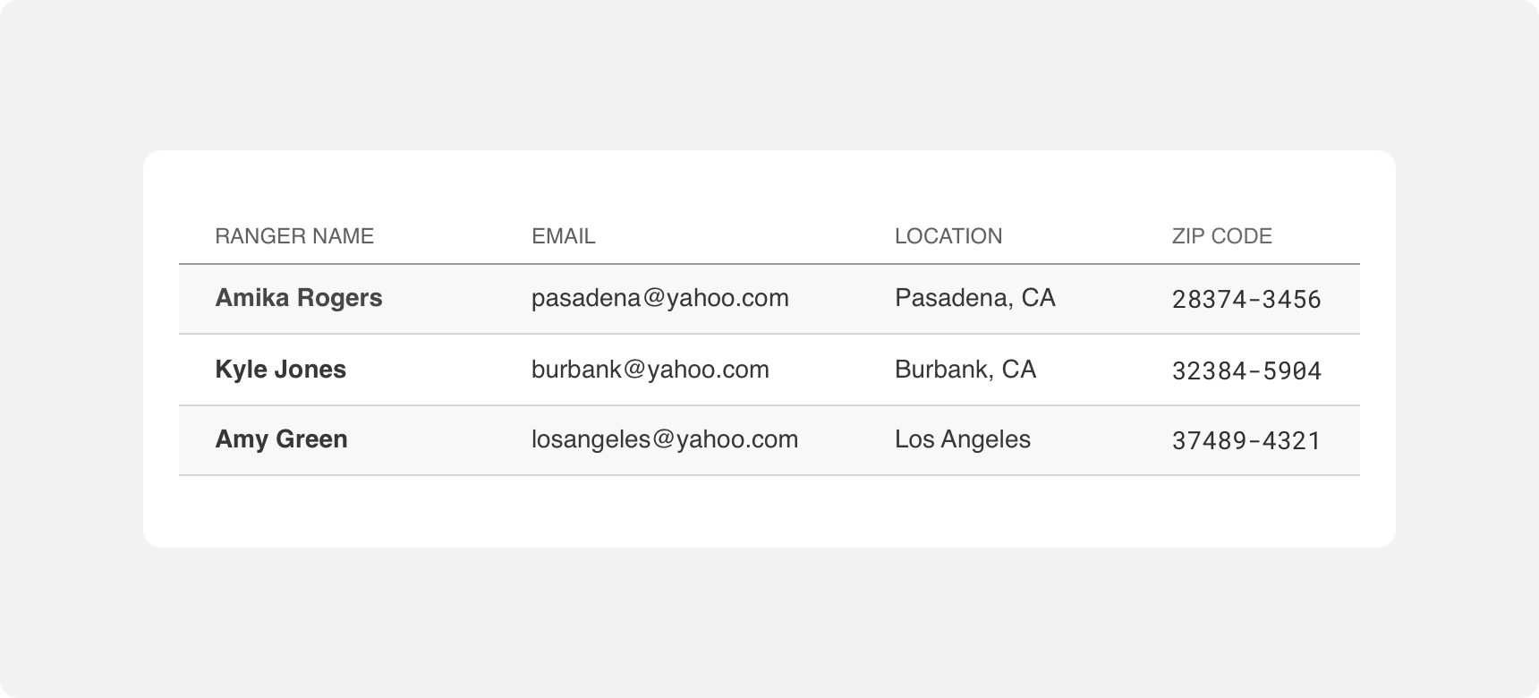
Striped
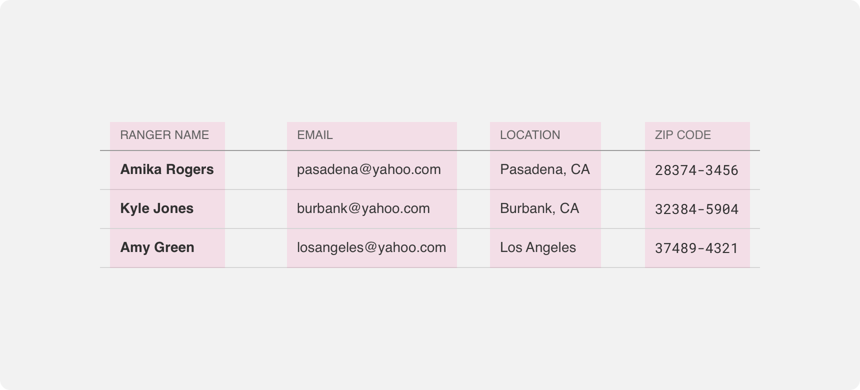
Striped tables present information in rows whose backgrounds alternate between filled and transparent. Filled background colors should be kept light so as to avoid bringing too much visual prominence to the background. Columns in striped tables are indicated by white space and the alignment of the content in columns.
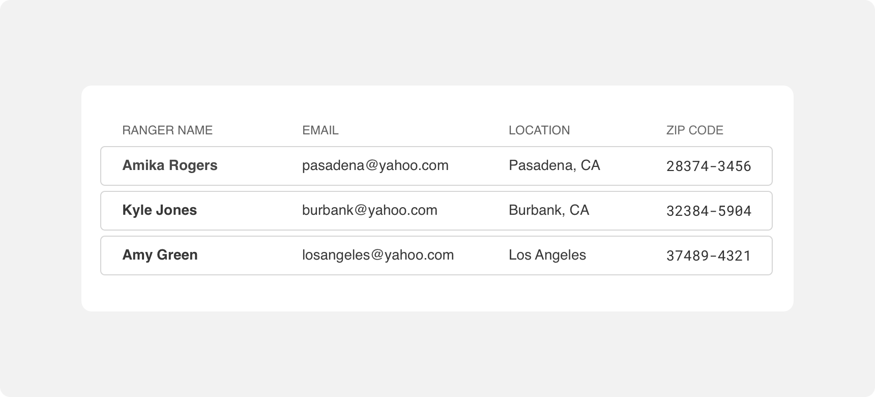
Cards
Card tables present information in rows that are clearly distinguished by either an outline or background fill. Unlike with striped tables, this styling is applied to each row in the table. Outlines should be kept light in color and thin in weight so as to avoid bringing too much visual prominence to the outline. Background fills should be kept light in color for the same reason. Columns in card tables are indicated by white space and the alignment of the content in columns.
Themeing
Denali’s components are completely themeable. This allows you to use our framework and adapt the visual style of Denali’s components to match your prodcut’s unique visual brand. Check out our guide to themeing with Denali to find out more.
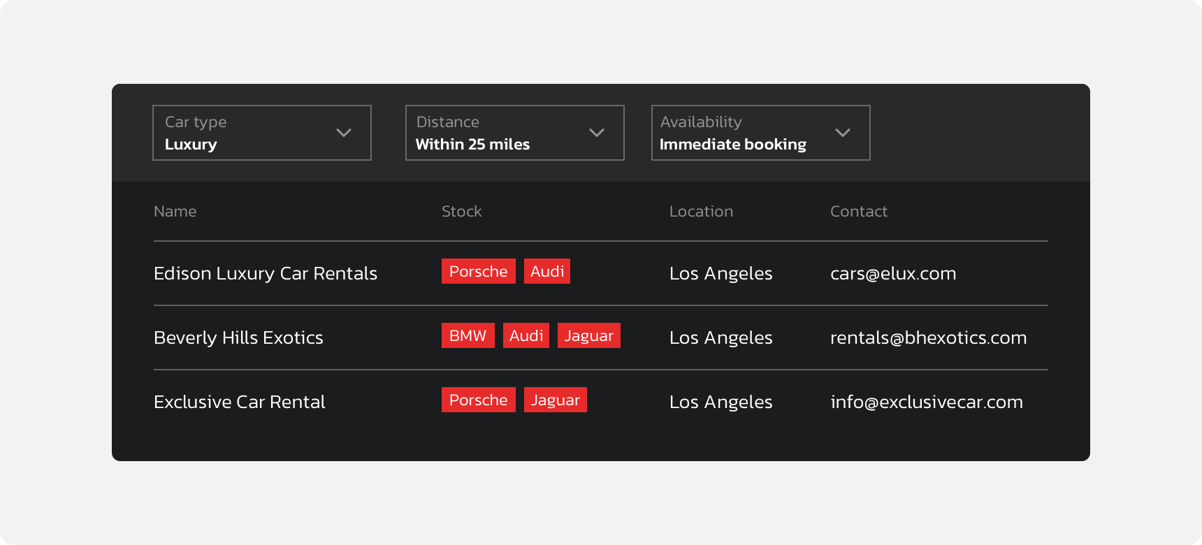
Dennit Racing Theme
Dennit Racing uses a customized Denali theme that aligns visually with their brand. Dennit’s table features custom type, headers, and rows.
For all variables visit the CSS documentation page for tables.