Breadcrumbs
Breadcrumbs are a wayfinding element used to help users understand the hierarchical structure of an app with many levels. They provide users with a sense of place that indicates how they got to where they are as well as quick shortcuts that allow them to return from where they came.
Developer Docs
Foundation
Breadcrumbs are a horizontal line of clickable links or “breadcrumbs” that represent the different levels of hierarchy a user has traveled within an app. The breadcrumbs are separated by dividers to indicate that each breadcrumb represents a different page.
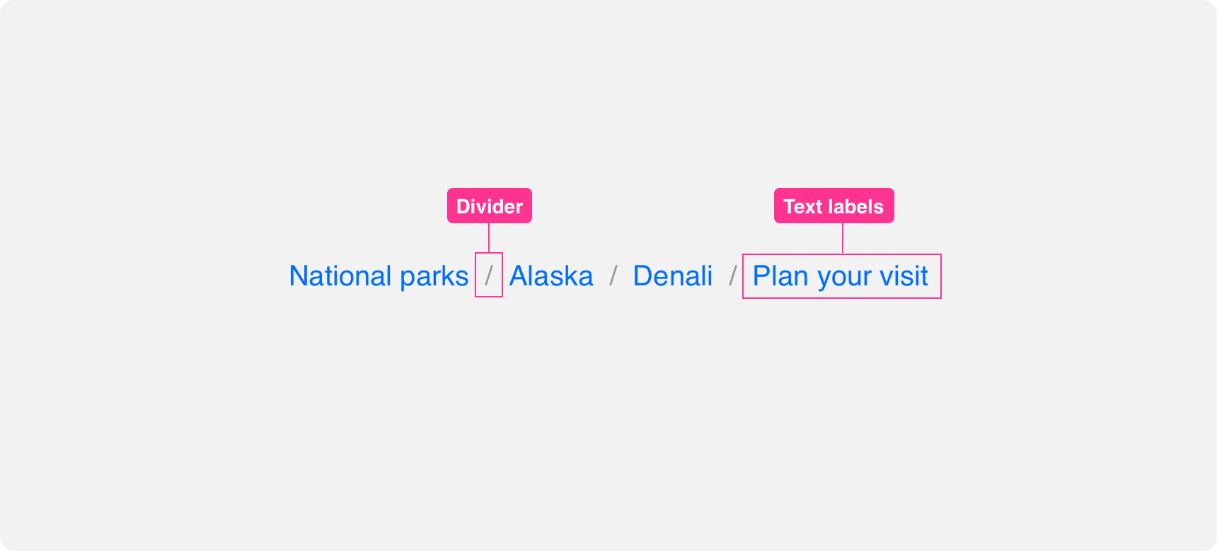
Text Labels
The “breadcrumbs” of a breadcrumb are the text labels that describe the hierarchy levels. The first breadcrumb represents the parent level. From there, a new label or breadcrumb is added to represent the user’s progression to the current page. Each breadcrumb is a clickable link that can quickly bring the user back to that level within the app.

list the current page in a breadcrumnb as text instead of a link.

list the current page in a breadcrumb as a link.
The last breadcrumb can represent the current page the user is on or the level that comes just before it. We recommend using the last label to represent the level before the current page because the page title on the current page can relay that information better than a breadcrumb can. If you chose to display the current page as part of the breadcrumb, that breadcrumb should not be clickable.

Breadcrumbs are a streamlined representation of hierarchical levels. Try to keep text labels short and descriptive. A breadcrumb’s label doesn’t always have to be the same as the level’s page title if it makes sense to name it something shorter and descriptive.
[Illustration of an example of this]
Dividers
Breadcrumbs levels are differentiated using dividers. Forward facing slashes are the default dividers but they can be replaced with chevrons or similar directional icons if desired. Dividers should not be clickable to avoid visual confusion.
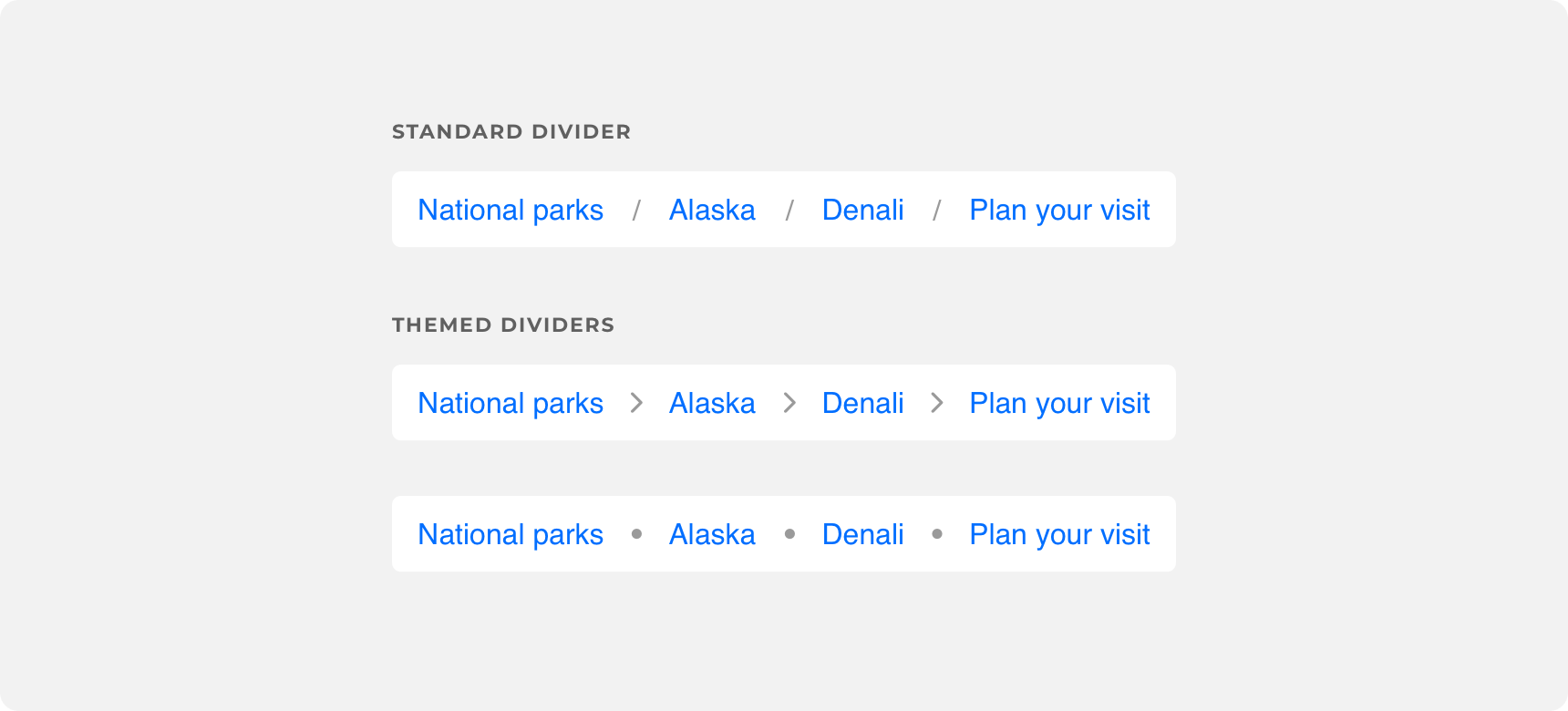
Check out Denali's Themeable Guide for more information on customizing breadcrumb dividers
Ellipses menu
Breadcrumbs should always appear as a horizontal line. If space does not allow for the entire breadcrumb to be displayed, the breadcrumb should not wrap. Instead, truncate the breadcrumb by placing an ellipses between the parent level and previous level. Hovering over the ellipses should trigger a menu containing the links that were truncated.

Placement
General usage
A breadcrumb is a tertiary level of navigation. As such, it should exist at the top of the page, where users are trained to look for wayfinding information, but beneath the main navigation component. In simplest use cases this is usually underneath the nav bar but above the page title.

place a breadcrumb underneath the main navigation component, above the page’s content.

place breadcrumb within a page’s content.
A breadcrumb can not exist as the sole form of navigation on a page and it should never be used in place of a primary navigation component such as a nav bar. Breadcrumbs should always be used in conjunction with primary or secondary navigation to better express to the user their location within the app.

Theming
Denali’s components are completely themeable. This allows you to use our framework and adapt the visual style of Denali’s components to match your prodcut’s unique visual brand. Check out our guide to themeing with Denali to find out more.
For all variables visit the CSS documentation page for breadcrumbs.
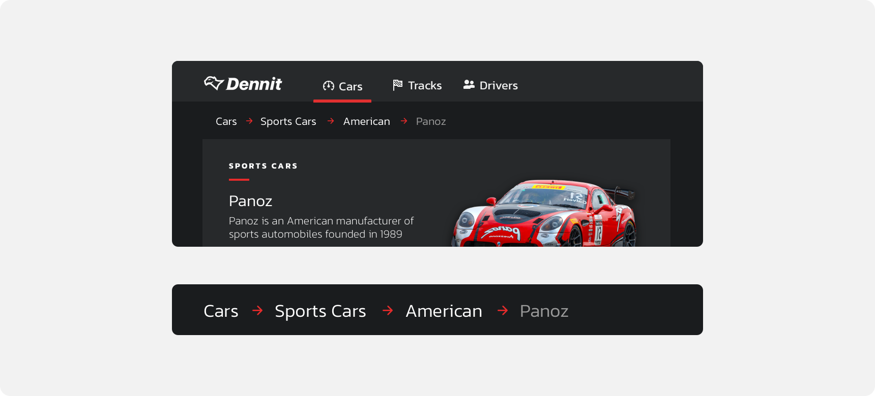
Dennit Racing Theme
Dennit Racing uses a customized Denali theme that aligns visually with their brand. Dennit’s breadcrumbs feature custom type, dividers, divider color, and links.