Alerts
Alerts provide users with information and to notify them of actions that need to be taken. Denali categorizes alerts into 3 distinct types notification, block, or inline with specific use cases for each.
Developer Docs
Foundation
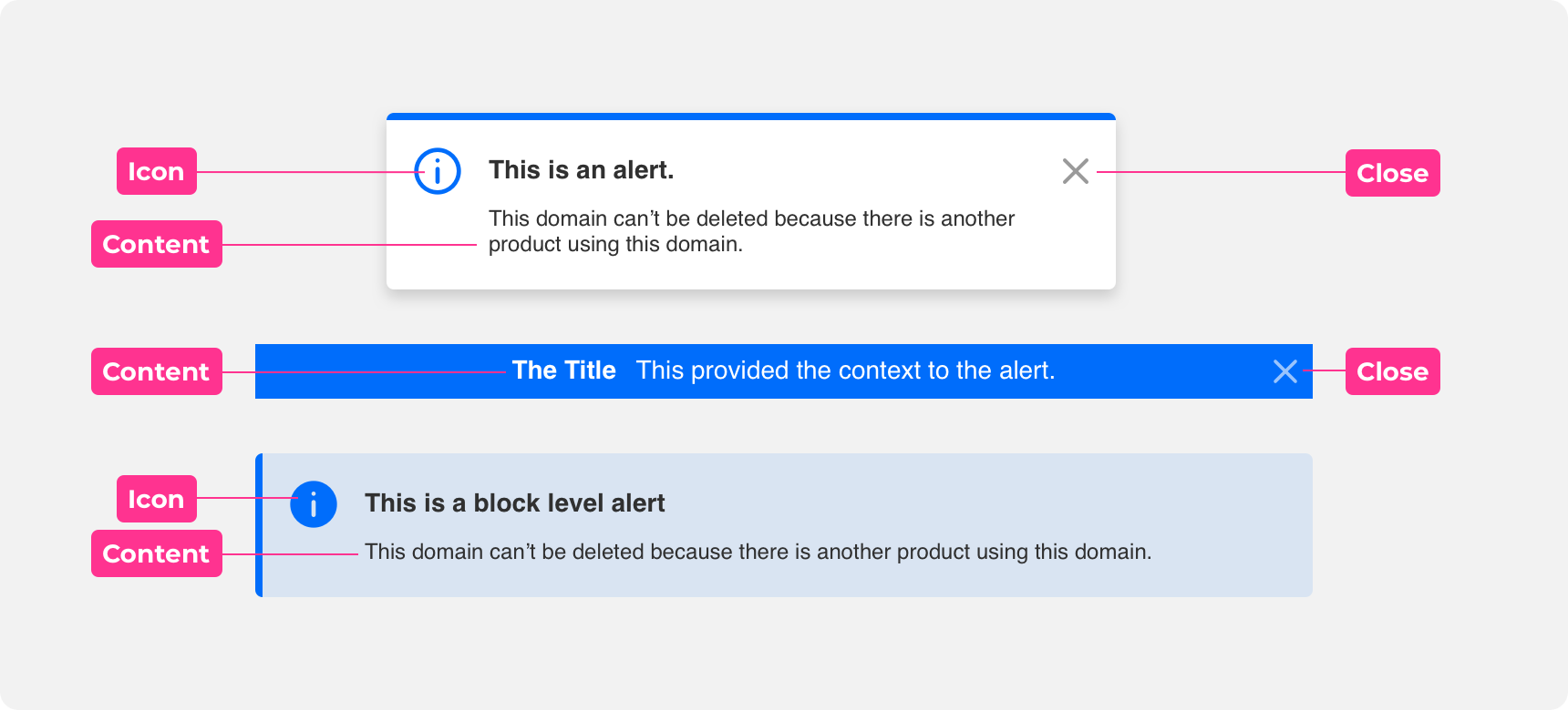
Icon
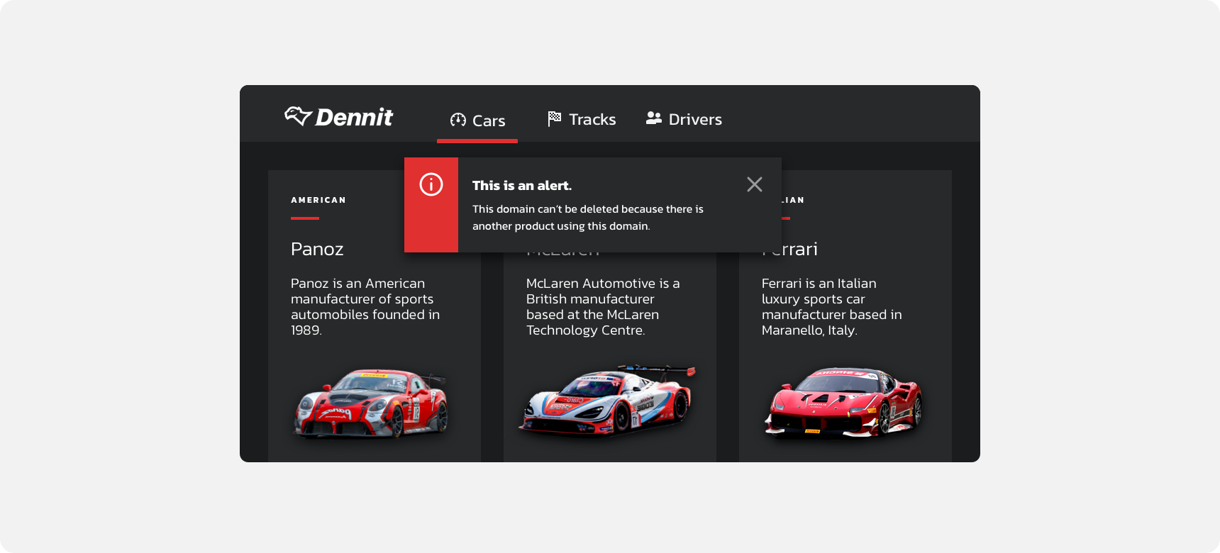
Icons can be used as supporting illustrations to supplement the message and help commicate meaning for alerts. They should be used in unison with the alerts content.
Content
Content is used to communicates a change or error within an alert or notificiation. This content can vary, but usually contains a title and description. These do not have to live in unison, but one or the other are required to provided context to the users.
Close
The close button is located in the top right corner of alerts and notifications. Close buttons are only present when alerts are dismissable and are used to clear alerts and notifications that have been read.
Types
Static
Static alerts are informational in nature. They appear by default and are not dismissable. We suggest using inline or block level style alerts for static alerts as they fit alongside the content they are referencing.
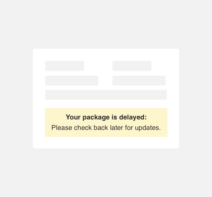
use a block level alert below a delivery tracking element notifying a user that their order delivery is behind schedule.
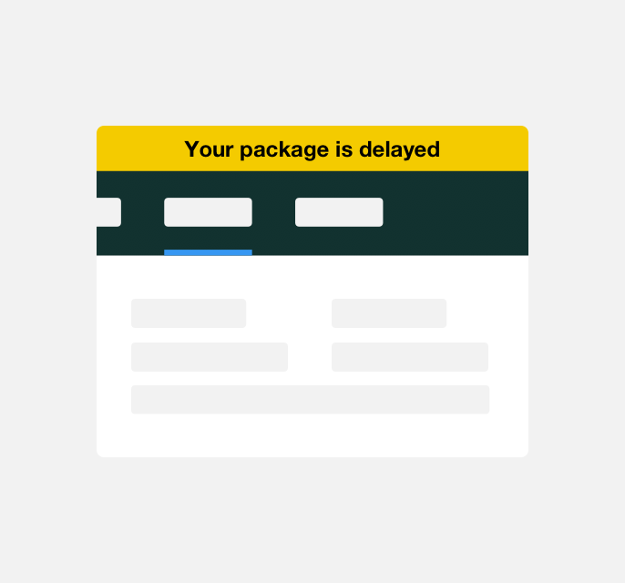
use a inline style alert above the element to notify a user that their package is behind schedule.
Notification
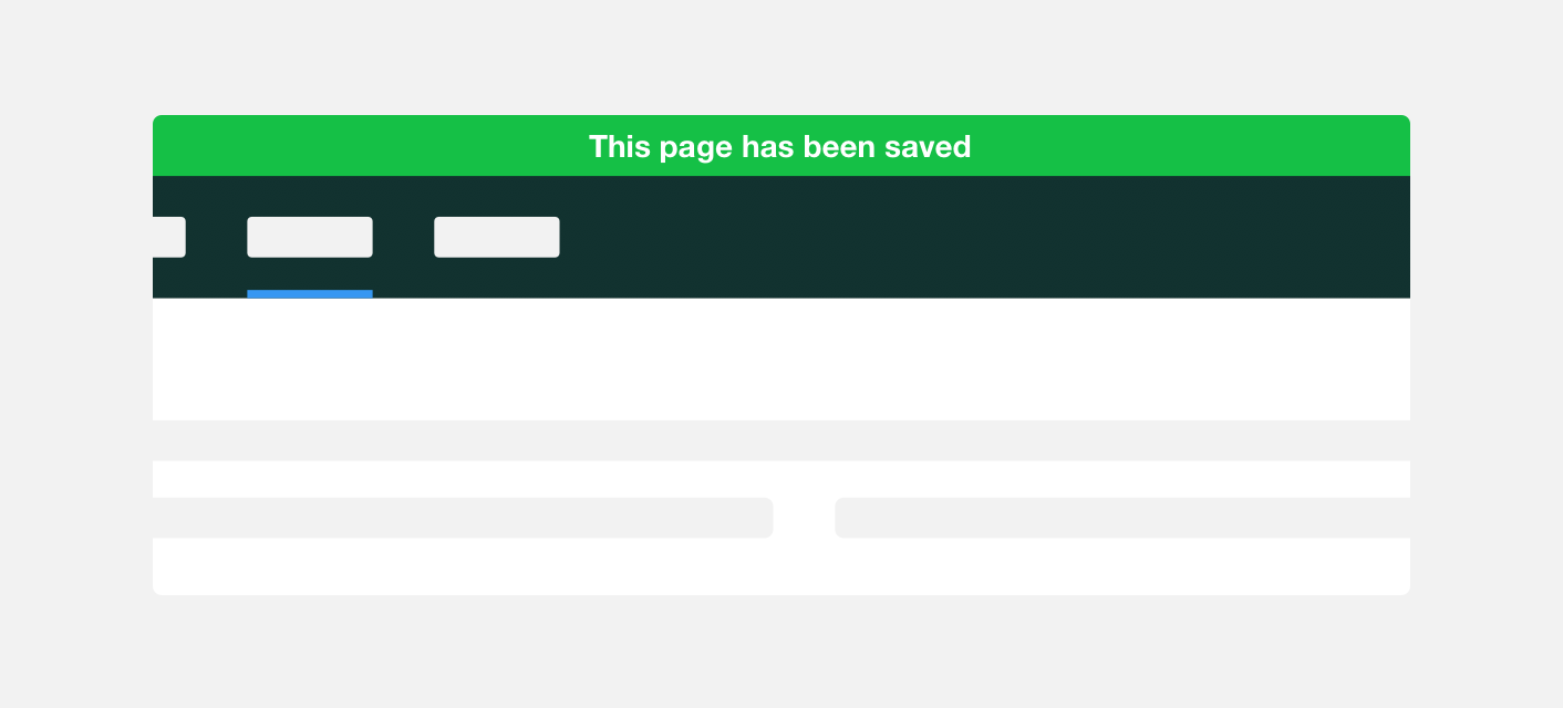
Notification alerts are informational in nature and appear immediately in response to an action a user has taken. Notification alerts are dismissed on their own after a period of 3-5 seconds. We recommend using notification style alerts for notification alerts as they call attention to themselves by appearing on top of all other elements on a page.
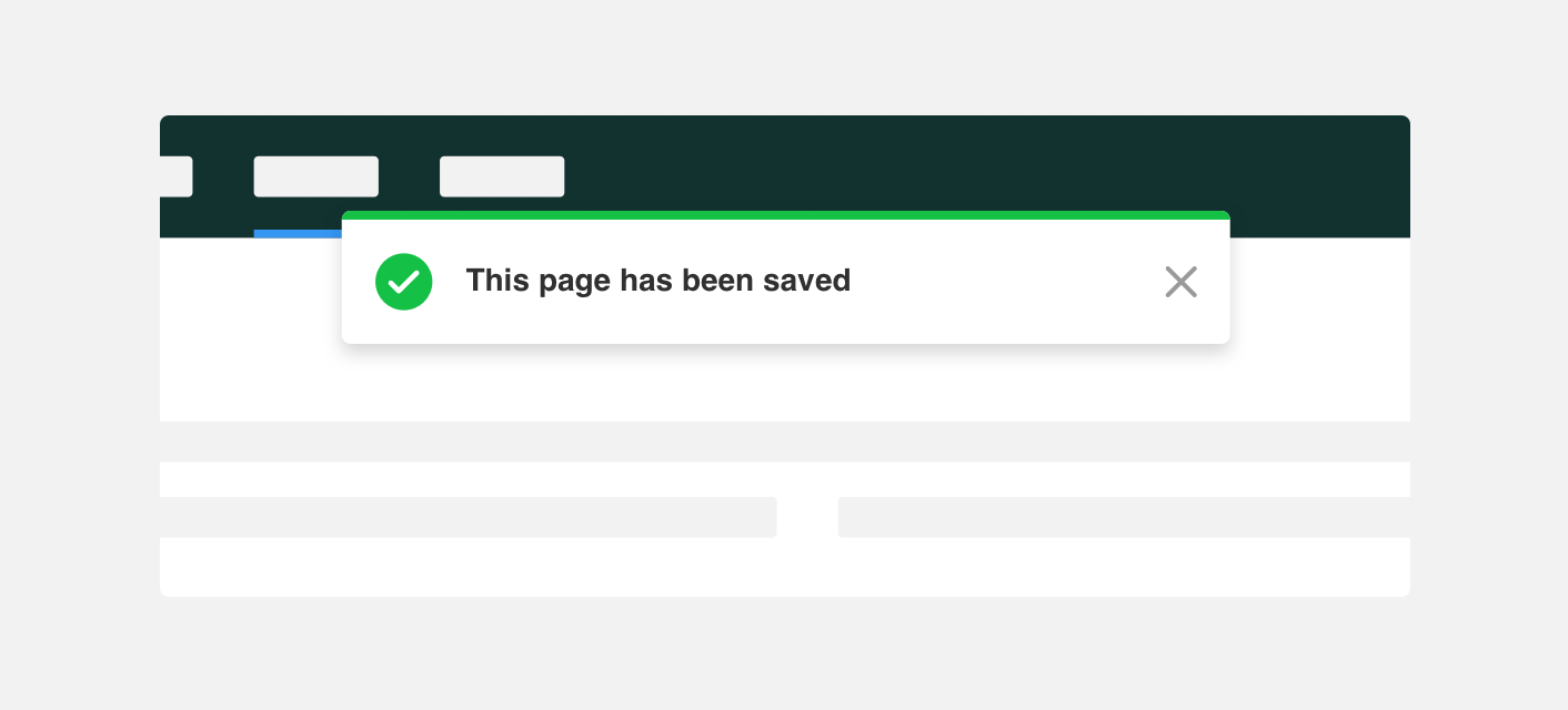
use a notification style alert to notify a user that changes they made to a page have been saved, immediately after they select the save button.
use an inline style alert to notify a user that changes they made to a page have been saved.
Placement
Alerts can be placed in a few locations depending on the objective of the alert. They can be fixed, displayed temporarily, or scroll with content, but this depends on the context usually defined as global or local type.
Global
Inline alerts reference information pertaining to an entire system or application. For this reason we recommend placing global alerts at the top of the application screen. We suggest using inline or notification alerts as global alerts as they appear at the top of the screen and visually encompass the entirety of the system or application they are applied to.
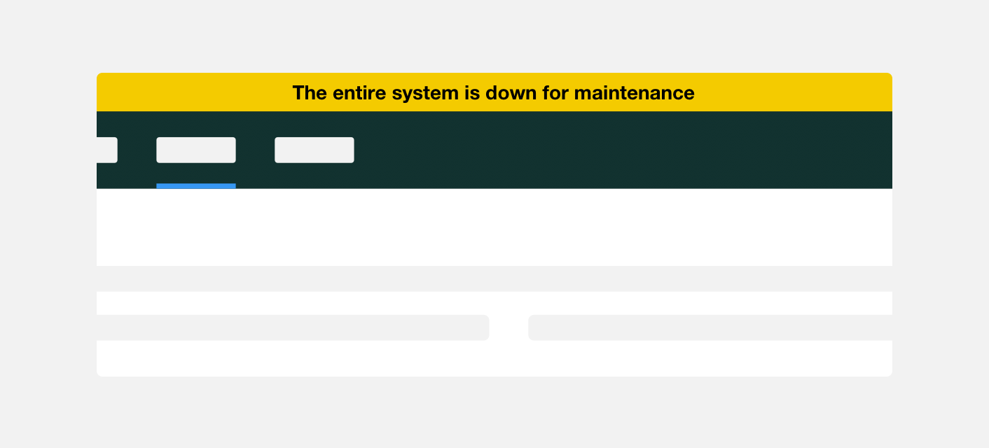
use an inline alert throughout a site to notify users that the entire system is down for maintenance.
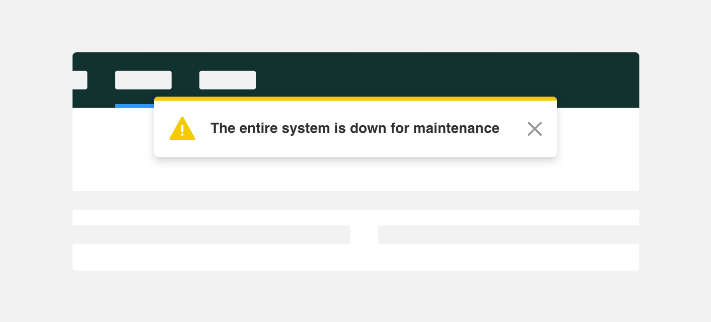
use notifications style alert on the landing page of a site to notify users that the entire system is down for maintenance.
Local
Local alerts contain information specific to an element on the page and are located in close proximity to that element. We suggest using block level or text style alerts as local alerts as they can be placed next to the elements they are referencing.
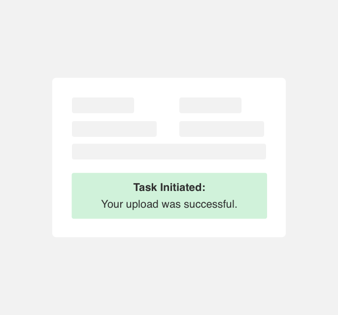
use block level alerts adjacent to an upload form to notify a user that their upload was successful.

use an inline alert to notify a user that their upload was successful.
Themeing
Denali’s components are completely themeable. This allows you to use our framework and adapt the visual style of Denali’s components to match your prodcut’s unique visual brand. Check out our guide to themeing with Denali to find out more.
Dennit Racing Theme
Dennit Racing uses a customized Denali theme that aligns visually with their brand. Dennit’s alerts feature custom color, type, and cornder radius.
For all variables visit the CSS documentation page for alerts.