Tags
Tags display descriptive text information. They come in solid, outline, and selectable styles. Tags can be grouped into scrolling or wrapping lists. Icons can also be added to tags.
Developer Docs
Foundation
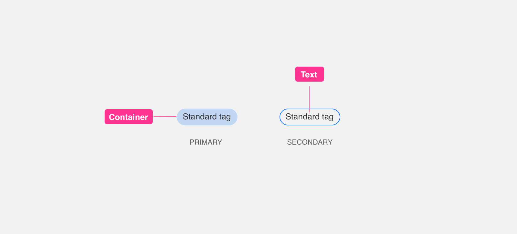
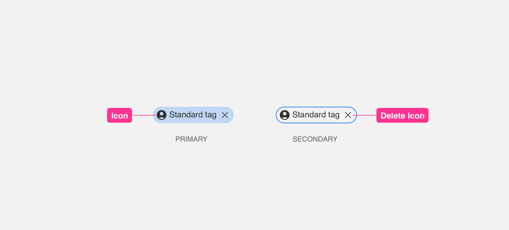
Tags are made up of a container and text. Optionally, you can include both a descriptive icon and remove icon where desired.
Required
A container is used to house all the elements in the tag. We currently offer containers in a solid and outlined version. Names, descriptions, actions can all be expressed with the text.
Optional
Icons can be included to tag to add clear visual understanding to the tags. Delete icons can also be used inside of tags.
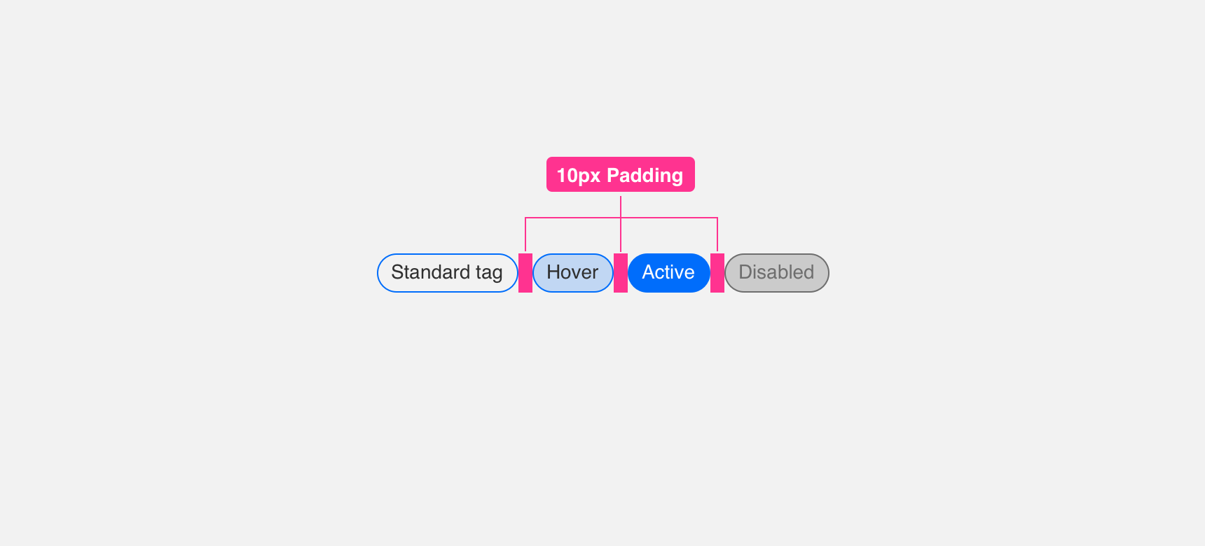
Padding
In order to maintain visual balance, we recommend giving a minimum 40px padding between the tabs.
Placement
General usage
Tags can primarily be used, but not limited to the following scenarios: As an input tag to visually represent what a user has added to a search input. Choice Tags that allow users to select 1 or many options presented. Similarly to Choice Tags, you can use Tags as a way for users to filter between options
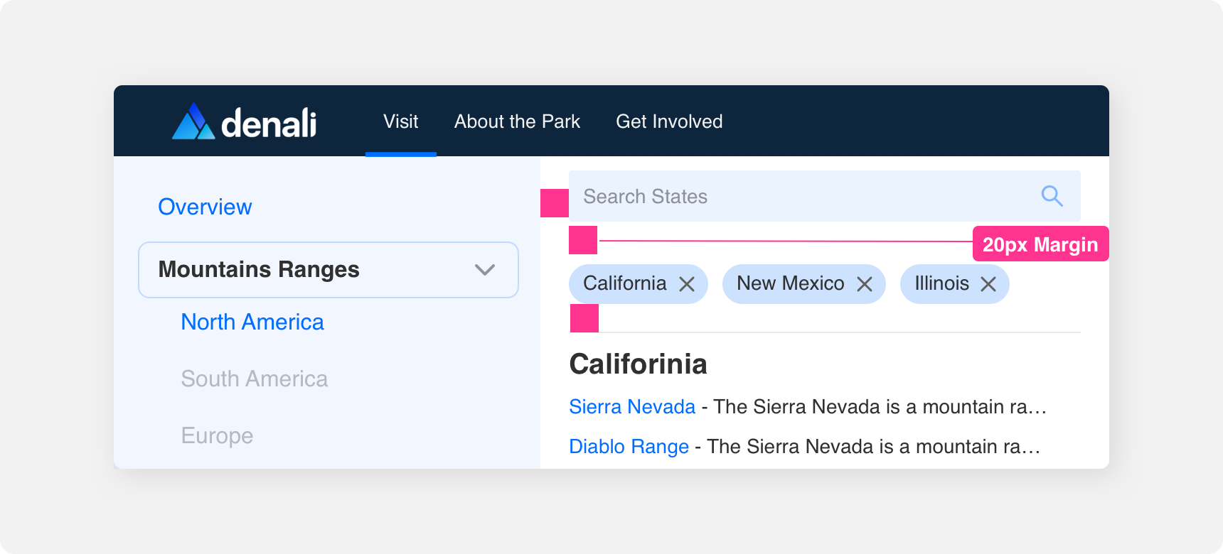
Margin
Adequate margins between Tag component and other components is important to maintaining discoverability and scannability. We recommend maintaining a minimum 20 pixel margin between Tabs and other components.
Themeing
Denali’s components are completely themeable. This allows you to use our framework and adapt the visual style of Denali’s components to match your prodcut’s unique visual brand. Check out our guide to themeing with Denali to find out more.
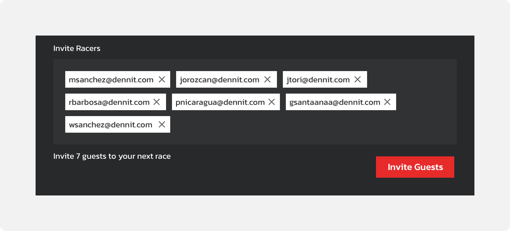
Dennit Racing Theme
Dennit Racing uses a customized Denali theme that aligns visually with their brand. Dennit’s List features custom type, color and icon theming.
For all variables visit the CSS documentation page for tags.