Tabs
Tabs are a navigation component that allow users to move between different screens and data sets. Another way to think of Tabs is like the tabs within a paper folder that allow you to organize files. They are available in primary and secondary styles.
Developer Docs
Foundation
Depending on your use of Primary or Secondary Tabs, the foundation elements can vary, but all do contain Body Copy.
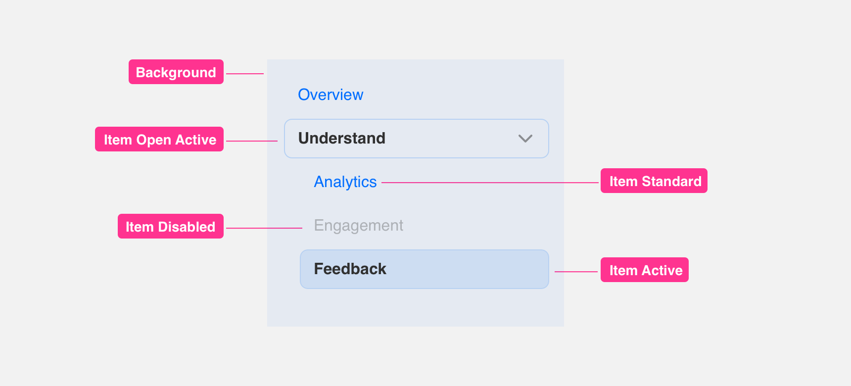
Primary
Primary Tabs are placed within a container. The active state is styled in black with a white tab like border around it. Inactive Tabs are colored with the primary color of the brand at a 50% opacity. Disabled tabs use the same styling as any disabled text.
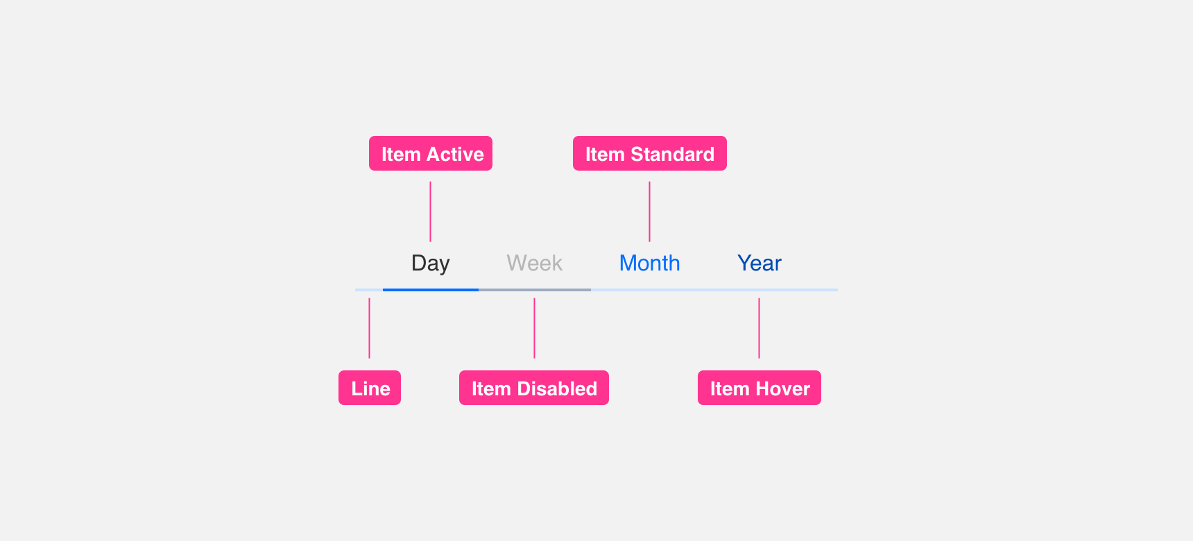
Secondary
Secondary Tabs do not utilize a background and are maintained above a line divider in the color or the brand at 50% opacity. The active state is styled in black with a brand colored line to add visual hierarchy. Inactive Tabs are colored with the primary color of the brand at a 50% opacity. Disabled tabs use the same styling as any disabled text.
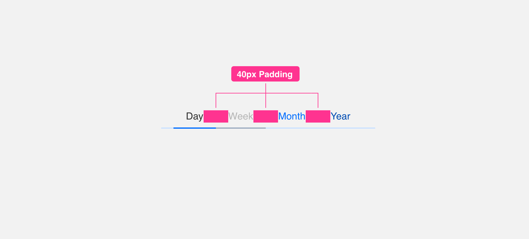
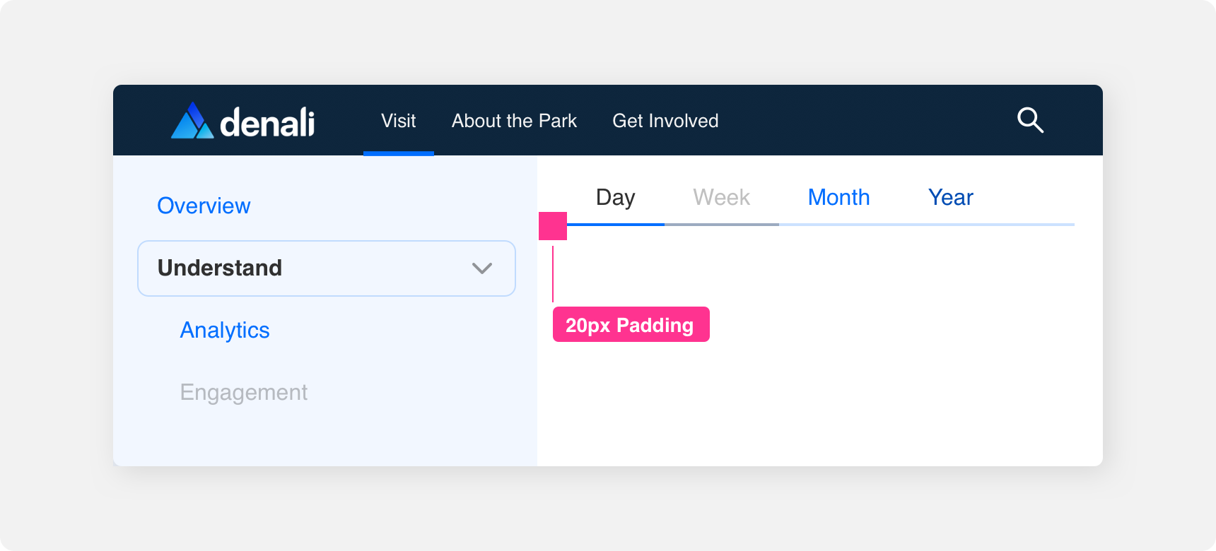
Padding
In order to maintain visual balance, we recommend giving a minimum 40px padding between the tabs.
Placement
General usage
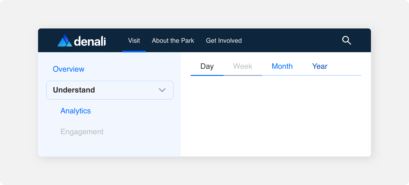
Tabs are generally, but not limited to being used at the top of a UI right under the Navigation Bar. Alternatively, Tabs can be utilized within a Card component.
Margin
Adequate margins between Tab component and other components is important to maintaining discoverability and scannability. We recommend maintaining a minimum 20 pixel margin between Tabs and other components.
Themeing
Denali’s components are completely themeable. This allows you to use our framework and adapt the visual style of Denali’s components to match your prodcut’s unique visual brand. Check out our guide to themeing with Denali to find out more.
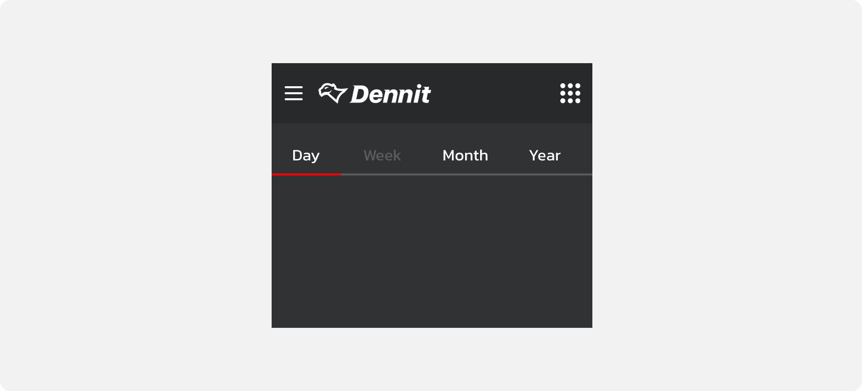
Dennit Racing Theme
Dennit Racing uses a customized Denali theme that aligns visually with their brand. Dennit’s List features custom type and color theming.
For all variables visit the CSS documentation page for tabs.