Chips
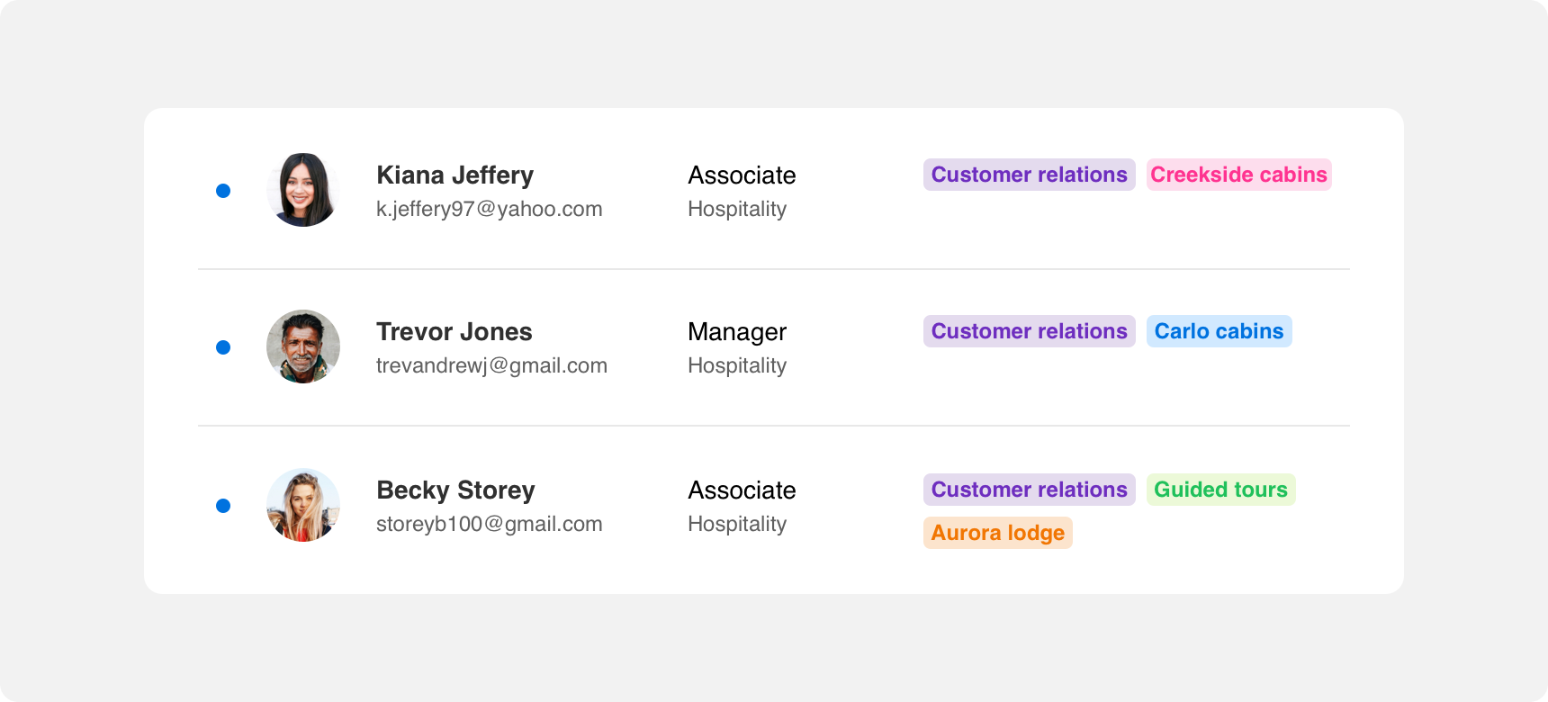
Chips are used to highlight small bits of information that are relevant to featured content on the same page. Generally, chips are small in size because they are tertiary components intended to support main content. Their small size allows them to convey information without taking up too much space or visual prominence on a page.
Developer Docs
Foundation
Chips are a simple component consisting only of a container and text label.
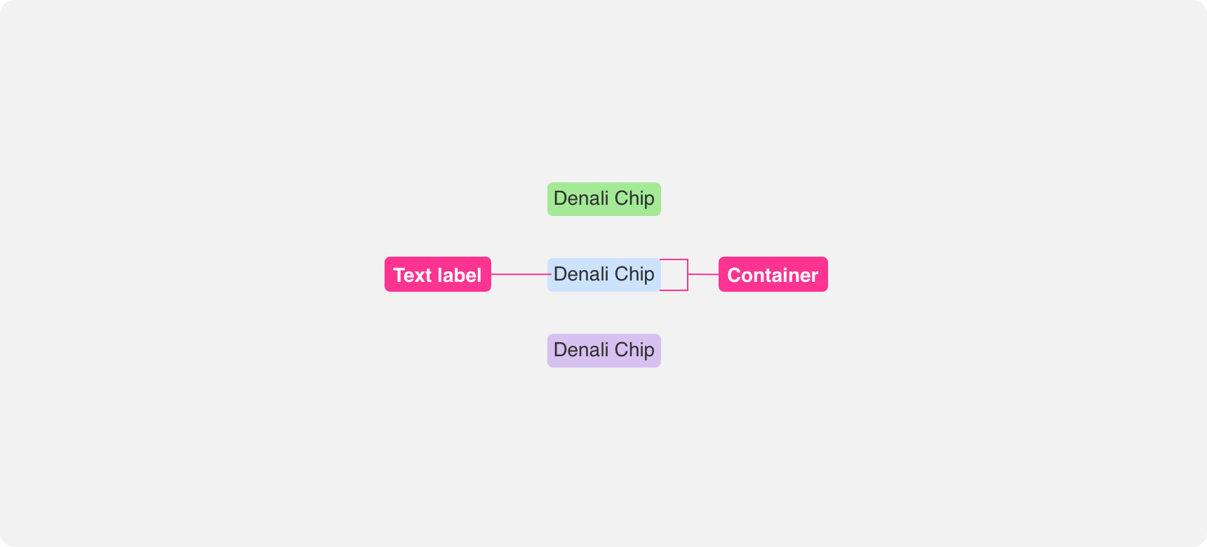
Container
Chips are defined by small containers. This allows them to convey information without taking up too much space.
If you want to give greater visual prominence to a chip we recommend giving the container a background color that stands out rather than sizing up the chip. If color alone is not sufficient to provide visual prominence, consider whether your information should be displayed using a different component entirely.
use color to give chips greater visual prominence.

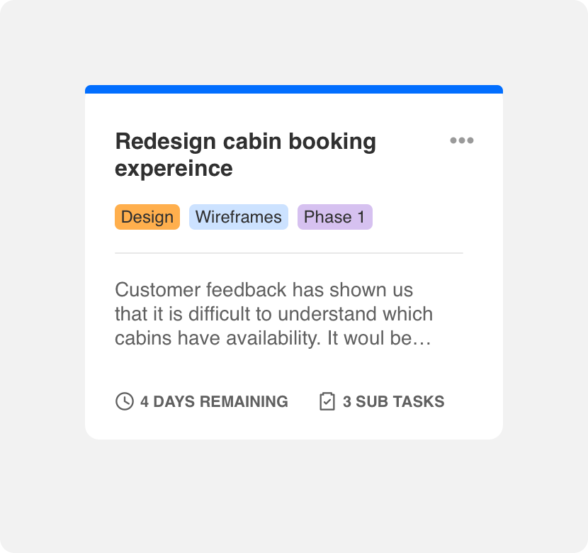
make chips larger than the content they support as they are meant to be tertiary components.
Text label
The text label within a container relays tertiary information pertaining to other content it is closest too. Labels should be kept short and to the point. We recommend breaking up descriptive information into multiple chips rather than trying to fit a full sentence in a chip. If you can’t convey your information using concise labels, consider whether a different component is better suited to your needs.
use multiple chips with concise labels to describe something.
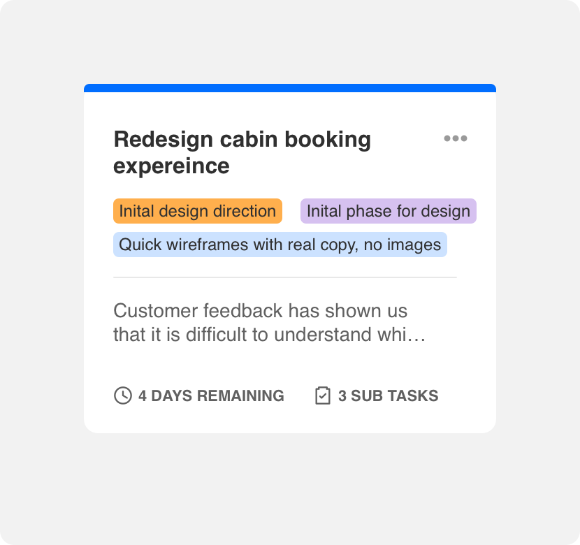
use lengthy descriptions within a chip.
Padding
Text labels are surrounded by even padding on all sides to ensure legibility and provide visual balance. Padding around the container should be kept tight enough that the chips can fit within small spaces but wide enough to support legibility.
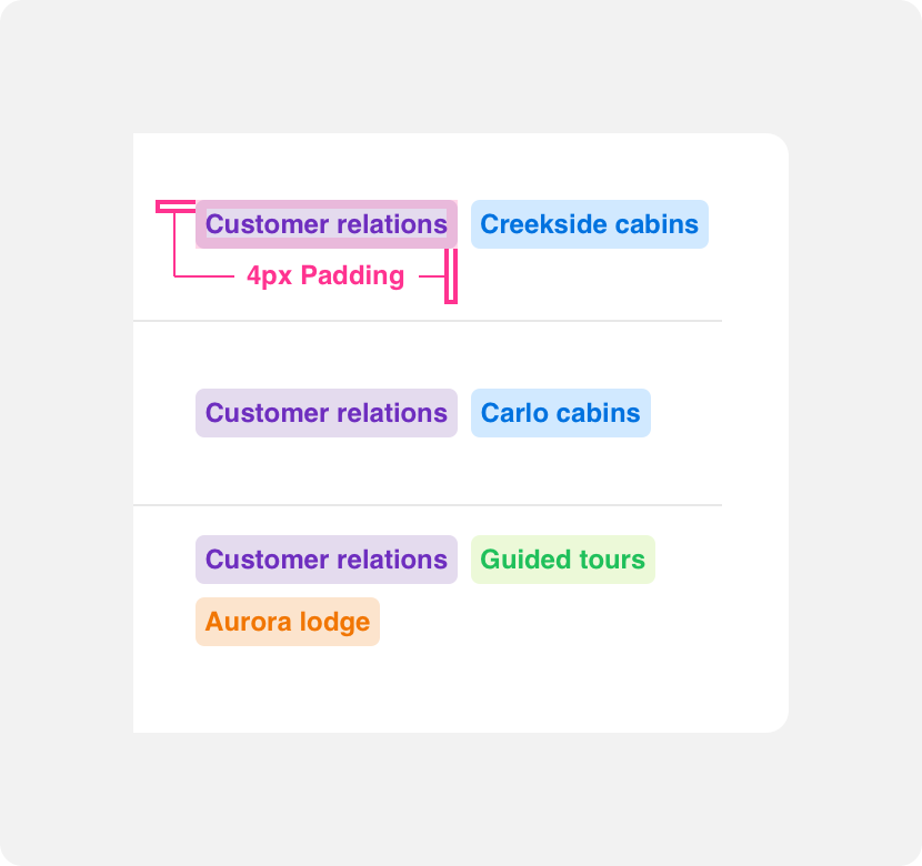
provide chips with enough padding to be legible.
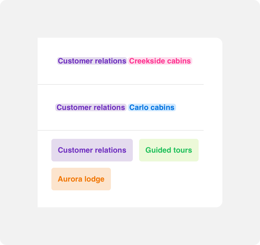
provide chips with so little padding that they are illegible or too much padding that the container size becomes too large.
Placement
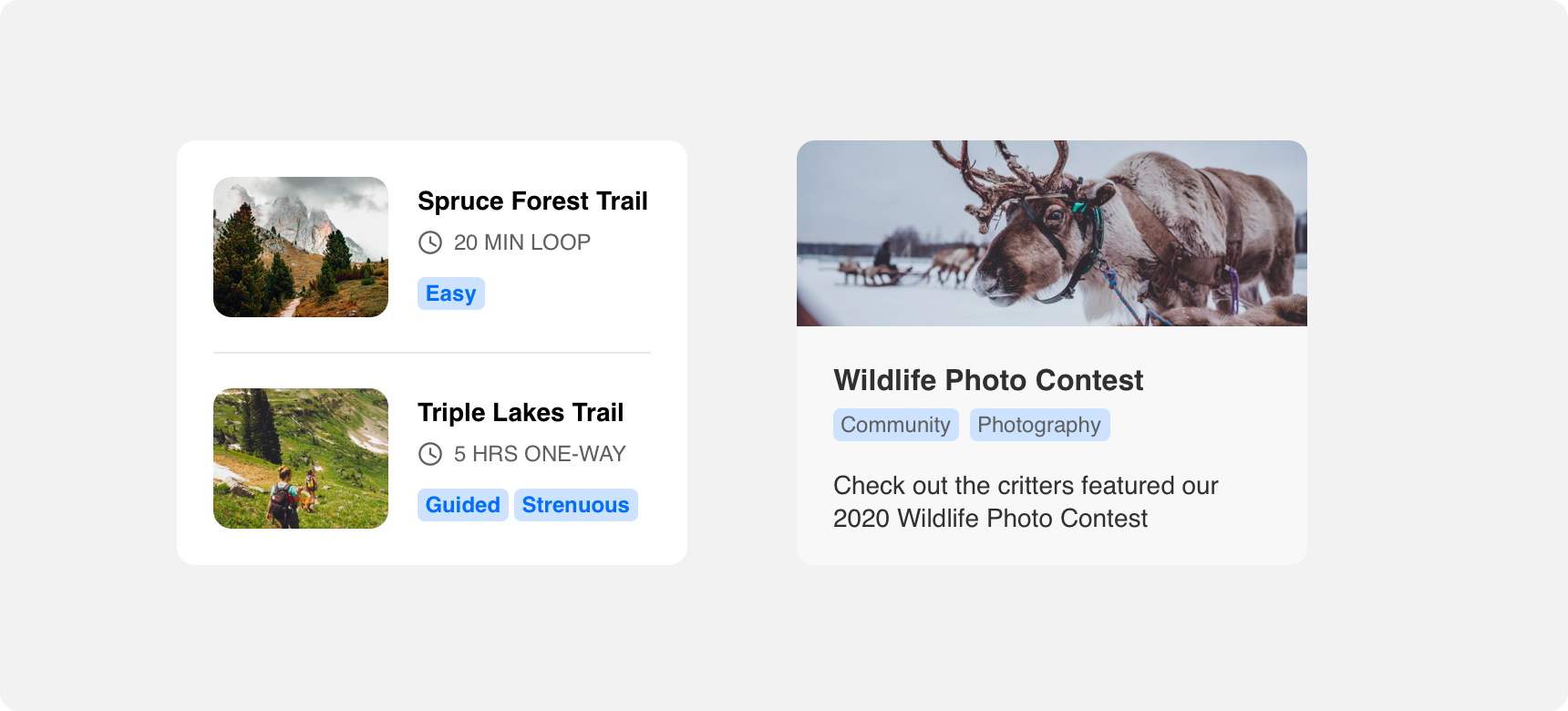
Chips can be placed wherever the main content they are supporting can be placed.
General usage
So long as chips are kept in close proximity to the content they are supporting, the placement of chips around that content is very flexible. Keeping chips in close proximity to the content they support is important because it allows users to make the connection between the two.
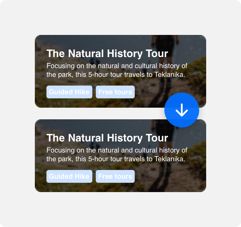
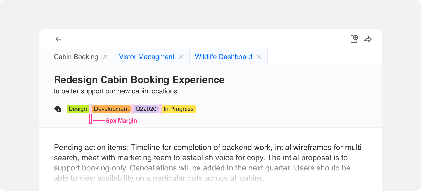
Margins
Always provide adequate margins around and between chips to support visual hierarchy and balance. We recommend a minimum 6 pixel margin between boxes and other elements, however this can be adjusted based on page density.
Themeing
Denali’s components are completely themeable. This allows you to use our framework and adapt the visual style of Denali’s components to match your prodcut’s unique visual brand. Check out our guide to themeing with Denali to find out more.
For all variables visit the CSS documentation page for chips.
Dennit Racing Theme
Dennit Racing uses a customized Denali theme that aligns visually with their brand. Dennit’s chips feature custom type, background, border radius, and border color theming.