Responsive Grid
Denali’s responsive grid allows content to adapt seamlessly to different screen sizes. The grid is based on a 12 column grid and is comprised of margins, columns, rows, and gutters. These components adjust automatically at predetermined breakpoints.
Breakpoints
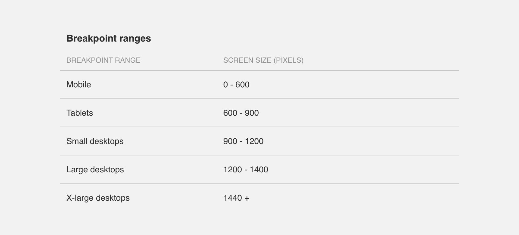
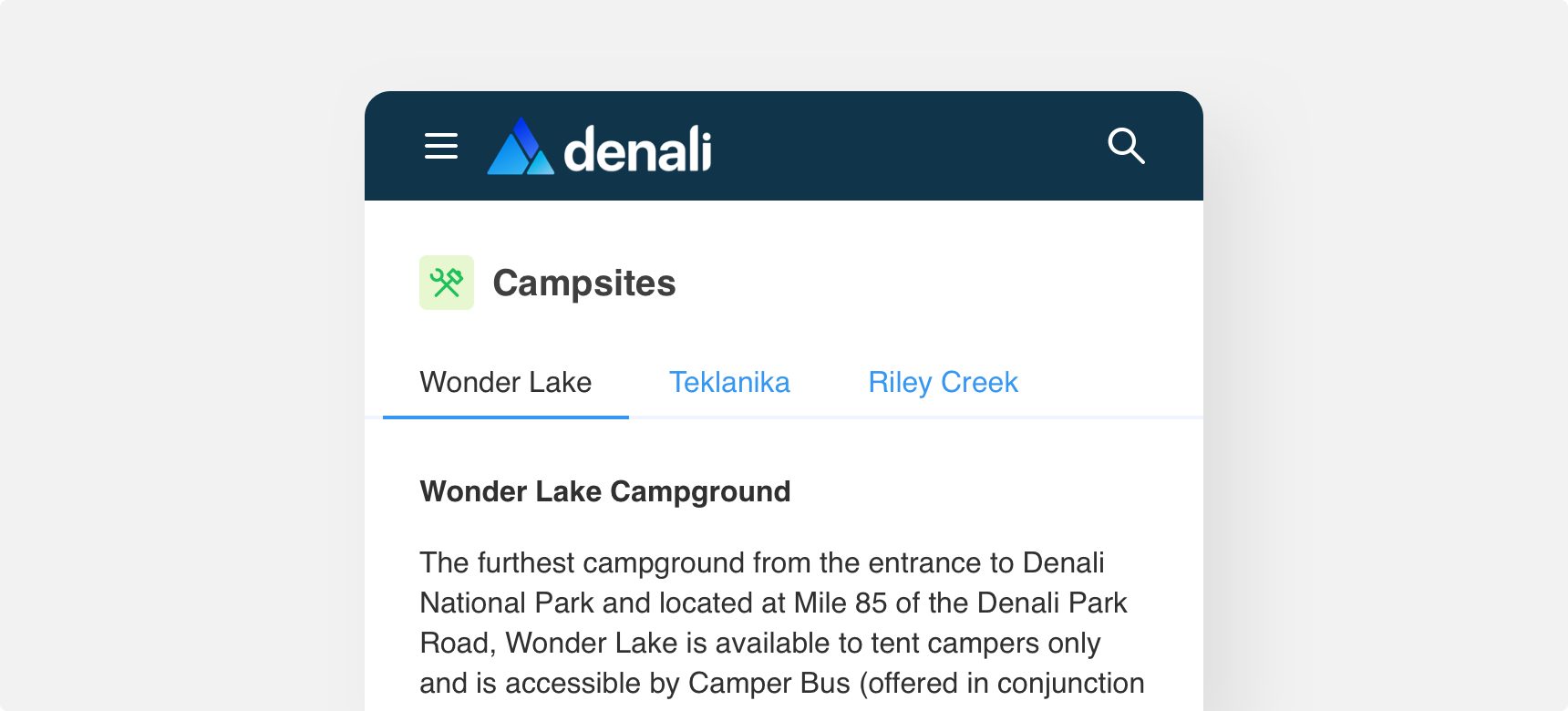
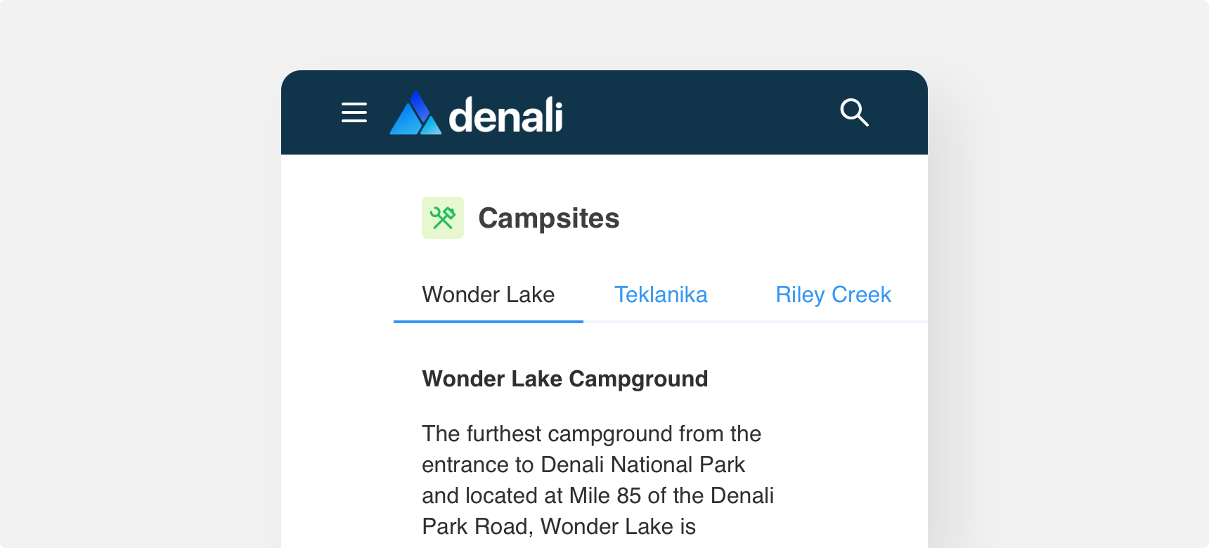
A breakpoint is the point at which an interface’s layout will adjust to fit a given screen size. In order to adapt to as many screen sizes as possible, Denali groups breakpoints into the following “breakpoint ranges”: mobile, tablet, small desktop, large desktop, and x-large screen.
Breakpoint Ranges
The number of columns that are displayed, as well as margin and gutter widths, is different at each breakpoint range. We recommend designing for the smallest screen size in each breakpoint range. This ensures that your design will scale up and down seamlessly to fit the range’s lower and upper limits.
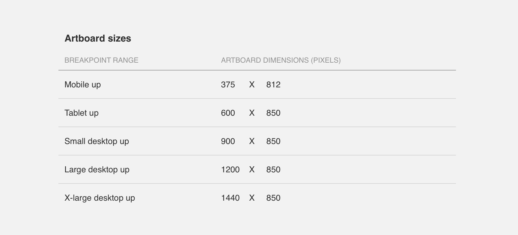
Artboard Sizes
We recommend the following artboard sizes when designing for each breakpoint range:
Containers
Containers refer to the (often invisible) bounding boxes that contain an interface’s content.
Basic
Denali’s basic containers maintain a fixed width at every breakpoint and have margins to the left and right. Margin width automatically adjusts according to the breakpoint range the screen falls into.

Full
Denali’s full containers expand to match the width of their outermost container, whether that be the screen or another container. Full containers have margins to the left and right that automatically adjust according to the breakpoint range the screen falls into.

Margins
Margins refer to the empty space to the left and right of full containers. Margins provide content with room to breathe, which makes the content easier to digest.
Margin width is automatically determined by Denali’s breakpoints. Basic containers do not have margins.
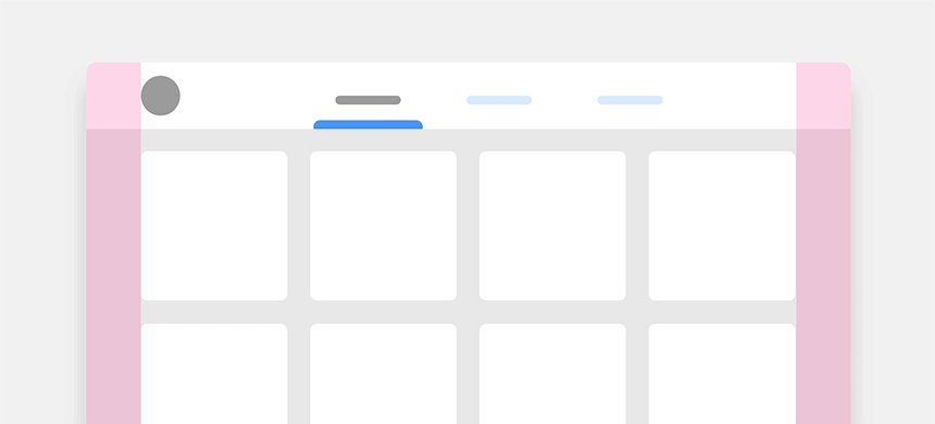
If necessary, margin width can be customized at any breakpoint. However, it is important to strike a balance between margin width and content that ensures ease of legibility. As a general rule of thumb, larger screen sizes utilize wider margins while smaller screen sizes utilize narrower margins. We recommend leaving a minimum 10px margin for mobile up, a minimum 20px margin for tablet up and a minimum 30px margin for small desktop up screen sizes.
use narrower margins on mobile screens as it allows the user to consume larger amounts of content comfortably.
use wide margins on mobile screens as it makes content difficult to consume.
Rows
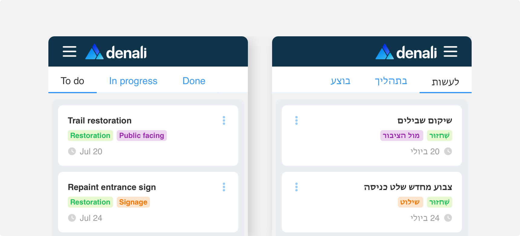
Horizontally layout your content using rows. Generally, content in rows is laid out from left to right but this can be reversed if necessary to achieve better informational hierarchy or in countries where content is read from right to left. Additionally, content in rows wraps as the screen size becomes smaller.
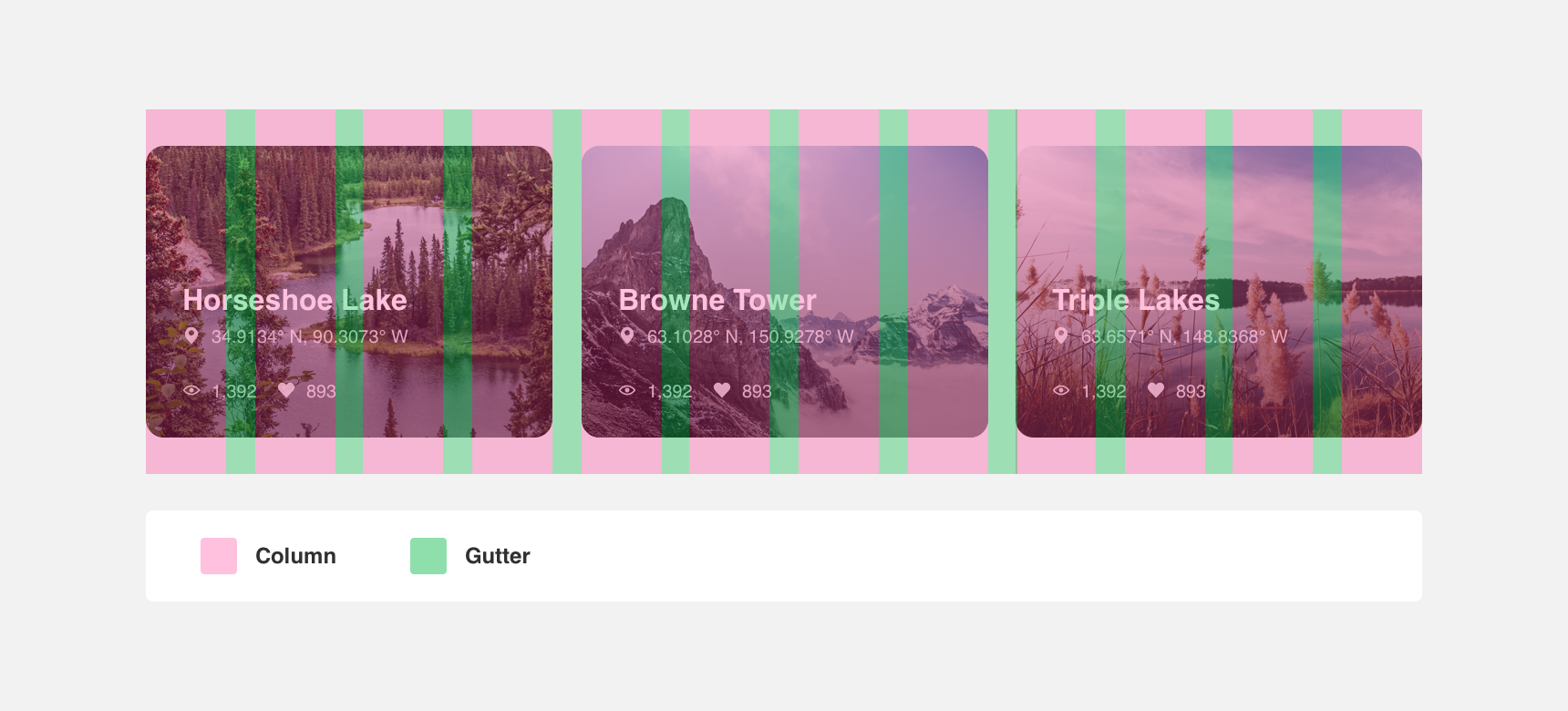
Columns
Columns divide the space within containers evenly. Denali’s grid is made up of 12 columns. The width of Denali’s columns is determined using percentages. This ensures that content can adapt to a variety of screen sizes without becoming cramped.
Gutters
Gutters refer to the white space between columns. Gutters are essential to legibility as they prevent columns from running into each other and give content room to breathe.
The width of gutters is determined by Denali’s breakpoints. All gutters share the same width in order to ensure that content remains aligned and easily scannable.
The width of Denali’s gutters were set specifically to provide enough white space to ensure ease of legibility. For this reason we do not recommend adjusting Denali’s default gutter widths.