Colors
From differentiating elements on a screen to conveying meaning, color plays a key role in creating products with effective interfaces and user experiences.
Guiding Principles
Our color principles were established to ensure that color is used in functional manner that is to communicate meaning and guide users through products effectively.
Accessibility First
Ensure users with color blindness and/or low vision are able to use your products effectively by maintaining high contrast ratios between colors in your interface.

use colors with high contrast ratios next to each other on a screen.

use colors with low contrast ratios next to each other on a screen.
Communicate Meaning
Colors often carry inherent meanings that differ depending on cultural associations. It is important to take these inherent meanings into account when using color in your product’s interface.

use green to signify a successful interaction.
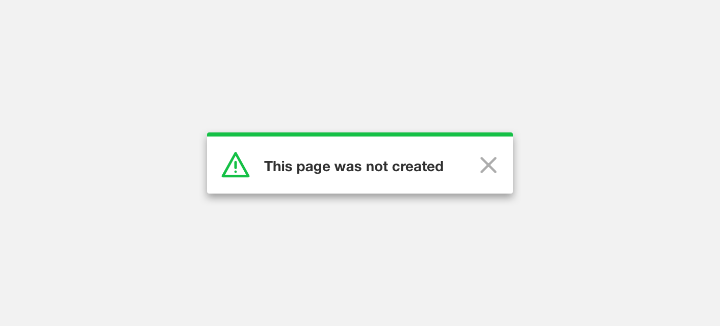
use green to signify an unsuccessful interaction.
Convey Hierarchy
Color should always be used intentionally to guide users and focus their attention on the task at hand.

use color to emphasize important elements on a screen.

use color to emphasize background elements on a screen.
Color Palettes
Our color palettes work alongside our guiding principles to ensure an effective and logical use of color.
Brand
#CCE2FF
#80B6FF
#016EFF
#004CB3
#002B66
Status
#EA0000
#F4CB00
#15C046
#0066DF
Grey
#FFFFFF
#F8F8F8
#F2F2F2
#E8E8E8
#D5D5D5
#9A9A9A
#606060
#303030
Red
#FFBDBD
#F89494
#F16A6A
#E94141
#E21717
#D01111
#BE0C0C
#AB0606
#990000
Orange
#FFDCC0
#FCC391
#F8A962
#F49032
#F17603
#DC6A03
#C85E03
#B35102
#9E4502
Yellow
#FFFCD2
#FFF4A9
#FFEB71
#FEE344
#FED800
#F7C500
#F0B200
#E99E00
#E28B00
Lime
#E8FFC0
#D0F595
#B8EC69
#9FE23E
#87D812
#7BC210
#6EAC0F
#62950D
#557F0B
Green
#D3FFD2
#A6EFB4
#7AE097
#4DD079
#20C05B
#1DAD51
#1A9947
#17863D
#147233
Sky
#BEF0FC
#96E8FC
#6DDDFA
#43D1F7
#19C6F4
#17AFD4
#1499B5
#128295
#106B75
Blue
#C0E3FF
#90C7F7
#60ABEF
#308EE7
#0072DF
#0065BF
#0058A0
#004B80
#003E60
Purple
#DBD0FD
#C8B6FF
#AA89EA
#8C5BD4
#6E2EBF
#5413A8
#40008B
#30006D
#20004E
Violet
#E9B7F3
#DE9BEB
#C777D6
#B152C2
#9A2EAD
#842895
#6E227D
#571B64
#41154C
Pink
#FABCDC
#FF9DCC
#FF7AB8
#FF56A4
#FF3390
#DF2D82
#BF2874
#9F2265
#7F1C57
Color copied to clipboard
Brand Palette
The Brand Palette is built around Denali’s blue brand color. These colors should be used on active elements such as links, buttons, and selection controls.
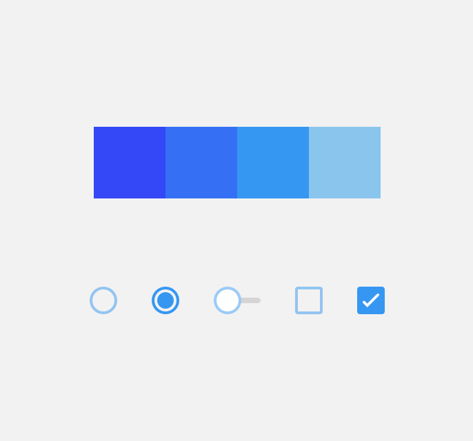
use brand colors for selection controls.
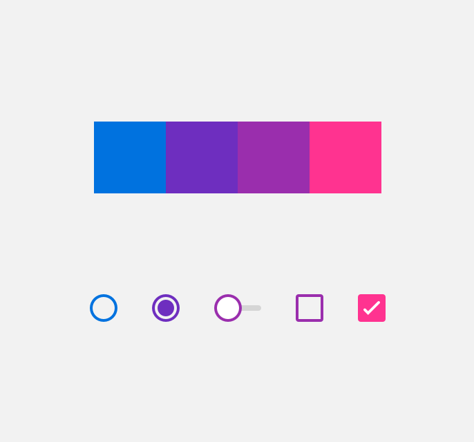
use colors outside the brand palette for selection controls.
Grey Palette
The Grey Palette is palette is built around . We recommend utilizing this palette for foundational interface elements such as such as backgrounds, cards, and containers as well as and to de-emphasize less important elements on a screen.

use grey to convey a disabled state.

use a color other than grey to convey a disabled state.
Status Palette
The Status Palette is built around the inherent meanings we assign to color. These colors should be used in accordance with their meanings to convey danger (red), warning (yellow), success (green), and informational (blue) messages.

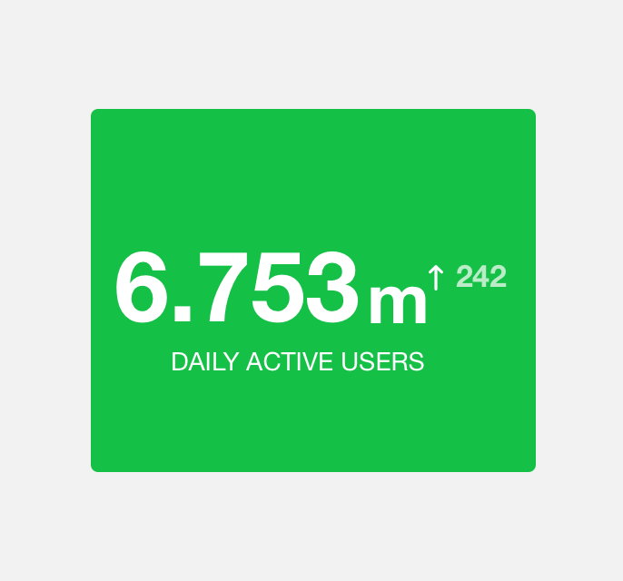
use green to convey successful upload.

use yellow to convey a successful upload.
Data Visualization Palette
Our Data Visualization palette allows for clear representation of data.
use green to indicate upward trends.
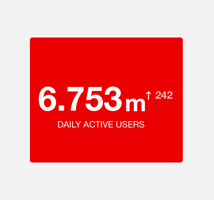
use red to indicate upward trends.