Iconography
Icons are an important part of our interfaces. They allow us to visually communicate actions and create patterns that allow users to work through our interfaces efficiently.
Icon Design
Our icons are designed to communicate ideas in their simplest form. Designing for simplicity ensures that our icons provide clarity to our users and that they maintain their readability even at small sizes.
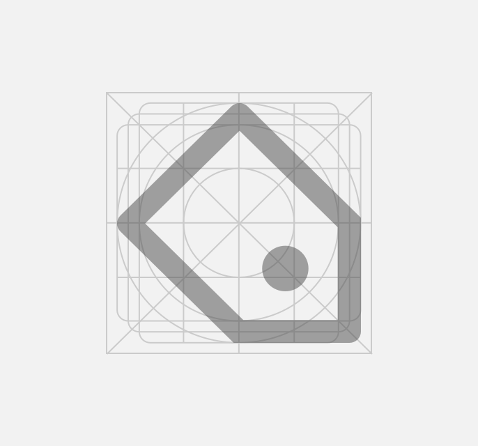
Icon Grid
Our icon grid was developed to maintain consistency across our icon family. When designing icons, always work at 100% scale. Download the Icon Grid.
Grid Dimensions
The icon grid is 48 by 48 pixels wide and is comprised of a 46 by 46 pixel live area surrounded by a 2 pixel border of padding on each side.
Live Area
The live area represents the “safe space” in which the icon should reside. No part of the icon should extend pt this space.
Grid Padding
The padding represents the “bounding box” that surrounds the live area. Preserving the white space created by the padding ensures that our icons look balanced when paired with other icons or when scaled to small sizes.
Key Line
Contained within the grid are various key line shapes. Designing within the bounds of these shapes ensures visual consistency and balance between icons.
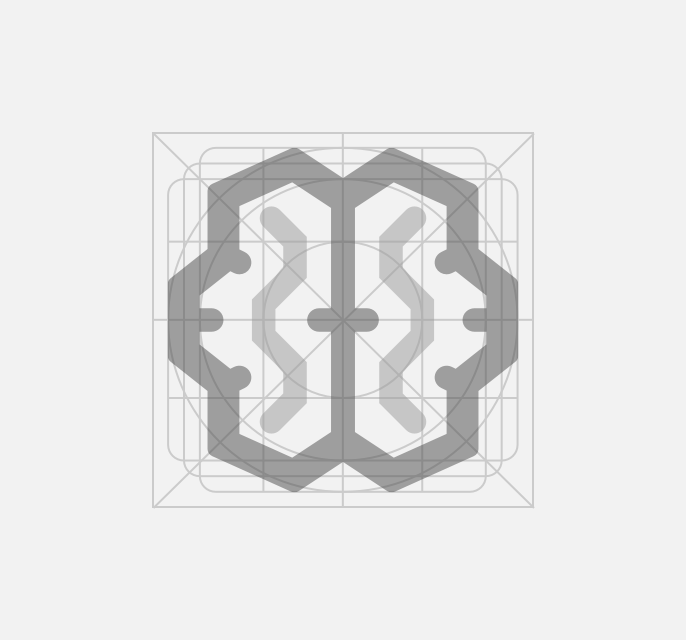
Strokes & Corners
In order to maintain visual consistency between icons it is important to maintain a consistent stroke weight and corner rounding radius.
Stroke Weight
Our icons are built using a 4 pixel stroke weight. This stroke weight should be applied to every stroke, except where minor optical adjustments to the stroke weight are necessary to maintain visual balance.
The stroke weight around this icon is 4px.
The stroke weight around this icon is 4px, but the stroke weight inside is 2px.
Corner Rounding
Corners should always be rounded by 2 pixels to maintain an open and optimistic character across our icon family.
make sure icons have rounded corners.
use icons with with straight corners.
Usage
We use icons throughout our products to communicate actions, create patterns, and help reinforce messages visually. Icons are most meaningful when paired with descriptive text but they can also function on their own.
Size
Icons are meant to represent larger actions or ideas in their simplest, most compact form. Therefore, icons should never be scaled down to the point that they lose their readability or scaled up to the point that dominate the visual hierarchy of the page.
Use the following icon scale to size your icons: 12px, 16px, 28px, 36px, 48px.
Spacing
Providing adequate spacing around icons is essential to maintaining their readability. We recommend the following white space guidelines for each icon size. Icon space values specific to the use of icons in certain UI components such as the navbar and buttons can be found on their respective component page.
Keep a minimum space of 6px between icons and other elements.
Mobile Targets
In mobile products it is important to remember that icons at any size must be given a “touch target” of 48 by 48 pixels.
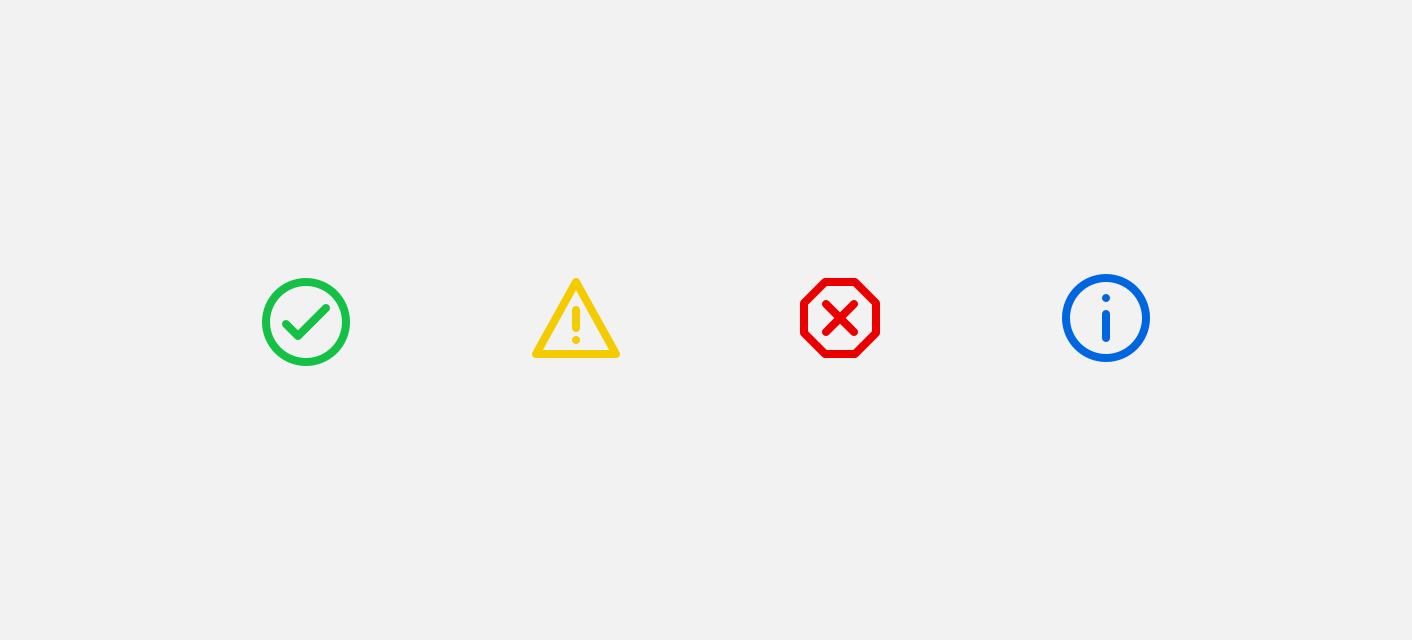
Static Icons
Static icons are icons whose primary purpose is to help convey an idea visually. Static icons can’t be acted upon. Examples of static icons include icons that accompany status alerts and icons that accompany descriptive labels.
Colors
Static icons can be colored using colors from any of our color palettes. However we recommend not coloring static icons with our blue link color #016EFF as it may cause confusion.
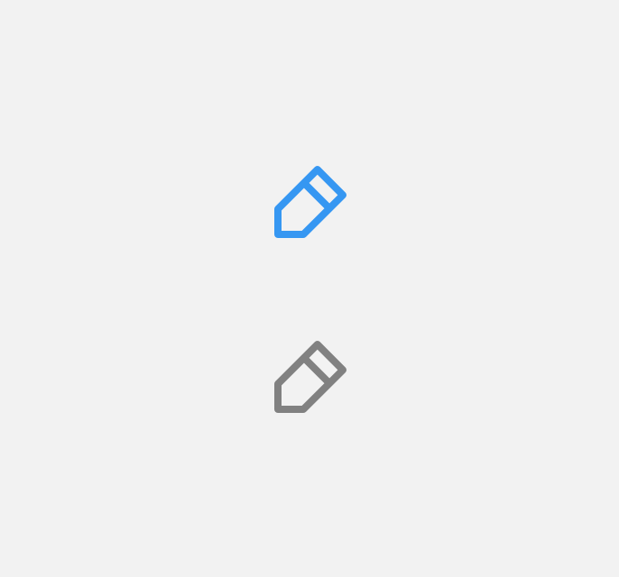
Actionable Icons
Actionable icons are icons whose primary purpose is to convey an action. Actionable icons can be acted upon. Examples of actionable icons include icons that accompany buttons or links.
Colors
We recommend only coloring actionable icons with our $brand-300 color. This ensures that the icon will look actionable to users.