Density & Spacing
Balancing page density and spacing is fundamental to creating interfaces that are easy to consume. This balance is achieved by using space effectively and consistently to ensure scannability and clear visual hierarchy in both high and low density interfaces.
Page Density
Page density refers to how dense an interface is. For example, high density pages contain a large volume of content while low density pages contain a lower volume of content. Often the density of an interface depends on its use case. For example, data driven interfaces such as cost dashboards generally need to present a large volume of information to their users and are therefore high density pages.
It is important to balance page density with negative space to maintain readability. This is especially true of high density pages where providing too little negative space runs the risk of eliminating visual hierarchy and overwhelming the user.
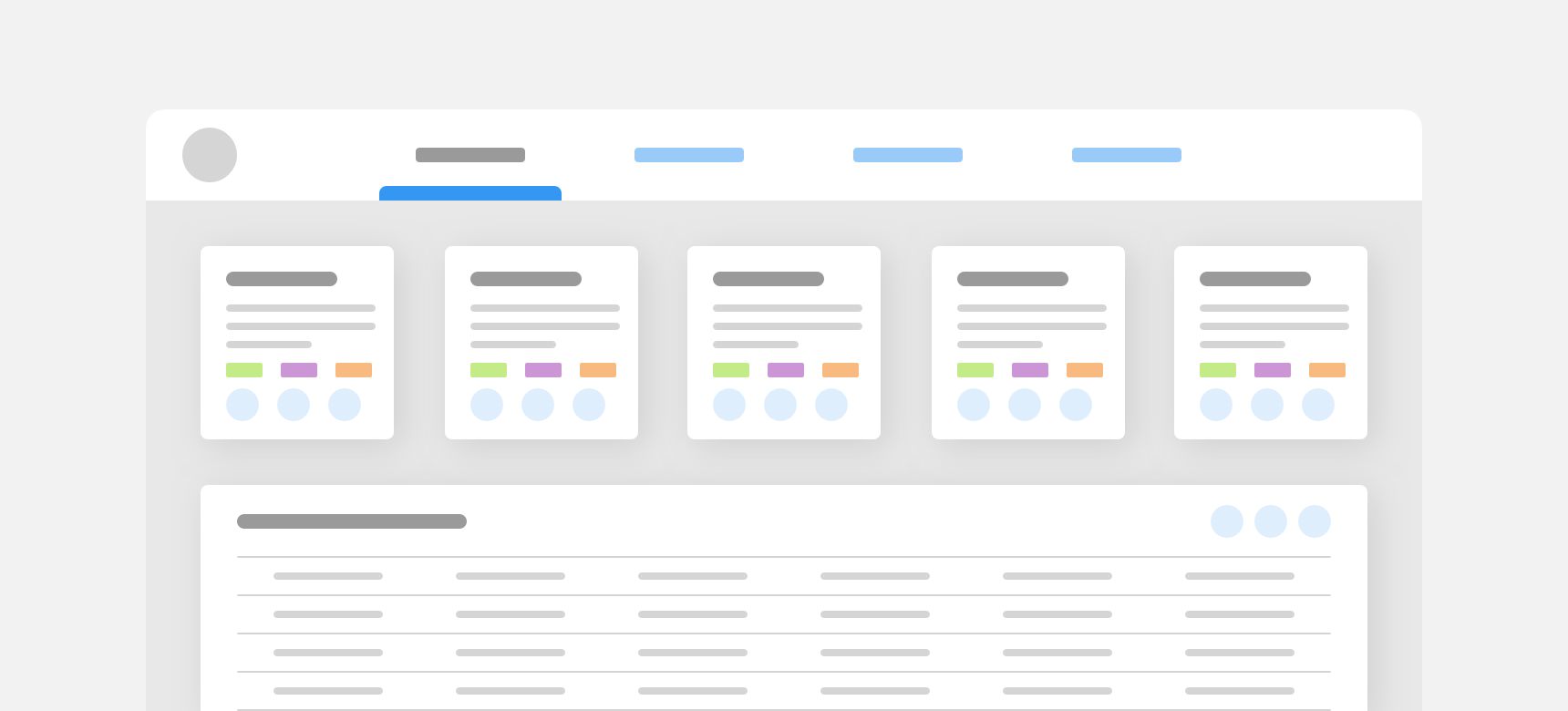
provide adequate negative space in high density pages. Grouping related content together and using negative space to separate groups of content helps create visual hierarchy and maintain readability.
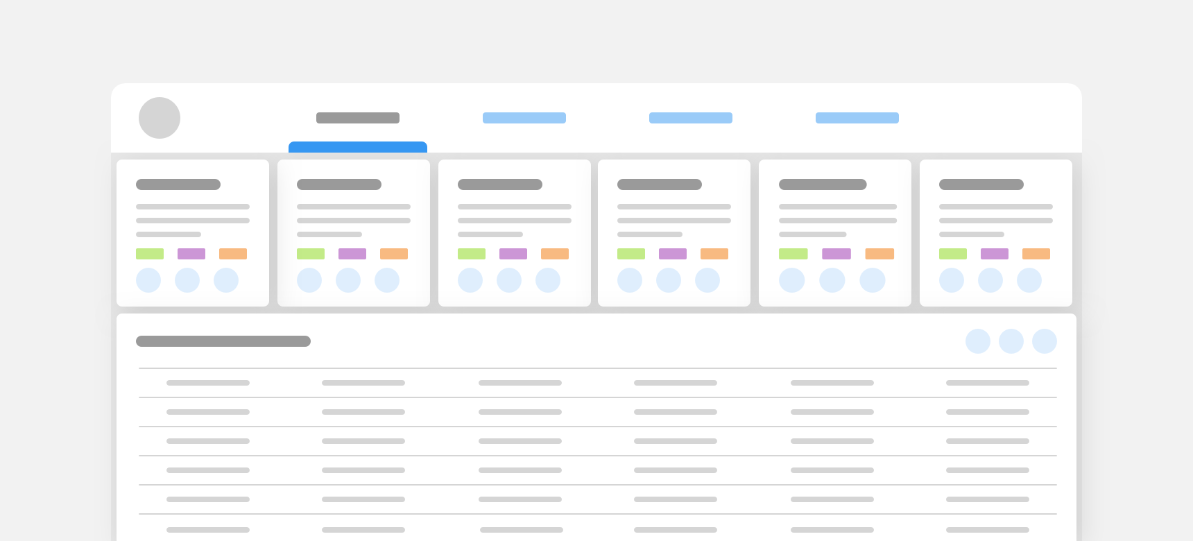
eliminate negative space in high density pages. Though it may seem like a solution for maximizing available space, it removes visual hierarchy and hinders readability.
Component Density
Certain components can support both high and low density use cases. A table is a great example of this as it’s row height can be adjusted depending on the size of the data set being displayed. Other components, such as buttons, are available in different sizes to support different page densities. For example, a small button would be utilized in a high density page where space is limited. Density information specific to individual components can be found on each component page. Do not adjust the density of a component unless the component’s guidelines explicitly support varying density and/or sizes.
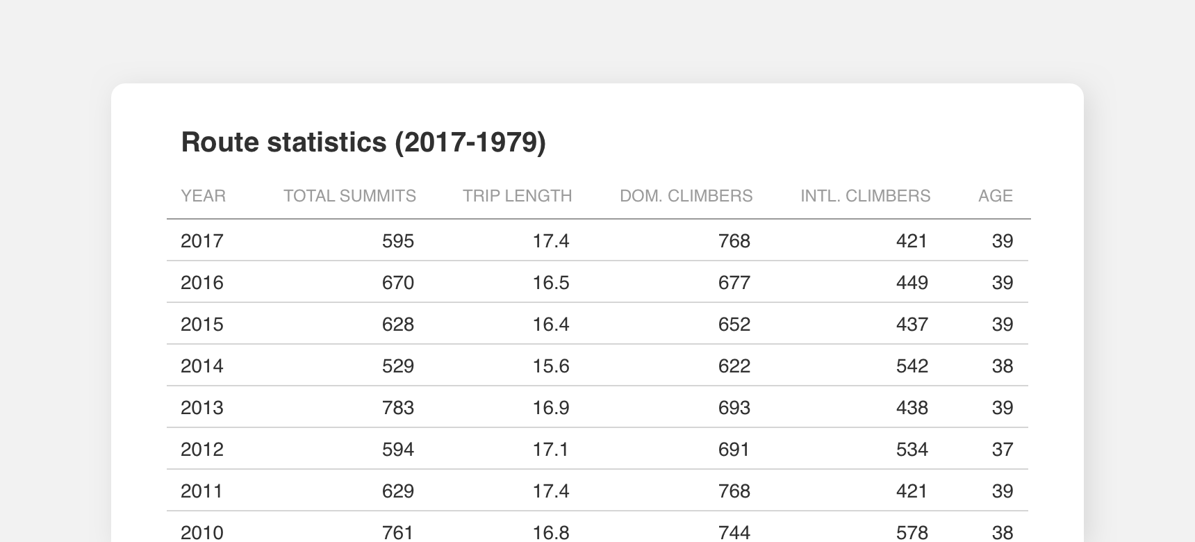
This high density table relies on narrower table rows to display decades worth of data to users.
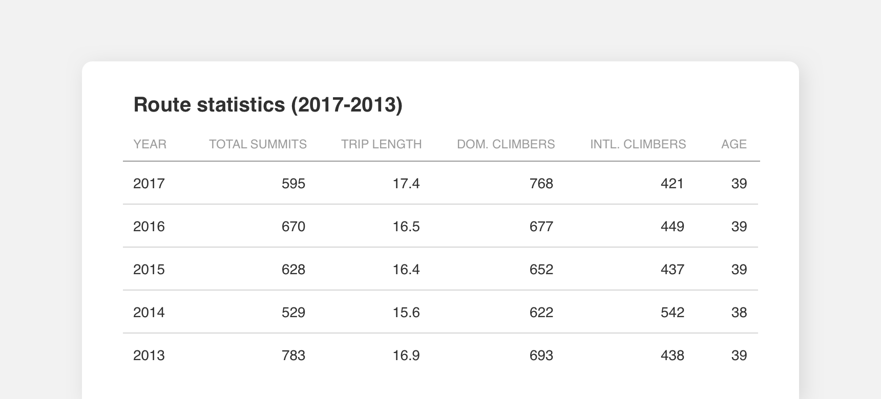
By contrast, wider table rows suit this low density table because it only presents 5 years worth of data to users.
Applying Density
Consistent density should be maintained throughout an interface. Mixing high and low density components in a single interface can throw off a layout’s visual hierarchy, which has the potential to shift the user’s attention to the wrong place and/or make consumption difficult.
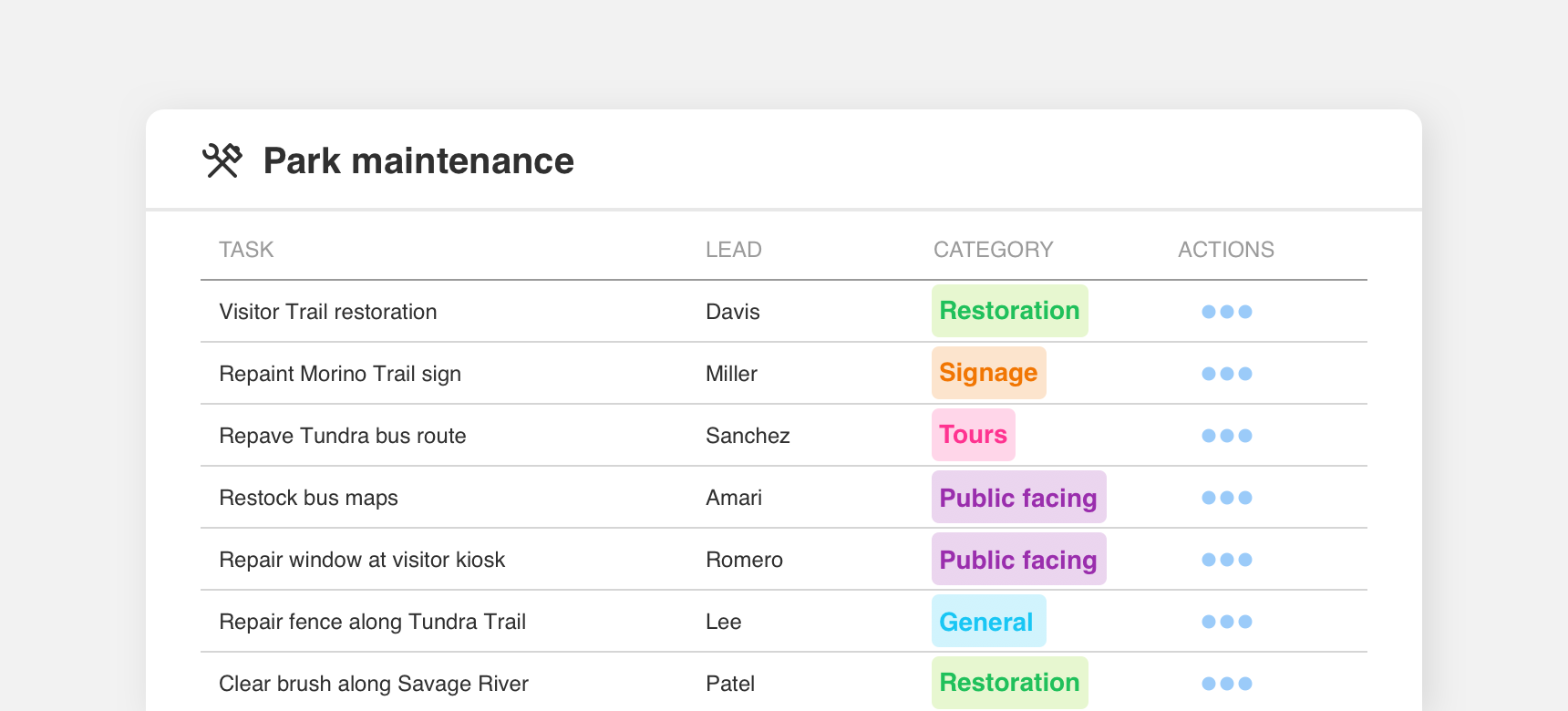
use components of the same density together.
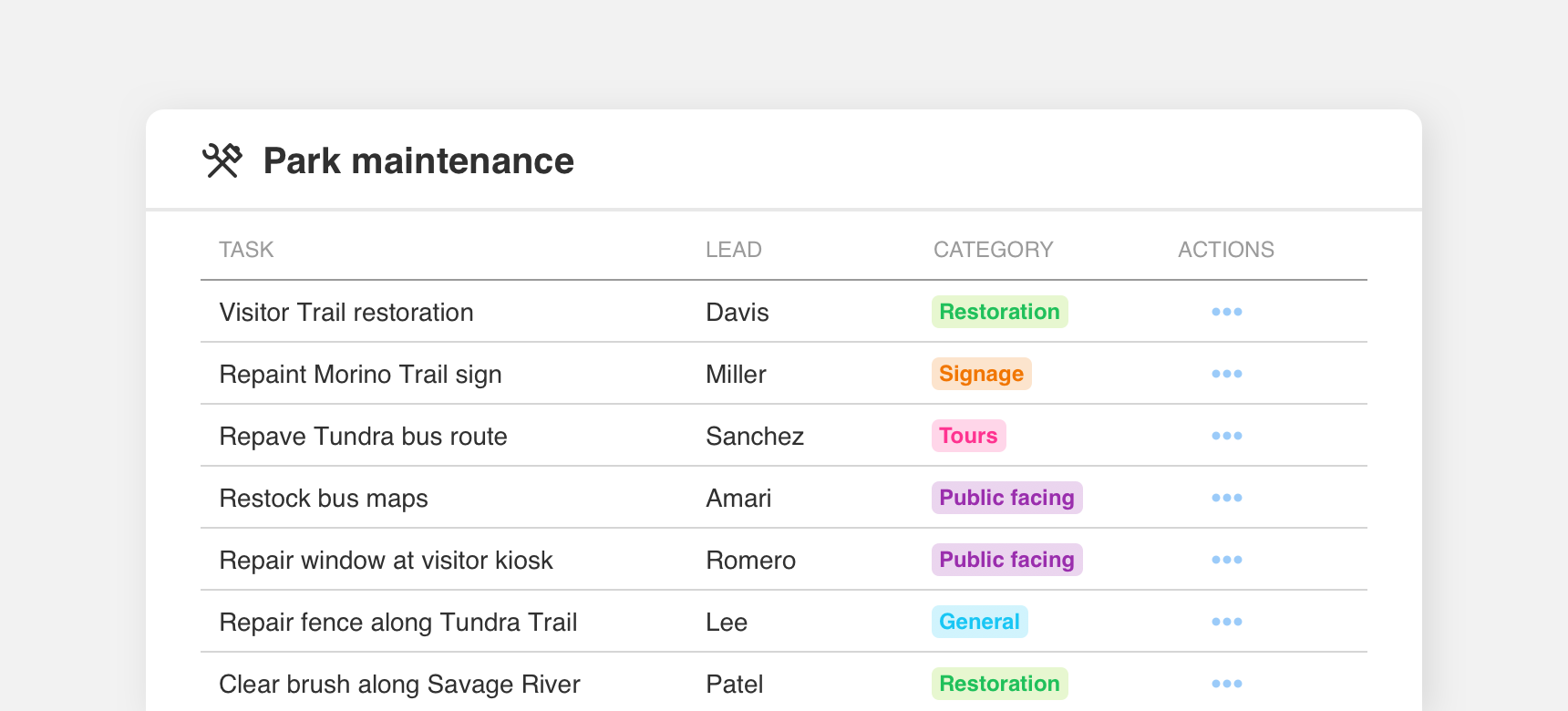
mix components with differing densities together. Here the combination of high density table rows and text with low density chips and icons makes it difficult for a user to focus their attention.
Spacing
Spacing is key to maintaining visual hierarchy and scannability in interface layouts.
Spacing increments and padding
We recommend spacing elements in increments of 10 pixels. It is important to provide enough space, or padding, between elements to maintain visual hierarchy. Spacing guidelines specific to individual components can be found on each component page.
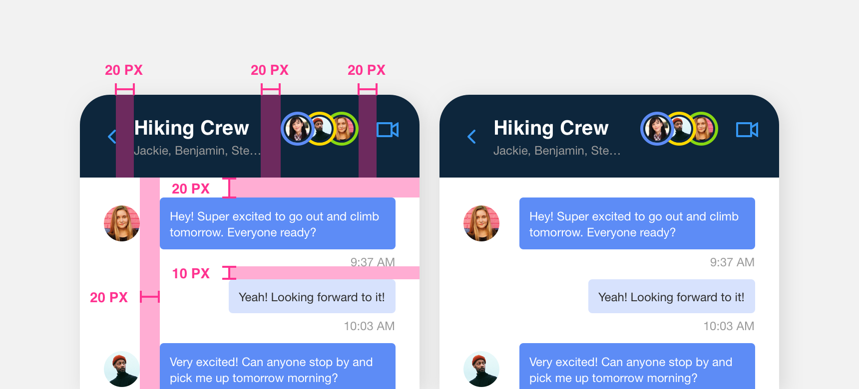
With the exception of smaller elements such as the timestamp, elements in this chat interface are spaced in increments of 10px.
Baseline alignment
Elements align horizontally to a baseline grid. This helps maintain implied horizontal lines that visually guide a user through an interface. Denali’s baseline grid is still in development but as a general rule of thumb related elements should bottom align themselves horizontally.
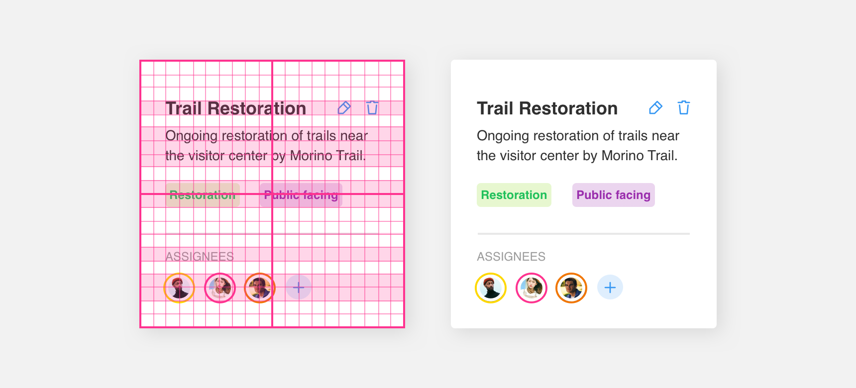
Within each card text and icons are aligned to each other and the baseline.
Vertical alignment
The vertical alignment of larger components and containers conforms to the columns of our grid. This helps maintain implied vertical lines that visually guide a user through an interface.
Smaller components such as text, links, or images that reside within larger components and containers do not need to conform to columns. However, it is still important to maintain implied vertical lines by left or right aligning these items to themselves and using consistent, incremental spacing.
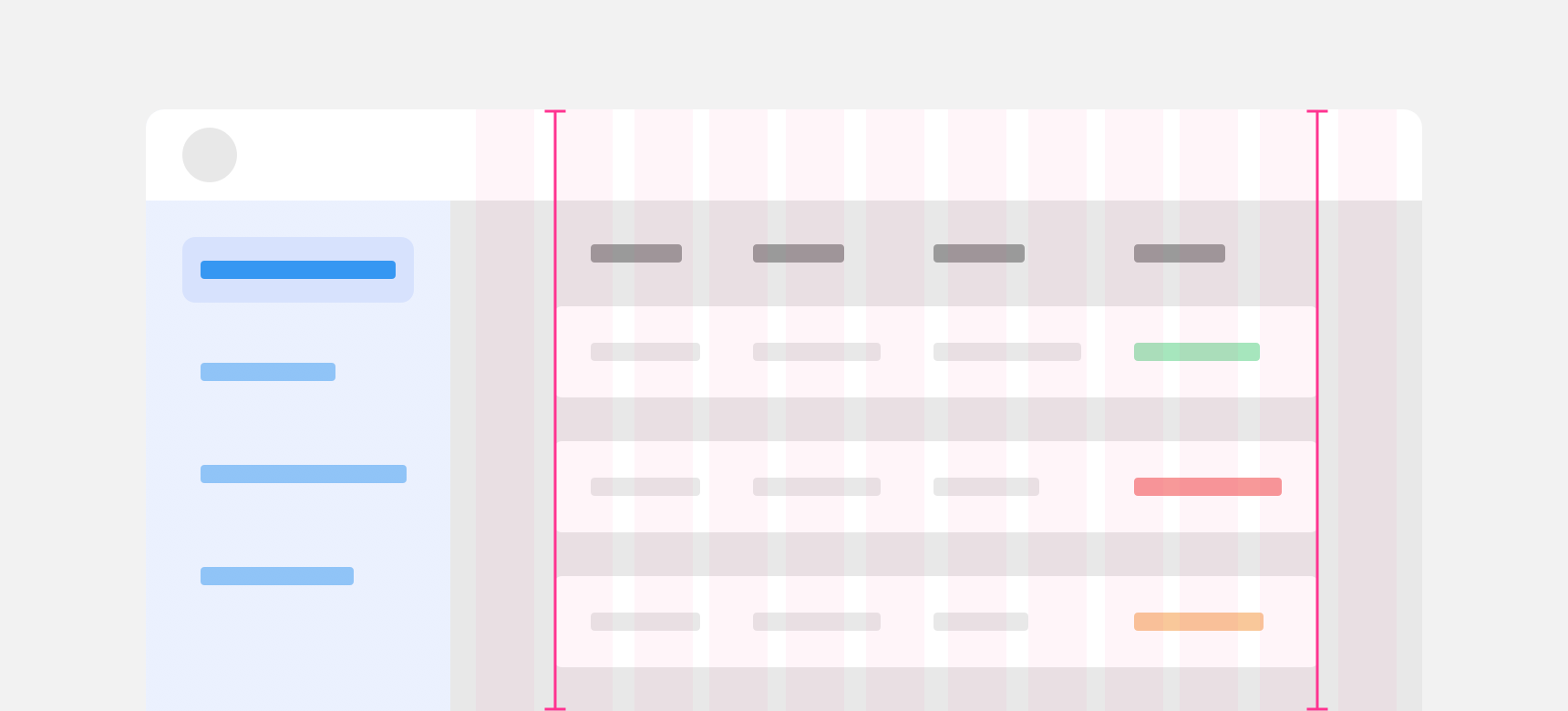
The table aligns to the columns of Denali’s 12 column grid.
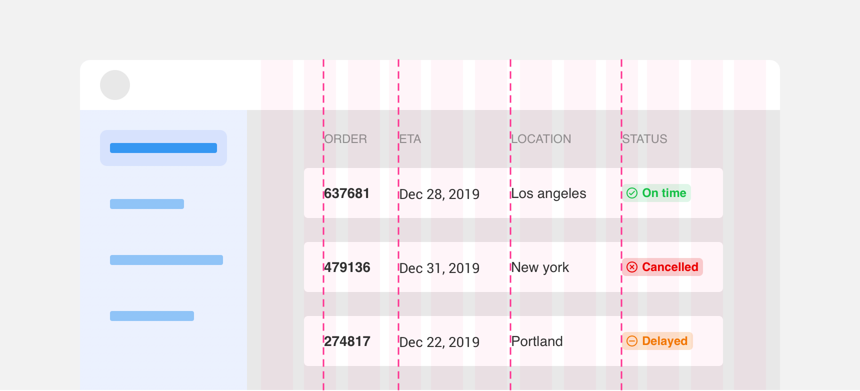
Table row content does not align to the columns of the grid, but the content is vertically aligned to itself.
Targets
Leaving space around touch and click targets is important to maintain usability.
Tap targets
Tap targets refer to tappable elements in an interface such as buttons and links. In order to ensure that users can tap these targets effectively it is important that they are at least 44 by 44 pixels.
Elements that are smaller than 44 x 44 pixels can be placed in invisible bounding boxes to ensure they are tappable. Links within text are exempt from this rule as any attempt to place links in bounding boxes may cause bounding boxes to overlap and make clicking links or highlighting surrounding text difficult.
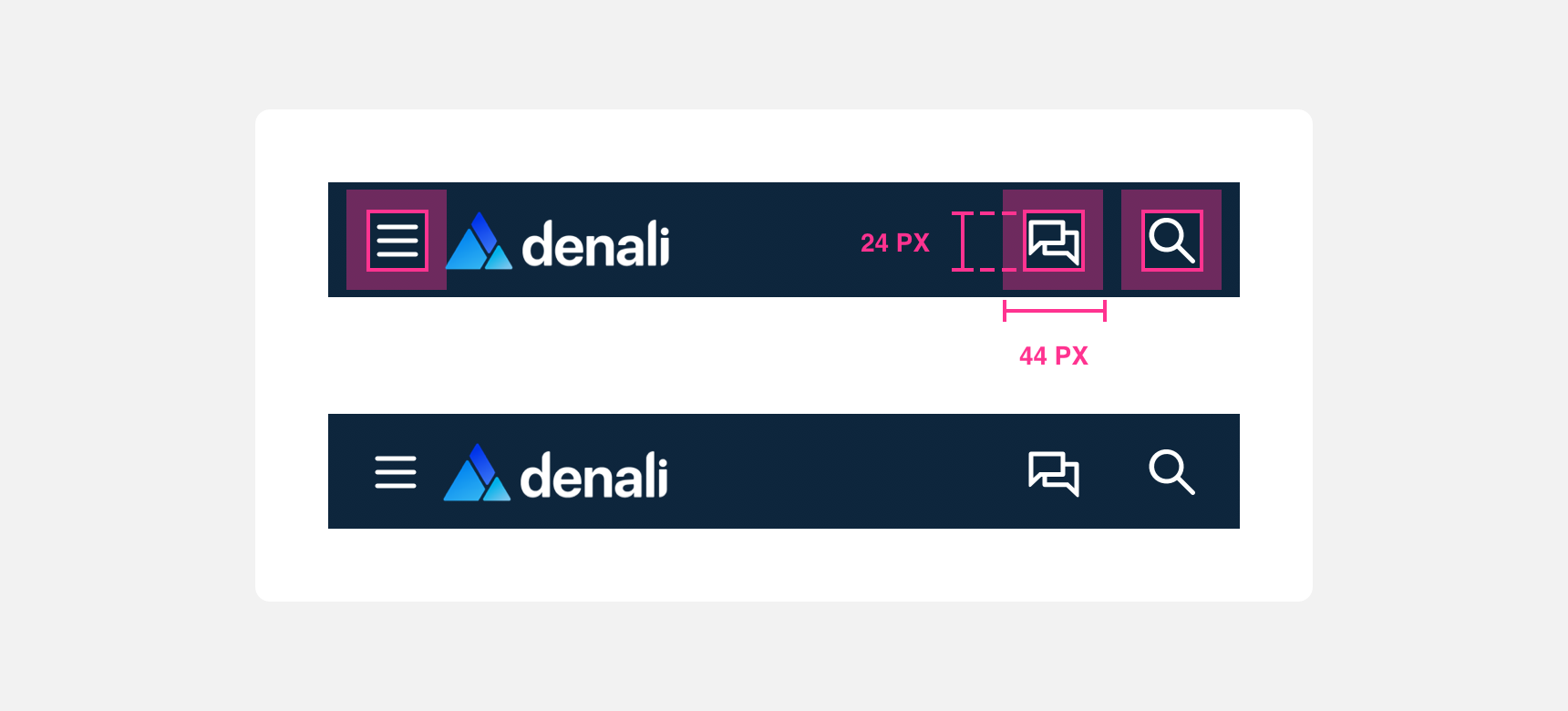
Icons within a mobile navbar are 24 by 24 pixels tall but they reside in a 44 by 44 px bounding box to make tapping them easier.
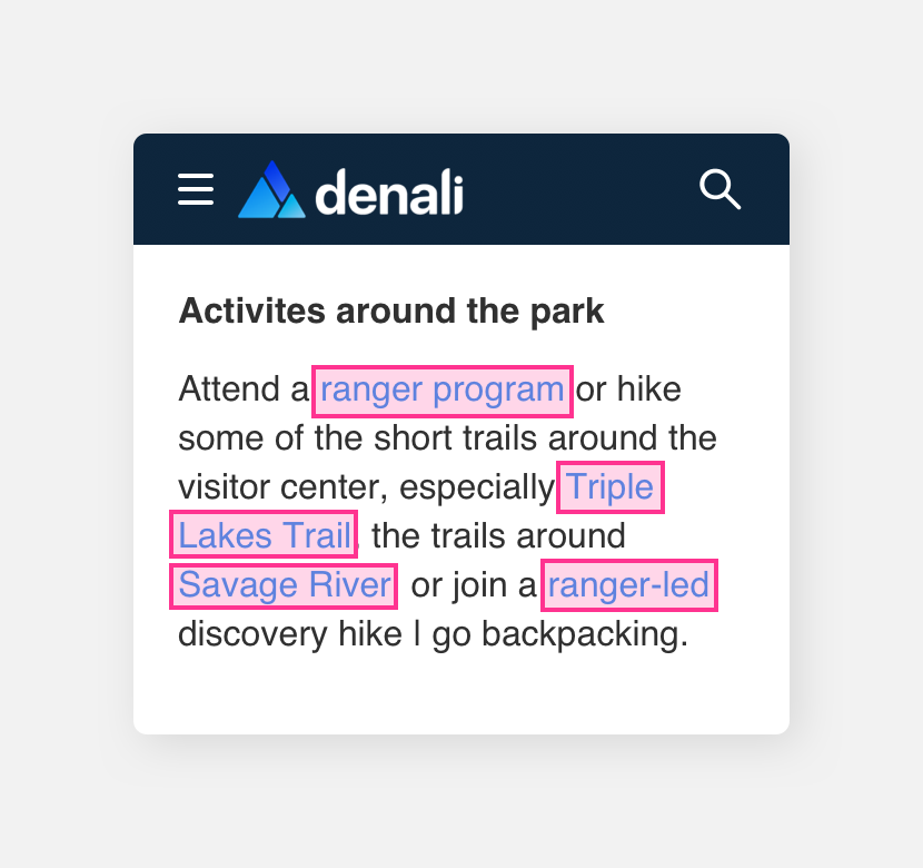
refrain from adding bounding boxes to links within text.
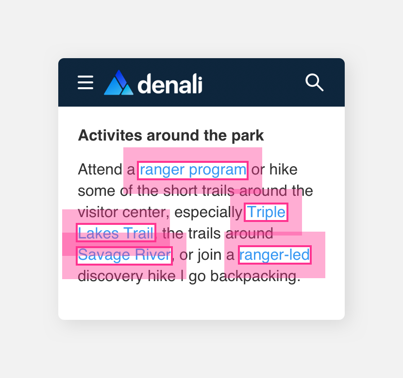
put links within text in bounding boxes as they may overlap and make precise tapping difficult.
Click targets
Click targets refer to clickable elements in an interface such as buttons and links. In order to ensure that users can click these targets effectively it is important that they are at least 20 by 20 pixels.
Elements that are smaller than 20 x 20 pixels can be placed in invisible bounding boxes to ensure they are clickable. Links within text are exempt from this rule as placing them in a bounding box would disrupt the flow of the text and make it more difficult to consume.
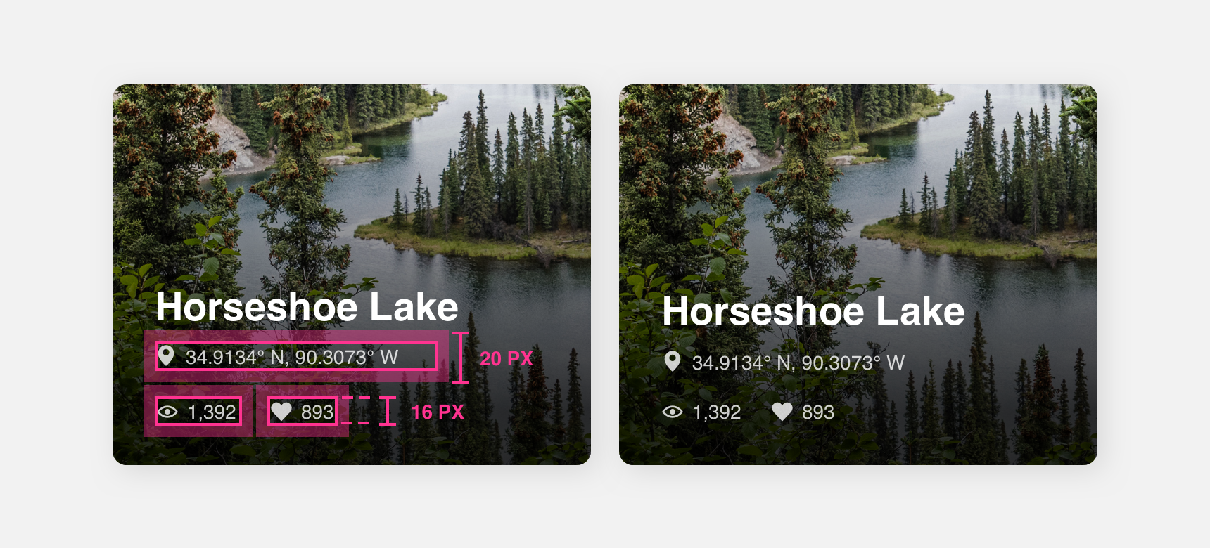
The clickable elements in this photo album cover are 16 px tall but they are placed within 20 px tall bounding boxes to make clicking them easier.