Component Behavior
Component behavior refers to the way that Denali’s components adapt to fit within the different breakpoint ranges of Denali’s responsive grid.
Responsive patterns
Adapting to fit the responsive grid often means something different for individual components. Specific component behavior guidelines can be found on individual component pages, but as a general guideline adapting to fit the grid can mean any of the following:
- Changing size
- Stacking, rearranging, or collapsing
- Appearing or disappearing on screen
The following responsive patterns dictate the different ways in which our components adapt to the grid. It is important to utilize these patterns when translating an interface’s design across breakpoint ranges to ensure consistency and predictability.
Full width
Certain components expand to the full width of their container at smaller breakpoint ranges. This is especially common at mobile screen sizes because full width components are easier to tap.
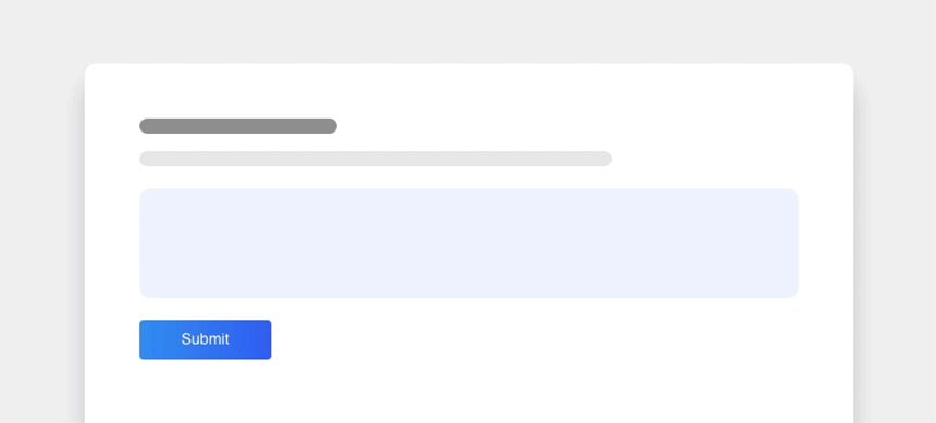
A button is a primary example of a component that can expand to the full width of its container at smaller breakpoint sizes.
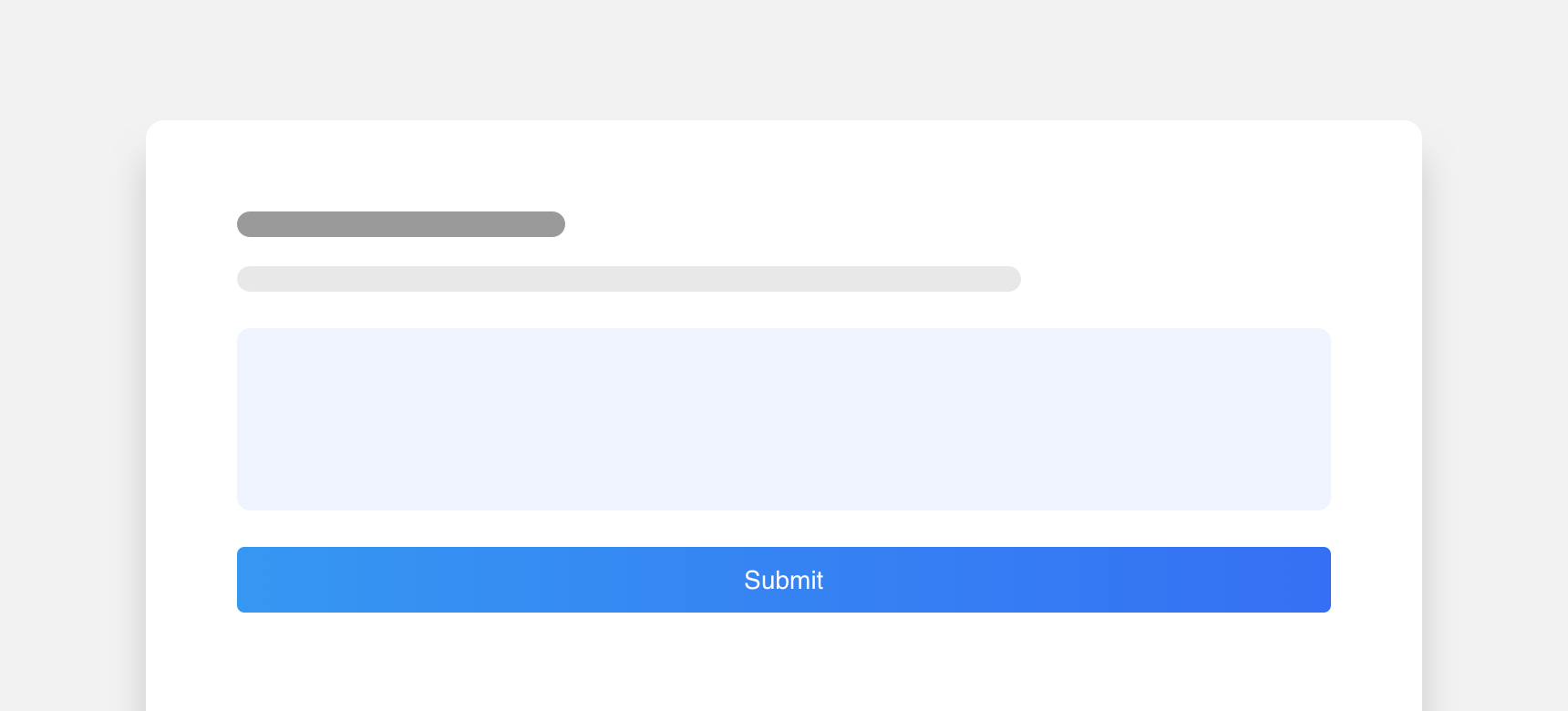
use full width components in situations where they are not necessary since full components can quickly becoming visually overwhelming.
Stack
At smaller breakpoint ranges some components will stack or rearrange themselves to better fit within fewer grid columns.
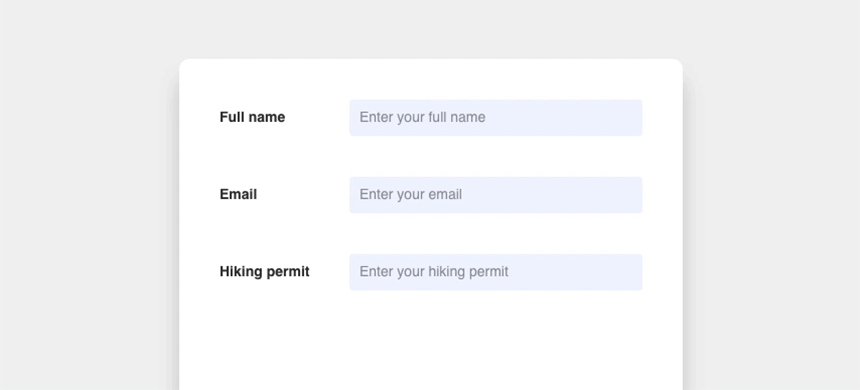
Inputs are an example of a component that stacks itself to better fit smaller screen sizes.
Wrap
Certain components will wrap to remain in close proximity to each other within smaller breakpoint ranges or to occupy fewer columns. This often occurs to prevent content from becoming hidden behind a horizontal scroll.
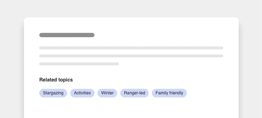
Tags are an example of a component that will wrap to better fit the space they are in.
Collapse
Ghost buttons are comprised of a label housed within a low opacity solid-fill container.
Larger components can collapse into more compact versions of themselves to fit smaller breakpoint ranges or fewer columns. Often, parts of the component that are not essential to the interface will become hidden behind icons and will only reappear when acted upon.

The navbar is a primary example of a component that collapses to fit its breakpoint range. Not only does it collapse in size, its smaller parts collapse into icons as well.
collapse a component unless it is absolutely necessary to do so to conserve space. Collapsed components often hide useful content. Hiding content instead of using the available space to display it may cause unnecessary confusion or friction for your users.
Reveal
When a component collapses at smaller breakpoints, the content that becomes hidden can reveal itself when acted upon. The content reveals itself by either pushing other content off the screen or overlapping the content on the screen. Additionally, if content on the screen needs to remain visible while the other content reveals itself, the content on the screen can wrap to fit the available space.

Here a side navigation reveals itself by overlapping the content on the screen.